Peer Review is a reboot of Half-Life's third and final expansion, Half-Life: Decay. Return to the Black Mesa Research Facility and relive the chaos from the perspectives of Dr. Gina Cross and Dr. Colette Green.
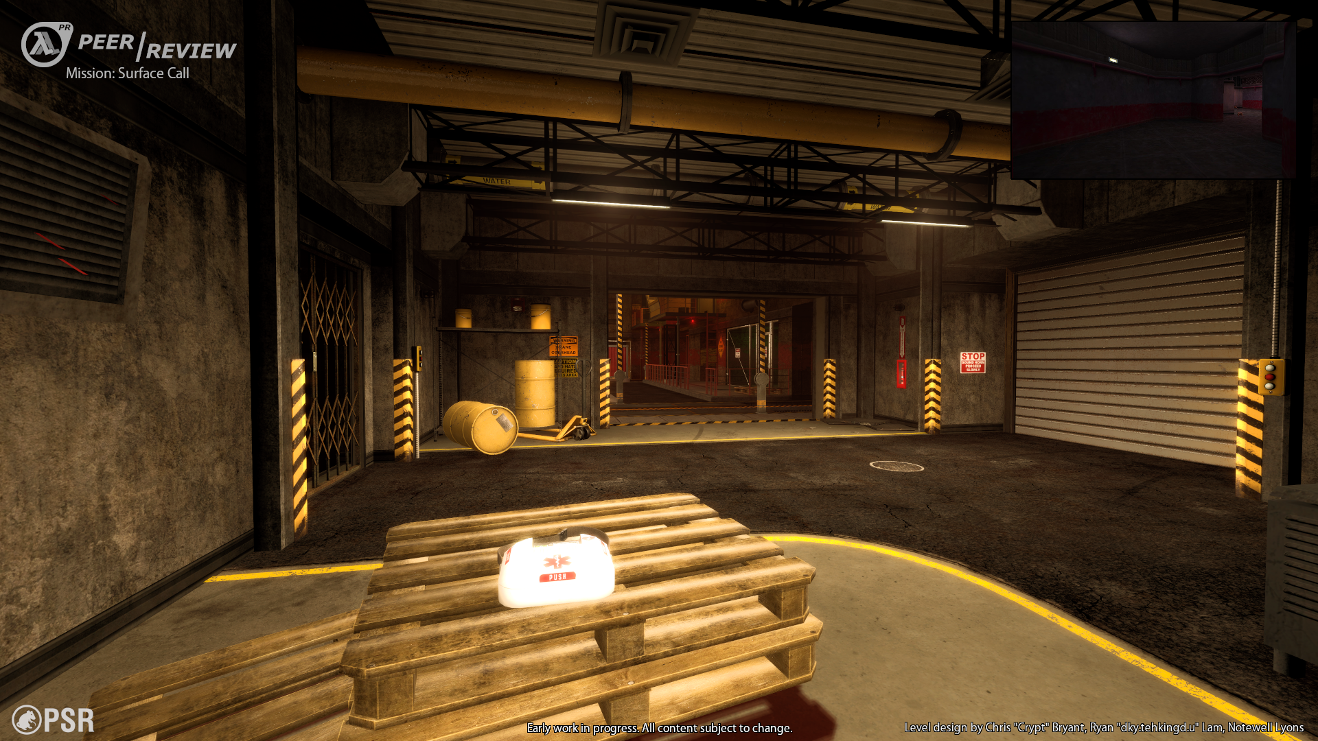
Surface Call
(view original)

Post a comment
Description
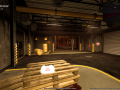
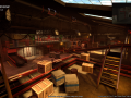
Level design by Chris "Crypt" Bryant, Ryan "dky.tehkingd.u" Lam, Notewell Lyons
Early work in progress. All content subject to change.
(buried)
Warm and caramelish looking, very reminiscent of Black Mesa's choice of style. I don't mean it in any good way, of course. Warm and caramelish (and overstuffed, by the way) is not fitting for Half-Life.
It doesn't look warm to me, maybe you think it's like that because it's bright and because of the yellow colors on the screen. I guess lowering down the brightness of the lighting and making the textures more bluish would help your case.
Coming from the king of bland and uninteresting lighting himself.
Looks nothing like Black Mesa to me. Black Mesa is so dark you can barely see in most situations, and it has tons of props everywhere that somehow pass for "detail" (especially pipes, take a shot every time you see a cluster of pipes in BM and you'll die before you reach Surface Tension).
I really fail to see how yellow-y lighting isn't fitting for HL. Back in the early 2000s there was still quite a wide use of those yellow bulbs, and Black Mesa (facility) was initially constructed in the Cold War (1950s, specifically). I'm not a fan of how that medkit is glowing, but I don't mind the lighting being yellow.
And there's also the large amount of yellow on the textures themselves in that area, wood, old concrete, dirty floors, yellow paint, danger stripes, yellow barrels... I don't think it's the lighting that's bugging ya. I don't hold it against you but I don't see a problem with it, especially considering how much effort has gone into the gameplay (see the demo video they have up).
Dark, cold and blue is not very fitting for Half-Life either :)