Yeah but the way he said it it's like "This games red pencil looks like THIS games red pencil!" when they are both using the same engine and based on the same damned red pencil. There are only so many ways to model these things.
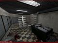
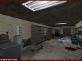
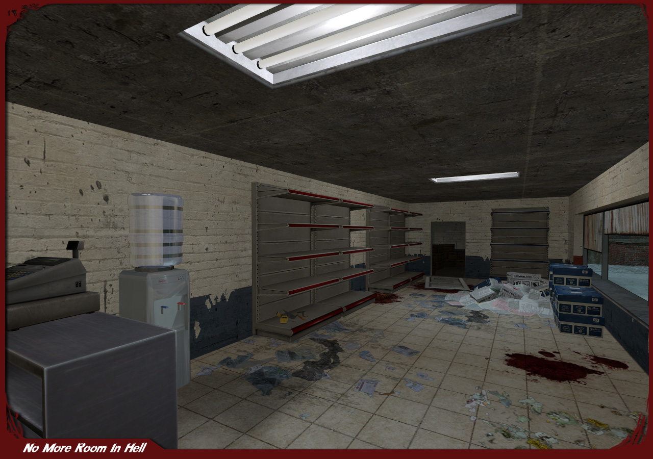
I finf the water cooler from this shot has the weirdest lighting.
About the "ceiling being too flat" and "aren't they supposed to be".
The thing is there's a fine line between games and real life. In real life a corridor is more or less just a blocky... hallway. It's realistic, it's solid, it's logical. But in a game it loses all it's appeal and is often mistaken for sloppy level design.
Which is why lots of people have had the idea to ram in boxes, barrels, dirt, bumps and the like. Something that in real life would be rather odd. And definitely not something you see in every single corridor. Just go to any clean building and look at the hallways.
The only details may be the trims of doorways, where the floor and wall meet or pillars.
The only way to really make a ceiling look more than a flat surface while keeping realistic, is a highly detailed texture.
Just my ... quick thoughts. I'm not sure what I'm saying really D:
Most of us know how mapping works and the break from good game mapping and realistic mapping, but that wasn't the issue here at all.
The angle given really does make the roof look flat, but you would never notice that while standing below that in a room. A roof can never be too flat, although it can be too much the other way. IMO the roof of a convenience store would look awkward with bumps and juts in it that were not overused light fixtures.
Not even HL2 took that into consideration, AlCool. But you made 2 contradicting statements; You are correct, no one would notice the ceiling bumps, and it would only be a feature that players look at once and say "cool" then never notice again.
The only thing I can imagine looking ok is realistic ceiling paneling with a few panels missing, and displacement of the panels to give them the broken down feeling that the rest of the map craves.
Tharapita: You put it into words wonderfully. Video games exaggerate on purpose, it derives an emotional feeling from the player. However adding in the details that make a room or hallway more realistic just adds to the quality of a map. Adding trim, bumpmapping ceilings, creating grooves in tile textures... All this adds to a map, but the props still bring out the fantasy in it.


someone had stolen food
Nah, it looks like that normally.
shelfs are looks the same in l4d
ITS THE SOURCE ENGINE, DOIII
The shelves are actually one of our custom props, as is the water cooler, cash register and checkout counter the register is on.
Yeah but the way he said it it's like "This games red pencil looks like THIS games red pencil!" when they are both using the same engine and based on the same damned red pencil. There are only so many ways to model these things.
I finf the water cooler from this shot has the weirdest lighting.
Everything looks okay except the ceiling. Doesn't mix with that light fixture at all.
Lighting is to bland... And the ceiling sucks. It's to flat.
Aren't ceilings supposed to be flat (most of the time)?
About the "ceiling being too flat" and "aren't they supposed to be".
The thing is there's a fine line between games and real life. In real life a corridor is more or less just a blocky... hallway. It's realistic, it's solid, it's logical. But in a game it loses all it's appeal and is often mistaken for sloppy level design.
Which is why lots of people have had the idea to ram in boxes, barrels, dirt, bumps and the like. Something that in real life would be rather odd. And definitely not something you see in every single corridor. Just go to any clean building and look at the hallways.
The only details may be the trims of doorways, where the floor and wall meet or pillars.
The only way to really make a ceiling look more than a flat surface while keeping realistic, is a highly detailed texture.
Just my ... quick thoughts. I'm not sure what I'm saying really D:
Most of us know how mapping works and the break from good game mapping and realistic mapping, but that wasn't the issue here at all.
The angle given really does make the roof look flat, but you would never notice that while standing below that in a room. A roof can never be too flat, although it can be too much the other way. IMO the roof of a convenience store would look awkward with bumps and juts in it that were not overused light fixtures.
Not even HL2 took that into consideration, AlCool. But you made 2 contradicting statements; You are correct, no one would notice the ceiling bumps, and it would only be a feature that players look at once and say "cool" then never notice again.
The only thing I can imagine looking ok is realistic ceiling paneling with a few panels missing, and displacement of the panels to give them the broken down feeling that the rest of the map craves.
Tharapita: You put it into words wonderfully. Video games exaggerate on purpose, it derives an emotional feeling from the player. However adding in the details that make a room or hallway more realistic just adds to the quality of a map. Adding trim, bumpmapping ceilings, creating grooves in tile textures... All this adds to a map, but the props still bring out the fantasy in it.
I agree with Taylorinalaska completely.