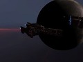
Our representation of Halo's iconic space combat in the Homeworld 2 engine, which puts the player in command of some of the most powerful weapons fielded by the UNSC and Covenant and to provide a balanced and competitive experience.
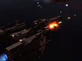
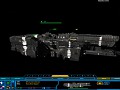
Normal Map in-game test
(view original)

Post a comment
Description
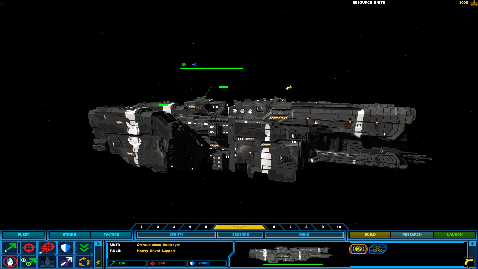
The Longsword, Frigate, and Destroyer all have a base alpha color of hue 128 (medium between black and white, base grey).
Please point out something I'm doing wrong because the normal map looks worse when the bump is applied.
wow.. thats cool, excellent good work fellas
lol it's not good work, just look at all the shiny parts. I can't find a way to lose it.
i think he doesn't even have read the description -.-'
I'm not sure what you mean by 'shiny' its probably just me but I can't see any shiny-ness....
Hmmm, UNSC ships are made of a titanium alloy correct?? So wouldn't it have some shine to it naturally?
They might, but the point is that the shine is regardless of the normal map and so it doesn't "work" with the texture, IE, theres a single shine which makes it look like a single flat surface, rather than multiple surfaces due to the plating.
Whatever, it looks awesome to me...But then, I am not a critique...
If you want each panel of the ship to have a different amount of shinyness, you need to manually change the luminosity (shades) of grey for each individual panel. I suggest you have no shinyness on the black lines seperating panels.
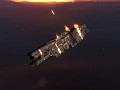
I don't know how to fix those wierd artifacts though. Maybe it has something to do with the unwrapping of the model?
Every panel is the same shade of grey, there should be no shiny-ness from the normal map.
It's not that, if you look at the picture properly you can see the normal map hasn't applied properly and lighting is still interacting with the flat mesh face as a whole and ignoring the normal map.
It's not ignoring the normal map, I would say the normal map is too strong as is.
tbh this serves the purposes of the mod.
But if you want more and are a perfectionist (sigh) then perhaps use more colours to differentiate the separate parts of the ship other than the dark grey wire-frame? although so many shades of grey will always still be grey.
Anyway that's from a photographic viewpoint; the random light anonymity is probably out of my depth with digital.
I'm not sure what you mean by dark grey wireframe, and it's not an issue with the texture itself, it's more the normal/bump map issue.
Again, it's nothing to do with colour or definition, it's the normal map not implimenting properly - the normal map should be breaking up the flat mesh by making it appear as if some of the details are 3D, which they're not.
The "grey wire frame" i expect you're talking about is part of the normal map - each of those lines is meant to be the edges between plating and such, and the normal map is meant to make it look like they're 3d rather than just a 2d image put on a flat mesh.
Awesome guys the only thing id say is that yall should make a distressed specular map for it to give it a more tangible feel.
How so?
tbh i havent a clue what ur talkin about it looks awesome to me :D......as always :D
.
.