Doom 3 Evolution is a Single-Player Game-Play Conversion Mod. It is meant to be played with original Doom 3 storyline/levels. The main features of this mod are it's original Class, Skill and Genetic Modifier, as well as Weapon upgrade, systems. In a couple of words - this mod gives Doom 3 the depth it deserves, by introducing various new tools and skills, and a great variety of possible characters. In a couple of words - this mod will give Doom 3 the depth it deserves, by introducing various new tools and skills, and a great variety of possible characters.
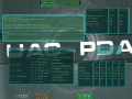


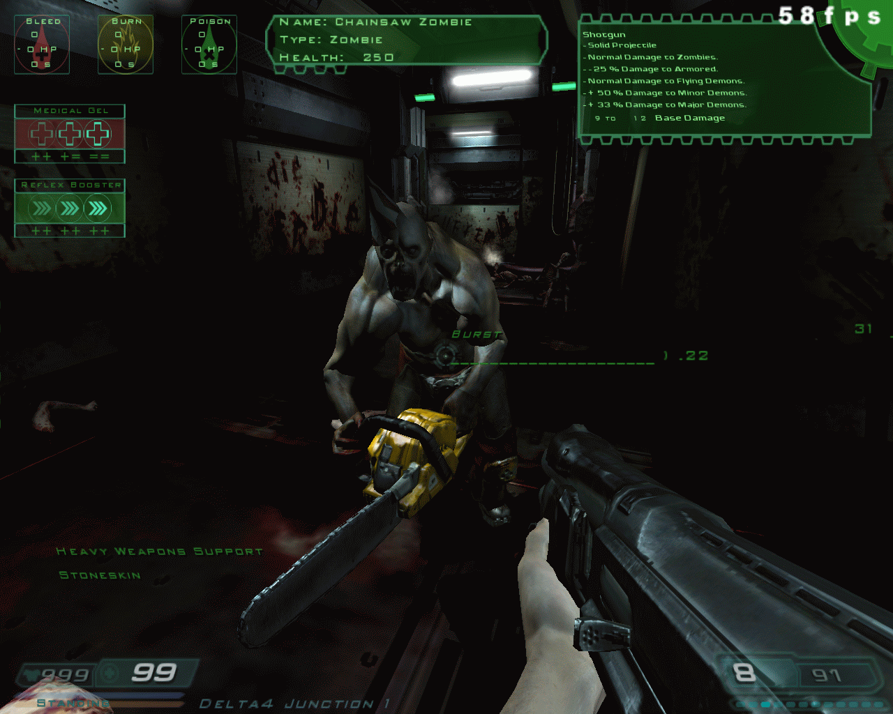
HUD Demonstration
(view original)

Post a comment
Description
Final HUD design.
I think there are too many things on the screen...
Fair enough, suggestions?
The hud for some reason reminds me alot of System Shock 2, it is cluttered though, here are my tips.
1.The bleed, burn and poison indicators should be with the weapon details on the right side. Unless I'm misreading that and its not the extra damage you do and its the effects on you, in which case, it should be slightly to the right of the health bar, that then goes down the path that health relating to you should be on the left, also if you can make it transparent when none of them are in effect, that would be good to.
2. The reflex booster almost certainly should go on the right, possibly above the ammo counter. Since its a combat focus, it should go with the weapon details on the right hand side. (I'm guessing its to either speed you up or slow time down)
3. Ditch the stock elements of the hud, it just conflicts majority with the new hud.
4. Med gel above your health. Stalker did this alright by having med kits showing below your health. All the way where it currently is, is messy.
5. Ditch the crosshair range finder and fire mode, If you want to keep firing modes, I suggest putting it just above the ammo counter, or to the left.
6. The monster info, nice idea, correct placing (I would have had it a couple of centimeters to the right though) but showing the exact amount of health of a monster isn't something I liked. A rough (and proberby easier to code) system would say Healthy for 100%-70% wounded for 70-40% Critical for 40% downwards, but thats your call.
Those are all very well thought out and logical. Thank you for that comment. You've meade me think hard and I've actually decided to go with most of your suggestions.
1. Those are negative buffs you get from certain enemies. Will be moved closer to the the health indicator, and made smaller.
2. All i can say is - yo make a fair point, I will move it close to the ammo.
3. You probably don't know how much work there is in making a completely new HUD... well, a lot :). You are right though- I will experiment with colour changes to ake them fit better.
4. Med Gel is not exactly a med pack. It mostly just heals the burn/bleed/venom buffs. I have a good idea about where to put it and how it will look. And yea it will be close to the health info.
5. The crosshair "range finder" is actually your current spread and it changes as you walk, run etc. The fire modes are relevant combat info that you need at any point. I realise it might look a bit cluttered in the centre of the screen, but it works (and looks) well ingame, so no changes there.
6. How the f**k didn't i come up with that... The health-stages system is briliant ( used in classic fallouts as well- and those are some of my favourite games ). Thank you for that idea- it will be implemented.
Downside is- there will be a long delay before I release the mod.
1,2,4 and 6 on the above list are done . Working on the HUD colour scheme and a few other interface problems atm.