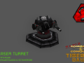
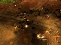
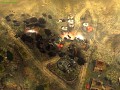
Remember the original Command & Conquer? Remember all the units, characters and themes from that game? Well, that classic from the early 90's that spawned over a dozen titles and revolutionized the RTS gaming world has been reincarnated in the C&C Generals Zero Hour SAGE 3D game engine and looks better than ever with 40 campaign missions with the original briefing videos! But once that is finished, you can dish it out in a skirmish or multiplayer game to your hearts content with the all new skirmish AI developed exclusively for this Mod!


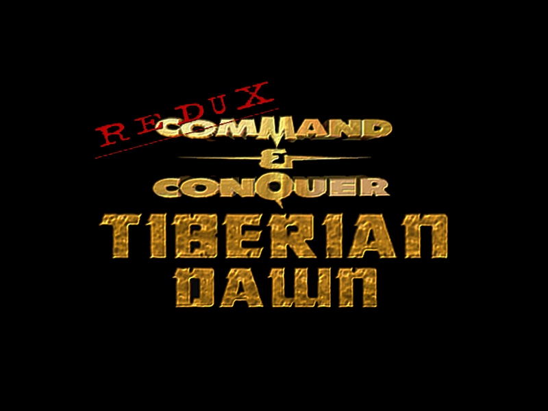
This first logo concept was posted on the forums and on my profile for initial review a few months ago. I have edited and posted it here for everyone's additional insight. The idea was to use the unique 3D C&C Logo along with a Tiberian Sun styled text. I used this design as I had imagined that if Westwood Studios had revised the first C&C Logo with the given "Tiberian Dawn" subtitle to help identify it as the predecessor to C&C Tiberian Sun, I believe this is how it would have probably looked, minus the REDUX stamp effect on the logo that identifies this Mod in particular. An alternate concept was also featured in the TDR v1.31 Tutorial Video: Moddb.com
Note that this opinion is supported by the Red Alert 1 & Red Alert 2 logos and how they are designed in the same style and format.
I like it.
better than the old one!
it looks good
Somehow i'm liking the old one better. I don't like the redux on top of the words...
Sorry, I meant to hit plus and my hand slipped. So please read as a +2
This one looks just perfect :) I love it. Great job once again!!
I was searching this logo for the video I put on ModDB couple of days ago. Great logo, I keep lovin' the original Command & Conquer text
Change the TB part to green perhaps?
cool but I think its better to put redux in a corner of the text because a cross over of the titel doesnt look that great
Sexy. :V
But yeah, move the "REDUX" to the corner again.
Yeah, the BigChesse256 is right. the REDUX on the main text is not so good where it is.
Thank you for your feedback everyone! The logo is fixed and updated!
This logo looks much better IMO then the last one!