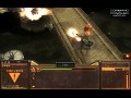
Bringing a truly unrivalled gaming experience to Zero Hour; Our team has added various modifications which updates the models, new sounds, and balance has been fine-tuned Untitled over shadows Zero Hour perfectly!


Ingame screenshots
(view original)

Post a comment
Description
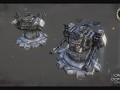
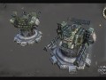
Just a few teaser images. More will follow soon!
Love the HUD !
In general they all look pretty bad the GLA one is half decent, HOWEVER i see a lot of potential,the color choice is ok and i like the hologram style UI idea but
1. make it in double or triple of the resolution if you actually want it to look good Generals will re-scale it
2. add some shape to it, use less complete square shapes
3. Use hard mix ,vivid light or color dodge for bevel
1. It is the same resolution as the default bar. Not going to increase it for performance reasons and coding and all that stuff.
2. What? What are "complete square shapes"
3. Hm...I keep that in mind but I dont think that THIS will really change much.
What else do you have in mind or what would you improve if this looks so bad? I'm always open for improvements if someone thinks he can do better.
Maybe try remaking the original UI but in a modern 2012 style, keep the glowy UI idea its good
2. Add more shape to it, like the orignal UI, kinda like this https://media.moddb.com/images/members/1/276/275104/genui2.png
3. It adds more a shiny metal like glow and overall it's good effect for anything.
Ah okay...well the shape thing - I removed most of the shapes in the original just to make it look more like a digital panel. Rectangle shapes are modern. Minimalism. You can see it everywhere. I just tried a modern diffrent look and not so much fancy here and there. If you see it the other way around then it's just two diffrent philosophies.
dat overlord :3
天啊!帅了啦!“On my god!That's so cool!”
Cant wait to have a try
Change the orange glow to red and I'll fav. it.
“还行” is a very, very colloquial way of saying, it will look weird when used in ui
“核稳定” is a biological term in Chinese
In ui, you can use the “原子状态:正常” or the “原子状态:稳定”
what is “我艹米”