Really glad to see you all still chugging along and producing quality content.
Comment History (0 - 30 of 382)

Bornstellaris - - 382 comments @ Sins of the Prophets
Good karma+6 votes
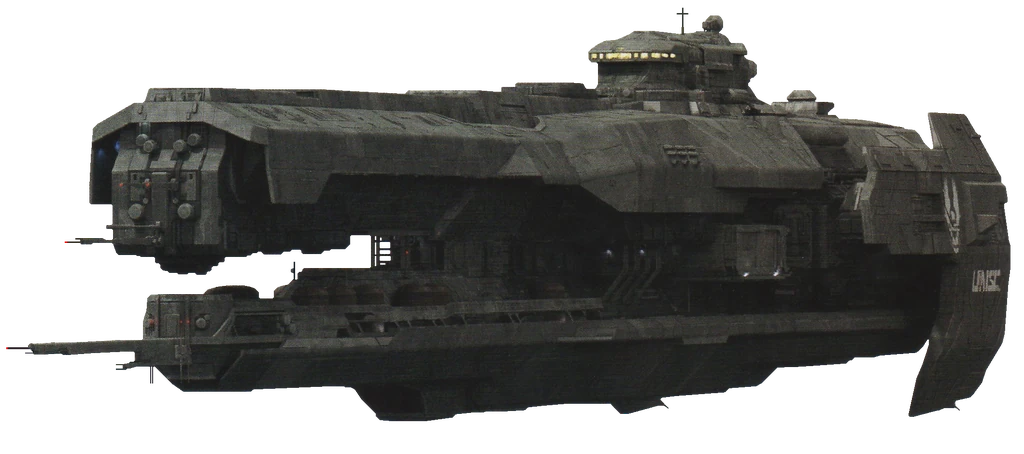
Bornstellaris - - 382 comments @ Strident-class Heavy Frigate
Good karma+1 vote
I feel like this model could use a little work to improve it. It's just little things that subtract from it. For instance, the bridge shape here isn't as tall as the actual model, and steps forward rather than the original slanting back then having a ledge hangover. The antennae should split further into little pieces rather than just ending flat. The front of the ship could use some bevelling so that it isn't a plain flat face. A few things could also be optimised a little better, like the small dome objects towards the front of the ship and the turrets on each side of the ship. It is a nice model, but there are a bunch of other things that could be improved on to make it that little better.
For reference, here is the image I used Vignette2.wikia.nocookie.net
Bornstellaris - - 382 comments @ Cerberus UI Remake Final
Good karma+7 votes
Why the change? This layout feels far too busy and cramped compared to the other one. The bottom just feels too squished and condensed to be useful, rather than the simple and effective look you had before.
Bornstellaris - - 382 comments @ Sins of the Prophets
Good karma+3 votes
Yes Unikraken, you do needs work.
Bornstellaris - - 382 comments @ Quick Update
Good karma+9 votes
It has been incredibly satisfying to see this mod from its humble beginnings, to the powerhouse of a community it is now. I think I can speak for the entire Sins of the Prophets team in saying a job well done, and we look forward to seeing your next successful release!
Bornstellaris - - 382 comments @ Star Trek: Armada 3
Good karma+1 vote
I'm really digging the new page layout, keep up the good work guys!
Bornstellaris - - 382 comments @ Covenant at War
Good karma+3 votes
If you haven't heard, we've moved in with the Sins of the Prophets modding team! A fellow Halo mod for the wonderful game, Sins of a Solar Empire! Come and join the fabulous community they have and meet a few familiar Covenant at War faces such as myself and DGaius!
Bornstellaris - - 382 comments @ Covenant at War
Good karma+2 votes
Thanks for the feedback! We'll definitely take onboard some of the balance feedback. As for the visual issues, we're still working on them. Some should be fixed with the next release.
Bornstellaris - - 382 comments @ Covenant at War
Good karma+3 votes
Come on man, we're a five man team. A lot has been happening behind the scenes, including a forum change to here ( Sinsoftheprophets.com ). Updates will be coming soon, we're not dead.
Bornstellaris - - 382 comments @ New Covenant Victory
Good karma+28 votes
Doesn't really symbol victory, looks more like a workers union meeting.
Bornstellaris - - 382 comments @ Star Citizen: United Nations Space Command
Good karma+2 votes
Hell yeah!
Bornstellaris - - 382 comments @ Help Wanted
Good karma+3 votes
Long time no see man, how've you been?
Also, I personally vouch for his modelling skills.
Bornstellaris - - 382 comments @ UNSC Sabre Hanger Redux
Good karma+4 votes
I'm well aware of what it looked like, I'm part of the Covenant at War and Sins of the Prophets team. I'm giving feedback to the artist so that they can learn and improve future works. Seriously, go kiss *** somewhere else.
Bornstellaris - - 382 comments @ UNSC Sabre Hanger Redux
Good karma+1 vote
Not the shape I would've gone but it'll do I guess. Some more details would be nice, looking very plain at the moment.
Bornstellaris - - 382 comments @ SGI:Rebellion Wear
Good karma+1 vote
I've heard they're just as strict.
Bornstellaris - - 382 comments @ Airpad - Complete
Good karma+3 votes
Pretty much this. It's not like we don't want to work with the_Farseer, it's just that our visions for the mod don't line up. We have great respect for the work Farseer does!
Bornstellaris - - 382 comments @ Covenant at War
Good karma+5 votes
See, we like to release big updates unlike drip-feeding you guys. Patience is virtue well reserved for the fields of Moddb.
Bornstellaris - - 382 comments @ Cube Comparison Shots
Good karma+3 votes
Intersecting geometry is a bitch.
Bornstellaris - - 382 comments @ Dawn of the Reapers
Good karma+2 votes
How'd you even get in there?
Bornstellaris - - 382 comments @ Dawn of the Reapers
Good karma+2 votes
That's really cool, maybe try zooming it out a little more next time!
Bornstellaris - - 382 comments @ Dawn of the Reapers: Onslaught (Pre-Alpha Release
Good karma+21 votes
Congratulations from the Sins of a Prophets and Covenant at War teams on your first release!
Profile
Bornstellaris
This Member joined
Sins of the Prophets and Covenant at War Dev Team