One of the most important things for the first glimpse at a product is its logo. For Dungeon Deities we went with a very simple logo in the past as you might have noticed. In fact it was the first placeholder for a logo ever created and not updated since then. With a new version of the game we, of course, want to update this important piece of graphics, we just cannot decide in what way.
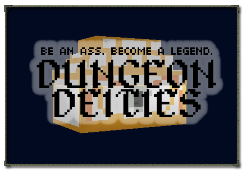
While the most important focus of the single dungeon journey of course is the good old gold chest the first logo draft might only be understandable once you played the game and know that every dungeon ends with a golden chest.
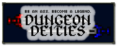
Our second approach is a more classical one to the dungeon crawling/rpg genre. Take some cool looking items, turn them by a few degrees and let the two blades cross, because it looks cool!
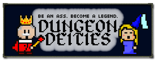
So as a third option why not focus on aspects that makes the game unique not in game mechanics but in setting and story. Who else but the two monarchs Queen Blue and King Red could complete this task. With their never-ending love-hate they are the perfect match to show the feud taking place in Violet Land.
Since we have seen the logos very often and did not decide which one to use yet, we'd like to give you the chance to assist us in this decision. Which logo do you like most? Are there some issues you think could be done better? Or do you have a completely different idea? Let us know in the comments below!
As always, any feedback or comments you have are much appreciated! We look forward to them!
 Want us to notify you once we start the next public testing session?
Subscribe to our one-time-newsletter at www.dungeondeities.com - or watch us on IndieDB or Twitter for the news!
I think I prefer the 3rd, possibly because I don't like the transparency of the cloud on the other two.
We could also reduce it in the swords version. In the chest version it would not make much sense. Do you also like the monarchs more than the other two?
Yeah, I think I do.
I think I prefer number 2, as I don't feel the chest or the monarchs fit as a logo very well personally. However I think the size of the cloud is quite off putting, have you considered making it a smaller white border around the text rather than such a large cloud?
The one with the characters for sure (the 3rd). Good luck with your game.
number 3
I'm liking number 2 the most, followed closely by number 3. But I think the glow/cloud effect on number 1 is best.
Have you considered having an actual *** with a legendary glow about it?