We're not dead!
Yes I know it's clichéd, but we have a good reason for our disappearance from IndieDB for the past little while.
Mostly it's been due to how busy I've been at college, and while I do apologise, it is important for fans to remember that as a student project, and much as I hate it, there probably will be times at which you guys are left slightly in the dark about what's going on.
For that reason, follow us on twitter and tumblr!
Because I want to avoid these periods of radio silence as much as possible, I've started using the Cube Noir blog and twitter feed much more, so if you want to get all the very latest news about releases and new features, follow @CubeNoir and read our blog at Cube-noir.tumblr.com, particularly the latter if you want to read the change-lists for each build of INCURSION.
And if you are feeling very interested in the games development indeed, and are willing to sift through the rest of the nonsense I tweet to get your information fix, you can also follow me @gazornonplat since I often tweet in more detail about upcoming/possible features and coding stuff.
Next, our new logo!
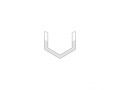
Yes, you might have already noticed, but after a period of gross indecisiveness our logo has been given something of a revamp, and one that I feel is professional and original enough for us to keep for quite some time. If you're interested, here are the various iterations and concepts it went through during the design process;


Until finally...
I arrived at this;

Now, I don't know about you guys, but I'm immensely pleased with this logo. Based on the classic fedora/trilby hats worn in classic "Noir" films, it's as clean and crisp a design as I think I've ever done, and it looks even better on a textured background; Cube-noir.com
Finally, we're hiring an artist!
Just visit this page for details, and drop us a line if you think you're up to the task.

I like the first logo the best it's clean & simple :D.
I agree, but it was actually very difficult to work with, since I had taken the cube from a screengrab of a model in google sketchup, and as a result things like anti-aliasing and shadows were working out very badly. Just open that image in a new tab or save it, and view 1:1 scale and you'll see what I mean.
i like #4 best
The second one looks really retro and simple enough. I like that one
Perhaps. If I'm being honest it was actually a really tough choice to pick one.