I decided to take a break from Area 51 mapping, and make something that could be implemented later in the game - and that's how this house was created.
Pretty spooky, eh?

Click the thumbnails for full-size images.
Yet more random media releases from me, this time depicting a deserted house which will be seen later in the game.
Posted by Aaagreen on
I decided to take a break from Area 51 mapping, and make something that could be implemented later in the game - and that's how this house was created.
Pretty spooky, eh?
Click the thumbnails for full-size images.

Those are some excellent screenshots you have their.
Nice texturing!
I agree, nice texturing and some very nice mapping work.
From a mapper to a mapper, I think it's pretty neat.
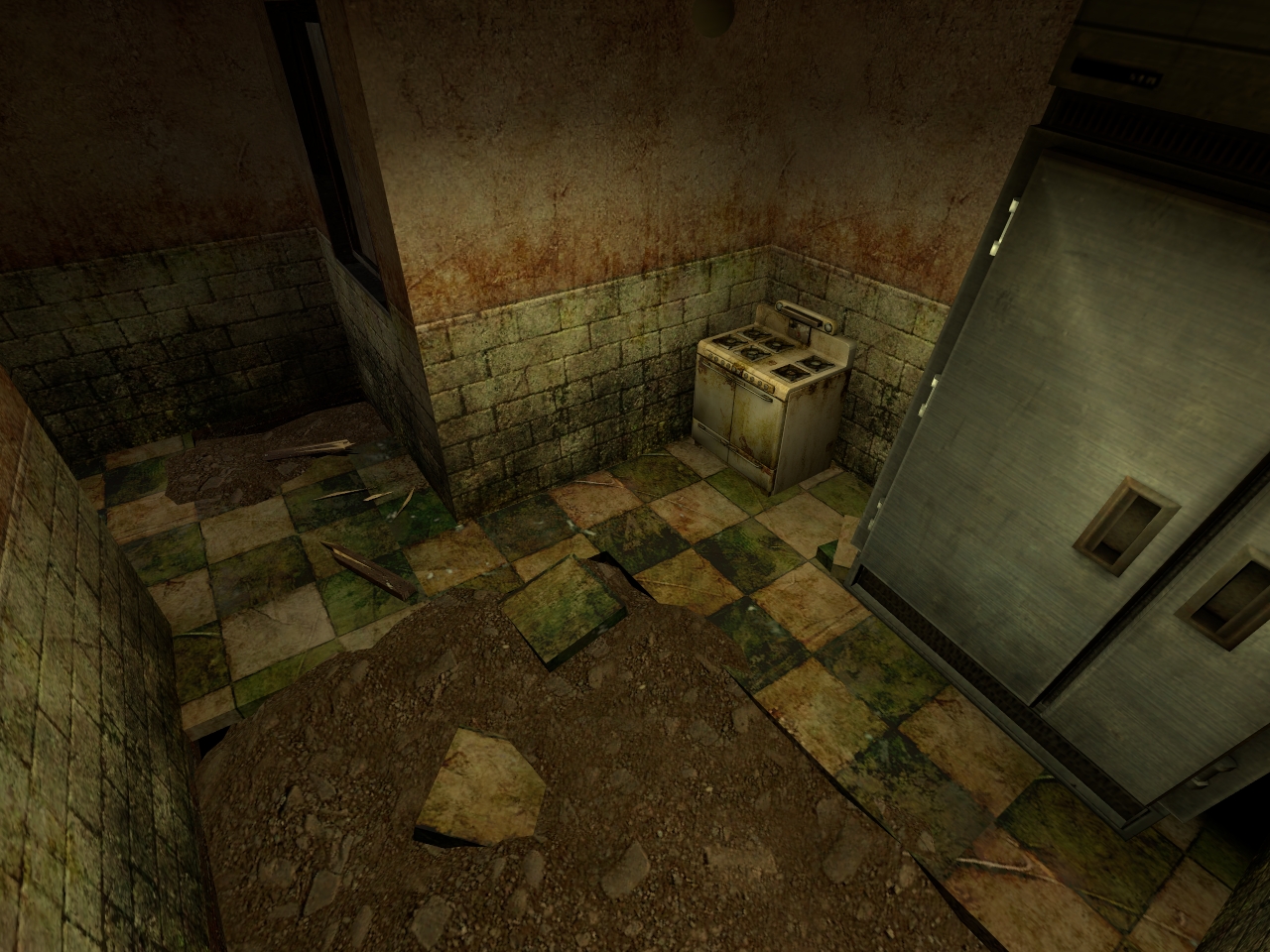
The textures are nice. My only complaint texture wise is the wall textures with the tile/plates look a tad low resolution. But that's hardly an issue here. I like the floor debris, the small wooden bits and tiles are neat. HOWEVER, I think the loose tiles are too thick, perhaps reduce them by half in thickness. The common floor tile isn't that thick.
Perhaps also add a tile or two more around the room. One could for example be leaning against a wall.
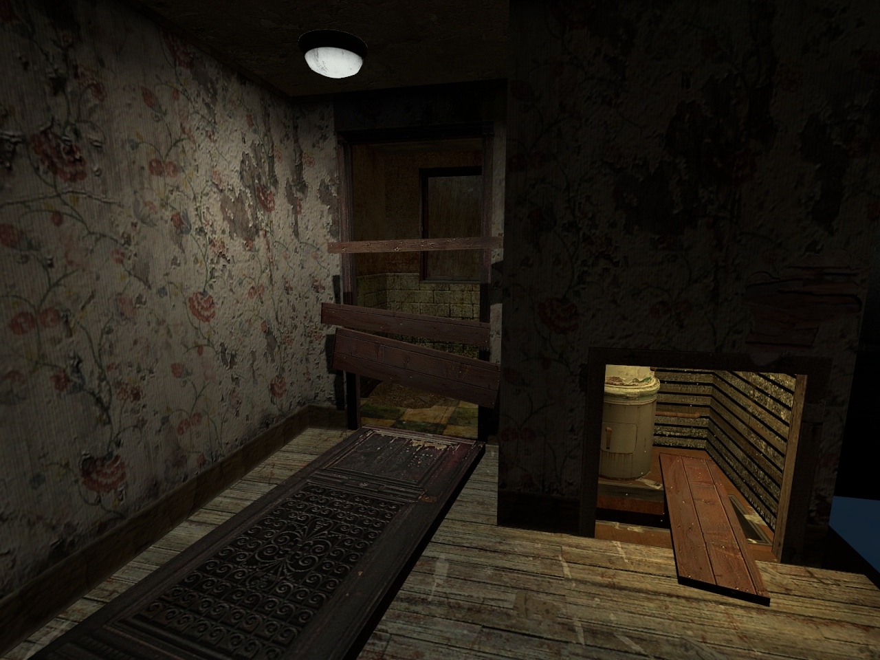
Logic wise I'm curious why that door frame in 0002 has been boarded, somewhat, after the door had come off. My advice, take the boards off perhaps. I say put the boards on the floor to make it look like the door and boards were both smashed off. Maybe leave one board dangling by one end on the wall.
I notice in screenshot 0004 on the middle left where the floor ends and the dirt starts there's a corner going into the black void, might wanna cover that up. That and the tile texture doesn't align all too well into the wall, leaving some tiles thinner and the corner tile into a strange L shape. I know there are buildings where tiles are aligned like that, but in a game I think it'd "look" better to align the texture.
The lighting I'm sure will improve so I wont judge there.
If you're already aware of or planning the above then my apologies, I'm just saying my thoughts and don't mean any harm.
Keep it up.
Some good criticism here, I'll let you know what's happening now.
The door frame in 0002 has been boarded merely to give the player something to do while running through this house - something which was added in Ravenholm a lot.
The "void" in screenshot 0004 is nothing more than the toolsblack texture, don't worry, there are no leaks here.
The wall textures are of a low quality because they were designed for a basic beginners engine, not a proper engine where the majority of the time, the same content is used over and over again. Until I get me a texture artist, it'll have to stay that way.
Nice style, keep up good work.
i'm glad to see some progress. these rooms are off to a good start.
please scoot the beginning of the wall tile down a bit, so that it is flush with the bottom edge of the window.
reconsider your props perhaps. the old style stove looks very small next to the giant metal freezer. The freezer looks too clean and out of place compared to the dirty stove. Perhaps trade out the freezer for a collection of gas pipes and a water heater. That will maintain the "stuff in the corner" look the freezer is creating while also maintaining the "run-down and residential" look the stove is creating.
i can't shake the feeling that this is all you've been working on since your last update. Is there anything else going on back there?
Yeah, yeah, I know, the fridge needs a retexture. It's the most worn fridge model that HL2 offers.
Cool, similiar of my college !
So awesome...
like the screenshots, floor tiles seem abit too thick realy, and the kitchen area just too empty... should add more props like shelves, counters, cupboards, appliances maybe, whatever... but otherwise i think its looking good
Good looking pics, tell little bit more about progress on next update.
that kitchen is beastly