Most NES RPG’s didn’t try too hard to hide the tile based nature of their graphics. In some of them, like Dragon Quest, it was quite obvious and it didn’t look that good, however, for Me and myself, like the sun and the moon I’m trying to add more variety to each tile set so things look more organic.

In Dragon Quest they didn’t even bother to use shadows (which give depth and volume to objects). You don’t need a grid to clearly distinguish each individual tile. Final Fantasy isn’t that much better.
If you look at the grass in both examples they only use 1 very simple tile for it. Me and myself…, in the other hand, will use 5 different textures for grass, each (but one) has 5 different tiles (top-left, top-right, center, bottom-left, bottom-right). That’s 21 different tiles just for grass!
Because of this, making the maps is taking a LOT of time, but hopefully, it will look very good in the end. In fact, I have to be cautious of not going overboard with the tile variety, as too much would probably not be possible on the NES and I want to somewhat stick to its limits. Still, I can’t deny I’m having a lot of fun building these maps, and I’m not far from being done. ![]()
My goal is to make this look better than any other tile based RPG on the NES!
Thanks for reading, as promised, here are some new screenshots, enjoy!:


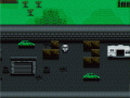

The grass looks a bit too 'busy', especially in the 2nd image. It makes the screen look cluttered and difficult to read and focus on. While the examples you showed are much more simple, they are also more readable. I'd suggest toning down the detail a bit, at least just for the ground so your character stands out against it.
Agreed, a weee bit too much detail in the grass. haha
Thanks for the feeback, guys! Heh, the 2nd image looks a bit weird because that zone is still unfinished (reason why it looks so sqaurish) but also that's the Forest Maze I talked about on the previous post. So those are the top of the trees not grass, and when you get under those you enter a room and the rest of the screen is darkened. Kind of hard to explain, but you will see it in motion soon. Thanks, I'll try to tone down the contrast on the grass to see how it looks that way! :D
I thought I made a comment here, but I guess I'm crazy. I was going to say I thought it looked pretty decent, when your dealing with an NES you have a very limited amount of colors to work with, had most games went with what you did they would of looked a lot better. Theres not much you can do to not make it look busy, the NES had to reuse a little alot, but good examples would be zelda for nes, how many times do you run into that dam little tree? I could probably count the amount of tiles in that game on both my hands. Anyhow it looks pretty good, I love old school graphics.
Thanks, man! But yeah, I agree, 16 colors on screen, 16x16 pixel tiles, it's tough! Sometimes I would like to not make it look like an NES game anymore because it's limiting, but I'm gonna do my best with what I have, there will be time later for games with less limitations :D
I really like this graphical art style. The other people say it's too "busy" but I can't say the same. Keep up the great work.
Thank you! Let's see if I can improve the looks a bit in the final revision! :D