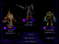
Okay, as I said before, I've been overhauling the menu graphics. For example, here's what I did with the 'expansion selection' screen:
Yes, yes, I know, the beta wouldn't have had that screen. However, seeing as I can't remove the screen in any way, I decided to use it.
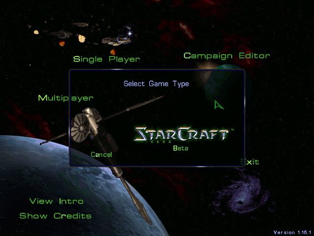
Let's load it up in game...
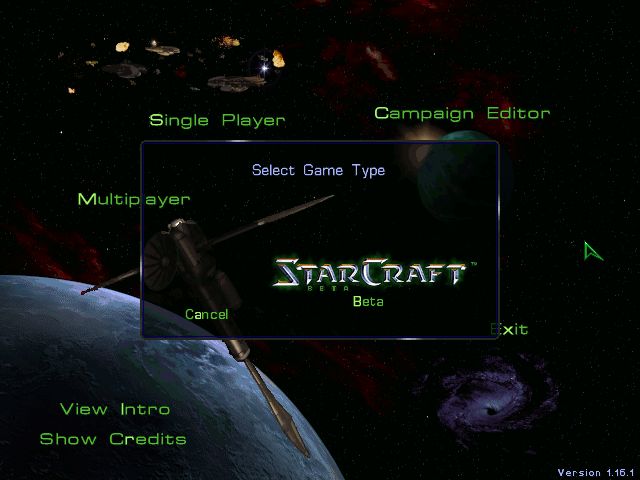
Oh, something's wrong here, somehow I managed to use the wrong colours for parts of it. Never mind, I'll just scribble around with black for a bit and we'll see...
...Clearly I screwed up. Alright, I'll use the colour picker from an area that is working, and...

Success!
Alright, onto other things. This is what I've got for the login screen:
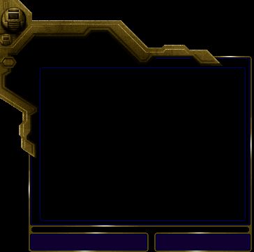
Looks great! Alright, let's load it up in game and see-
OH
MY
GOD

Alright, I honestly have no idea what I did to achieve that. I probably messed up with palettes or something. I'll have to look into this.
Either way, I'll be getting back to the actual beta stuff soon, don't worry. Expect a screenshot batch within the next couple of weeks.

nice menu progress dude
Thanks. I've still got a long way to go, but I'm working at it.
nice color
Thank you, yeah, looking at the Campaign selection screen, it appears to me that it had a more 'Protoss' feel to them, so I decided to do the same to the rest of the menus.