For those unfamiliar with the game, a quick recap:
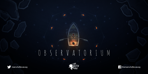
Observatorium is a single-player 2D puzzle adventure/exploration game that aims to fuse space and nature into a coherent experience. The core gameplay involves piloting a row boat whilst creating and destroying constellations using a special telescope. Stars appear as reflections on the ocean surface and numerous sea creatures populate the depths below the ship. The goal of each level is to master the behaviour of the stars and creatures provided.
The idea for the game and early demos came long before the art style was even considered so the gameplay had a big impact on the visual direction for the game. In this post I discuss some major decisions regarding the art style and highlight plans for evolution.
Camera
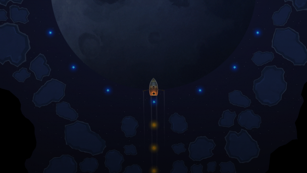
One of the most important decisions for the game was how to place the camera. We toyed around with the idea of making the game in 3D or in 2D with a non-orthographic camera. Since the game is about the synergy between the fish below your boat and the stars above your head, it made sense to force the camera to a top-down orthographic viewpoint; otherwise, it would be difficult to see how fish and stars could possibly be connected.
This sort of view perhaps feels a bit less 'personal' than some of the awesome isometric 2D games out there - such as Bastion - but we do get some nice side effects using this cam:
- We can play about with reflected objects on the water and tie them to the gameplay and story
- The sense of scale and isolation is increased - emphasizing the fact you are alone at sea
- You almost feel like you are looking down on the boat from outer space
So for now we are pushing ahead with a fully top-down view with the aim of zooming the camera in/out where required.
Lighting
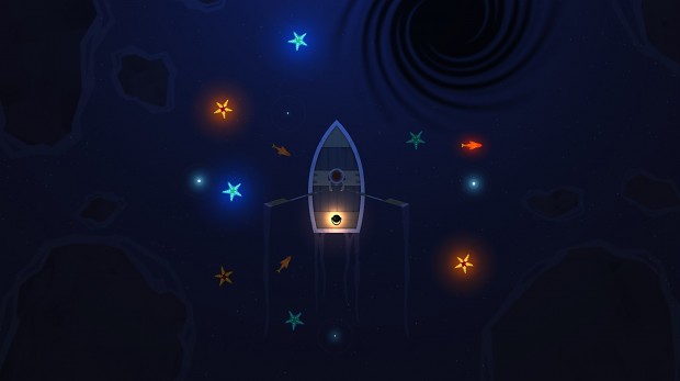
Another important decision was when to set the game. Again gameplay played a big part here. As the game is set on earth and we need to see the star reflections for the gameplay, we chose to set the game at night-time and to use moonlight to provide the overall ambience. This lets us play around a lot with the phosphorescence of the game world objects. We're using a combination of point lights, directional lights, unlit objects and glowing sprites the achieve look of the game. An example from our early light test scene:
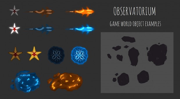
The stars and sealife each have multiple state: they can be dark (inactive), bright (active) or somewhere in between. Below is an example of how we carry the light and dark themes into the 2D assets themselves:
Moving forward - we plan to vary the setting a little. The game will begin at sunset and end at sunrise and we will use cavernous sections to reduce the visibility of the stars at certain points. We do plan on breaking away from these core rules during special or secret sections however.
Tone
Observatorium is a game about a small boy with big dreams on an epic journey across the ocean. As such, we're aiming to keep the tone light-hearted yet wondrous. We want to allude to the care-freeness of childhood and vastness of sea/space whilst (hopefully) preventing the game from becoming too saccharine. The fiction of Ray Bradbury would be a good reference: in fact I am a big fan and his work and many of his stories have helped influence the feel of the game. Here's an example of how we changed our marketing shot to better capture the intended tone of the game.
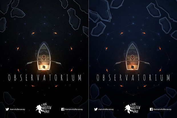
The left image ticks the space box but the overall feeling is a little too cold, gritty and washed out. The image on the right is the result of a colour pass. The feeling of space is still there but the moonlight and lantern combine to provide a warm/cosy feeling overall. The lantern also ties in nicely with the colour of the fish and the tone of the boy's hair.
Space and Nature
I've tossed around the phrase ‘space meets nature' a lot over the last few weeks so let me explain how this applies in Observatorium. The gameplay, as mentioned above, is about connecting the stars to the sealife. This idea bleeds into most aspects of the visuals. Take a look at the boat itself:
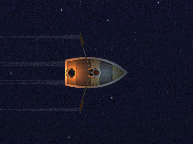
Notice anything special about the shape? It's no coincidence that it looks like a rocket. The boy himself carries the theme forward - he's almost dressed like he's ready for a space mission. His ‘helmet' is placed roughly where the window might appear on such a spaceship. Expect lots more visual references like this.
Summary
That's it for our first look into the basic art direction of the game. This post is by no means the final look we are aiming for but nods to our major goals and inspirations.
All artwork in this post is provided by the very talented Jonathan McEnroe (aka Apollo 2D) and you should check out his Indie DB profile here for more incredible art. We will be working together over the next few months to evolve the graphics even further and add more depth to the game world.
Please post any comments or suggestions below.
Thanks for reading!
Clive Lawrence
The Man Who Flew Away

Very clever, thanks for a cool read!
Thanks :)
Really enjoyed your analysis on color tone and the interconnection of space and nature in the shape of the boat. Great to see a developer really putting effective thought into these ideas!
Thank you! Lots more secrets still to come - including story :)