The horns sound, the ravens gather. An empire is torn by civil war. Beyond its borders, new kingdoms rise. Gird on your sword, don your armour, summon your followers and ride forth to win glory on the battlefields of Calradia. Establish your hegemony and create a new world out of the ashes of the old.
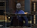
Barter
(view original)

Post a comment
Description
Mount & Blade II: Bannerlord Developer Blog 10 - Materialistic Approaches
Ok
That looks like is going to be an annoyance.
(buried)
I know its a WIP, but that looks terrible.
The menus shouldn't be transparent in any percent, now it's really awful.
In case feedbacks could help :
Not convinced by these big vertical list of items. It won't be practical to navigate and there is a lot of blank spaces.
Also, trading Fiefs in barter like this seems a bit... too informal. But maybe it's how it was done in the past.
(buried)
A search ******* button, please.
(buried)
My dog could design better menus than this!
Herp derp. Yes I wonder what WIP means...
(buried)
Work In Progress
I don't think its that bad but it needs a little more info, keep up the good work though!
They made the menus like this because they plan on putting priority on consoles. And I hate it.
I actually kinda like it, although it could do with a bit less transparency.
Did someone stole Gothic barter HUD? Jokes aside, you shouldn't have menus like that on PC.
I agree. On console... fine but not on PC.
Some constructive criticism/suggestions about how to improve this.
1. Get rid of the Transparency, it's unnecessary and should only be optional.
2. If you are going for a vertical list then make the pictures and names of the items bigger.
3. Add a description for the items.
4. If fiefs are now a bartering point then I suggest giving details about the fiefs like population, tax, resources the fief produces, and military strength.
5. Diplomacy should be it's own menu.
6. Separate the items into categories like weapons, horses, armor, food, and trade items. Something that's simple and clear to navigate.
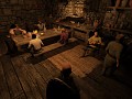
7. Give the person you are bartering with emotions and a personality. Anything as long as they aren't just blankly standing there.
8. Give the items a clear indicated value.
9. A personal suggestion, but make it more stylized. Give it an appeal so that it won't be a boring, plain, typical menu. A little style can go a long way.
I hope my comment has been either helpful or informative.
It looks like a CIV trade menu...
Aside that, a search button.
Thank you, I knew I forgot to mention something. Yeah, a search button. No one likes having to scroll through the entire page only to find out the item they want isn't there.
Damn it... well I love warband HUD. Why would you try making it annoying? Ok... ok. I will deal with it somehow.
Is this game coming out on consoles?
Eventually.
Explains the menu i guess, still its very early to tell.
You really think it's smart to aim for a multiplatform-release? Because I think not. I think it's a terrible idea. You won't make more money, you'd make less.
The graphics, which don't seem to have evolved in any way: okay. But consolish menues (if it just doesn't end there)? You're just gonna disappoint your fans.
I'm sorry talking to you like this. But...just take care of the performance optimization, develop intuitive menues, deliver modding tools and you're gonna sleep on a bed of gold. PS4 and XOne? Might get their versions later, but don't make the same mistake, so many others already stranded with.
The HUD is a good idea & looks great... for console ;) Not for PC! And please take care of optimization & modding tools for PC!! Mods is a big part of Mount & Blade, so try concentrate about that. And please try put less hours in the console development - They should not be the target audience here!...
You guys a doing a great work by the way! No doubt there - Keep up the good work :)
Not that happy about it. But since it's a WIP i guess there will be some improvement.
Oh, and if you decide to keep the vertical...Search Button.
As many have said, the menu is not great. Having the menu tailored to be accessible to consuls may be a bad direction to focus at this time. Make a great system for PC users and find a way to make it essayer for the xbon and PS4 later.
My suggestion to improve what is there. Instead of all your possessions listed in a long vertical list. Have them sorted by item type and listed by alphabetical order. This list as shown is not alphabetical and sense all you own is there it is impractical to find something specific. If the list is also ordered by item type like Food, Weapons, Clothing, Tools, and Titles. You simple need to have a menu selector at the top to cycle though those and you can even have a all items as well. It will also make finding what the seller has to offer. That will cut down the space needed for the menu by half. And a search option will go far as well.
The layout dose indeed look like civ and I am fine with that as it works but the boxes could use some polish. Maybe some graphical tricks to make it look like parchment paper and instead of the generic box with my offer / my request. Have a scale system. I assume that you already have a weight value system for bartering in place for the Ai do decide if the offer is fair. Why not let the player see a representation of that? Have a scale that tips to one side or the other and then the player will focus on balancing the offer and know why or why not the Ai is thinking about the deal. Having a open system just makes the experience that more enjoyable.
There are more things I would change about this but what I have listed is a good start. Keep up the great work and please keep showing even the works in progress. Sure sometimes you get a negative reaction like here. But to improve you have to take that risk.
Thanks
For the love of Deity you believe in, please give us window to ENTER EXACT AMOUNT MANUALLY!
Yep the UI looks awful here but it's a work in progress and will no doubt be amended.
I hope when you will be in the village, you will be able to punch villager and others will grab weapons and attack you. And in town, guards will attack you.