Template revised
(view original)

Post a comment
Description
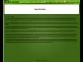
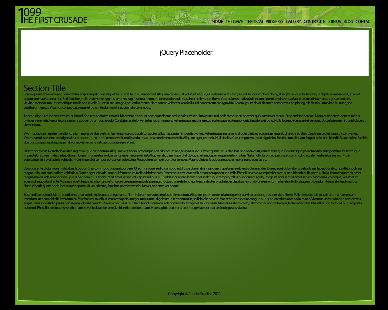
Here is the revised version.
In my opinion it looks clean and professional, but people say otherwise.
Here is the revised version.
In my opinion it looks clean and professional, but people say otherwise.
Note once game launches there will be many things on this site that isn't there now.
better now with the pic at the top but whats up with so much green
I mean Im sure its functional but nothing else.
My general feeling is something like "personal hobby homepage" look.
I agree with Krej.
It is far too square and the colors are far too much in-your-face. Green is also just not the color you want to use .. Look into symbolism, your target audience, etc.
Kinda seems like a pre-made template :/
Yes, yes the colours will change, this isn't a pre-made template.