Description
Small Half Life deathmatch map, recommended for 2-4 people. This is my first upload and my first creation from Valve Hammer Editor.
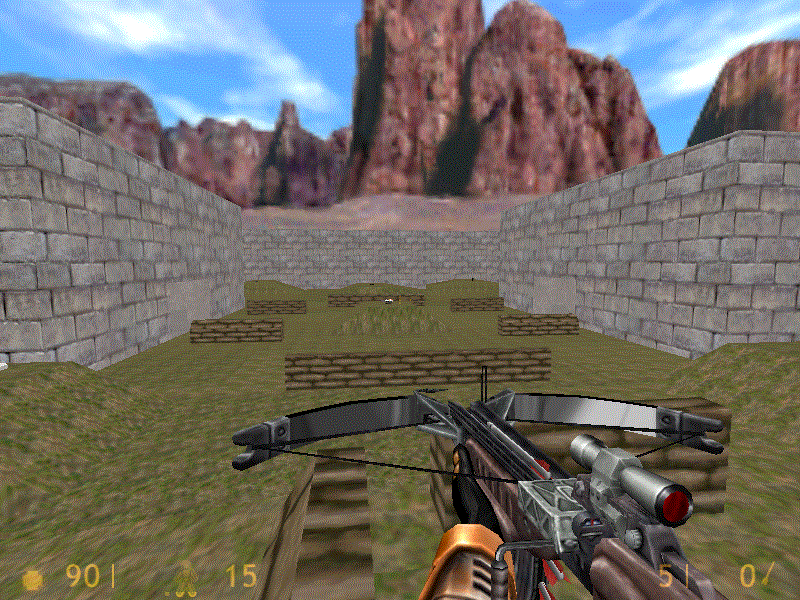
Preview
Post a comment
Related Games
Half-Life
First Person Shooter
Related Engines
GoldSrc
Commercial
Related Groups

Sierra Entertainment
Developer & Publisher

Valve
Developer & Publisher
Tags
This was deleted from my profile?
Anyways, I see this map has received low ratings and I would like to hear constructive criticism.
It' unimaginative and bland. The environment is way too simple even for Goldsource standards.
A: You need lighting. Badly. If you don't have lights, ensure you have no "leaks", and you have at least one light placed.
B: The map is very monotonous. Spice things up; add more variety. Things like decals, custom props, and world-brush objects are really great. You should also try add different textures. Maybe add watchtowers along the wall or some fencing, or different levels to the wall.
C: Frankly, the terrain looks awful. Either do it properly (there are many tutorials for that), or don't do it at all.
I didn't actually play it, I'm judging this from the screenshot. Good luck with your future stuff.
Thank you, I'll try those on my future maps.If you could play it and explore the whole thing to tell me what to do better, I would be grateful. Also, the map is shaped like a capital "I" and there are some bunker-like structures in the corners.