Hello and welcome to our second update.
First of all we're sorry we took longer than we anticipated to update again, we're a group of two, and we were overwhelmed by our work at college, nevertheless we were still working on our game. So let's get started.
These past 3 weeks we've been working on game design, level design and on our UI/UX.
Remember how our old UI looked?
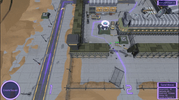
Yeah looks pretty bad, we know, fortunately that was only a placeholder.
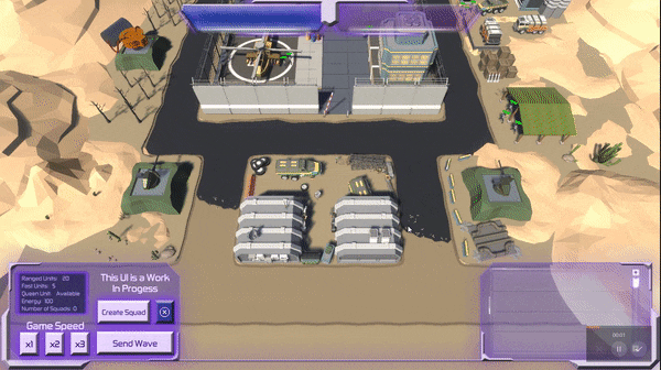
We decided to group all our buttons in one place and and remove any unnecessary amount of clicking, such as extra steps. This is what we came up with.
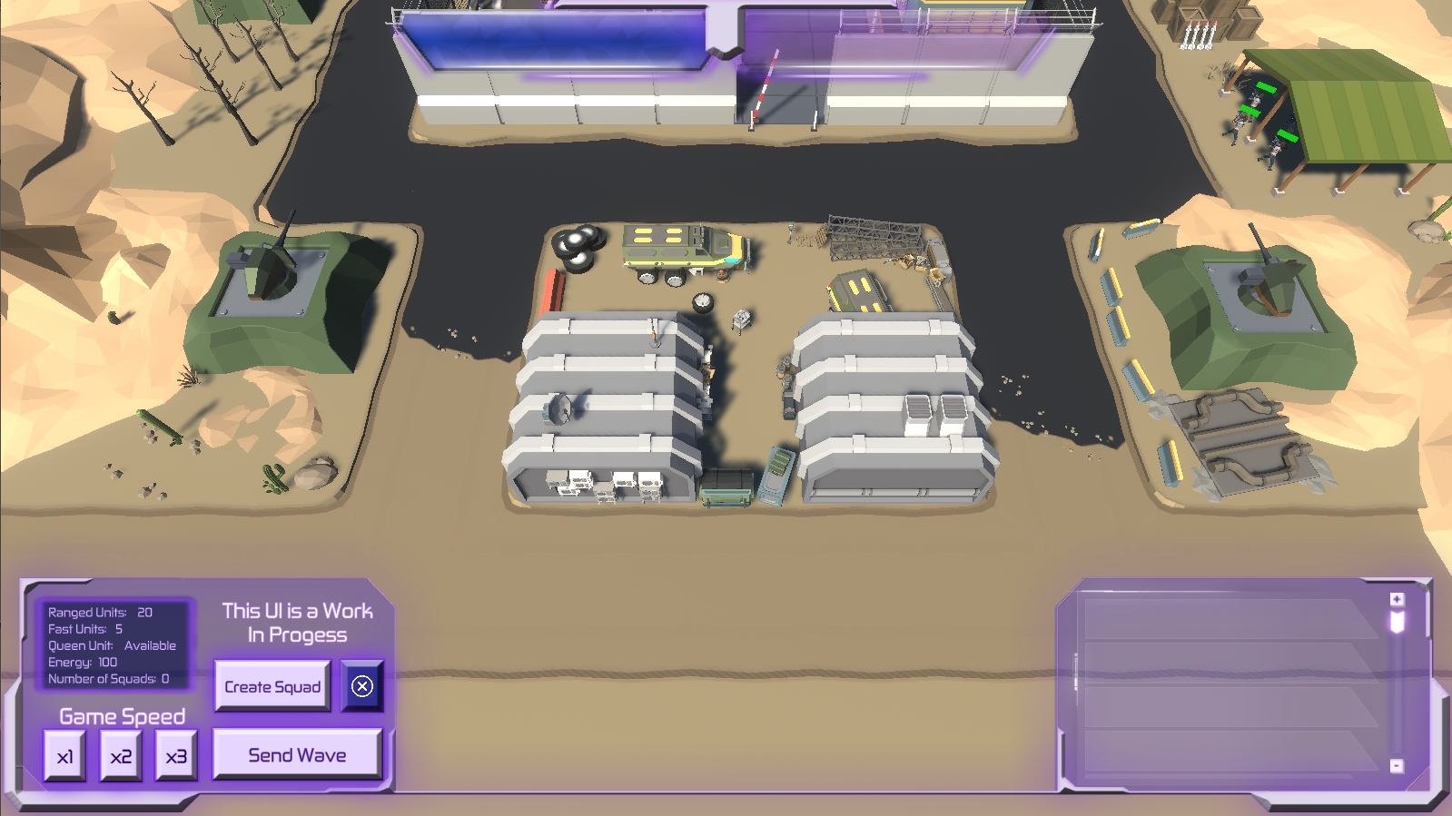
Take into consideration this is still a work in progress, but we think it is a major upgrade to what we had, we're not happy with how those buttons look so they're definitely going to get changed. However we're quite satisfied with how the overall look came about and this is how we're planning on making the visual theme be.
We're aware that the bars on top might be a little too big and they might get scaled down a bit, same thing for the two corner boxes.
Currently the right corner box doesn't work and is just an example but it's function is to eventually display all the currently stored squads to send to the battlefield. But more on that on the next update.
These bars are for two things, the blue one is for the amount of energy the player has to send his units, and the transparent one fills up with a purple color to indicate how close the player is to winning the level. Currently they're both static images but we're planning on adding animations and some particle effects to them.
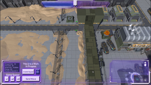
Moving on from the UI, we also worked on our levels a bit. On the first level that we showed before we had to change the layout because we reworked our path system and the level no longer fit with the new one.
So this is what we came up with, however we're not very pleased with it and it might be changed again later on.
This one is our second level that we made, what do you think?
We've made it much smaller compared to the first one, to reduce the amount of camera movement, but the amount of strategy required is still there, so we're quite satisfied with it.
That's all for now, thank you for reading this far.
Follow us in our social media at:
Twitter: Blue Lamp Studios
Instagram: Blue Lamp Studios
And let us know what you're thinking about our updates and game on the comments or through direct messages.
Stay safe and have a happy week.