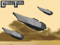
So here's an explanation of the current build picture system.

Img51.imageshack.us

Img163.imageshack.us
You will see that there is a blue border around both icons. Each border color has a meaning:
- Red = cruiser and cruiser related
- Yellow = economy and builders
- Brown = defenses
- Dark blue = mech and mech related
- Green = tank and tank related
- White = plane and plane related
- Light blue = ship and ship related
- Black = submarine and submarine related
The background color is a little more straight forward:
- Green is ground
- Blue is water
- Very light blue is sky
- Green / blue is hover
- Blue/green is amphibious
- Green/brown is all terrain
We also plan to implement (see below) dark boxes in the bottom left corner to allow the user to better see how many units they have queued up. And another box in the top right corner to indicate tech level.
Here's what we'd like some opinions on:


The top is what Oksnoop2 thinks it better. The bevel used in the bottom is just level of detail that he thinks will be lost in such a small icon. Also they are not small buttons with in buttons but all part of one surface.
I'm not content with either one but I'm leaning towards the bottom because I believe the human eye/brain finds gradients more appealing and I just wanted to spice it up.
So that's where we stand on this. We'd like to know which icon system you prefer or find easier to read, and your opinions on the explained system as a whole. Your opinions are valued.

personally, unless you are going to make 2 versions of this, just use the upper image as, it will be slightly easier, and although someone might possibly use a microscope on all the differences on the stuff for quality testing, but its unlikely, so just go with the upper one. besides, angles hurt my brain XD