Welcome to blog 2 of the Quote Codes Diaries. This time I’m going to dive into the details of the making of ‘Primitive Font’. (That’s our font featured on Typography Served on Behance for those of you who didn’t checkout our previous blog)
The Making Of Primitive Font
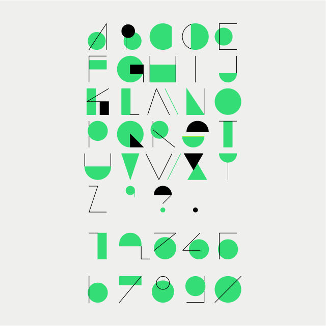
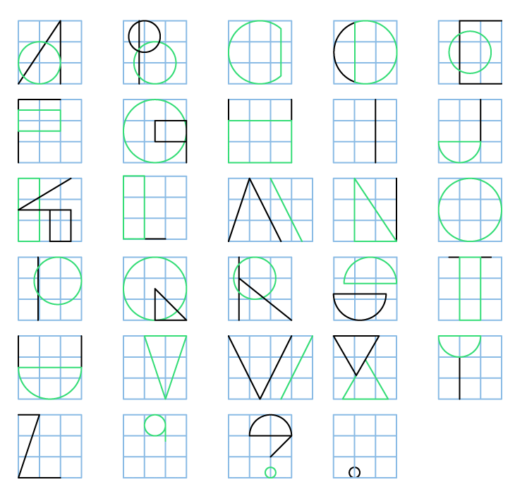
At its core Primitive Font is made up of four basic shapes
Circle + Rectangle + Triangle + Line

All designs are a combination of these shapes with minor adjustments. It is done by changing the sizes and the interactions between these shapes.
Everything except for the M and W is laid out on 3×3 grid (M and W take a 4×3 grid due to its horizontal expanse). The grid was just a framework to work within certain guidelines. The geometry behind the shapes was a very deliberate effort. We wanted to achieve a very minimal representative of the alphabet. We did compromise a bit for legibility though.
Let’s take C-D-O for example(The Big Short anyone?). The basic shape is a circle. The letters are just variants of it.
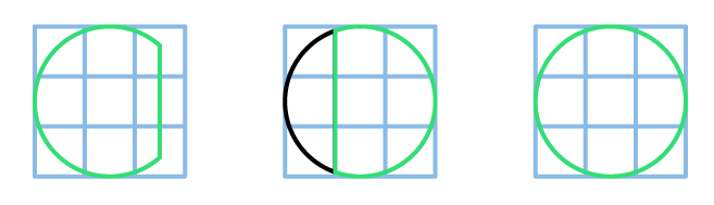
So the O is obviously a circle fitting the 3×3 grid. Simple. The C is just the circle with the right portion cut off. So we have C as well made from the circle cut off half way though the right grid block. The letter D is actually a slightly distorted mirror image of C. So we have the exact same principle with one exception. The straight line that other wise demarcates the D is now a curved one running along the circle’s circumference. And how do we give it a playful nature? Simple, add some colour into it!

The use of colour is mainly in the negative spaces throughout the letters. The playful aspect can be seen in the F and the E as well. Traditionally both are separated by only an extra line (bottom line in the E). But we decided to give the E a lil bit of quirkiness. Instead of the middle line, we substituted it with a filled circle. And what do you know? It works out!

The rest of the letters follow similar principles. All but M and W; Z and I. These are formed purely from lines. This was so as to avoid any confusion in regards to legibility.

Then comes the symbols set.

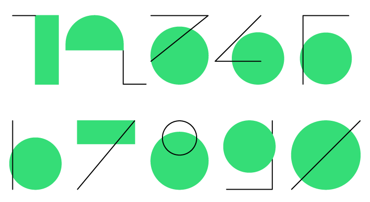
Similarly we even designed a numbers set based on the same principles (though they are a bit abstract).
So these are my two cents on the Primitive Font. Hopefully, this cleared up matters a bit for you. Look out for our next post, this is where serendipity and the fun begins – Animations!
![]()
Don’t forget to Pre-order Quote Codes on the Appstore here, it comes out on Jan 18, 2018. Pre ordering ensures that the app automatically downloads onto your device on Jan 18.