Medieval book style
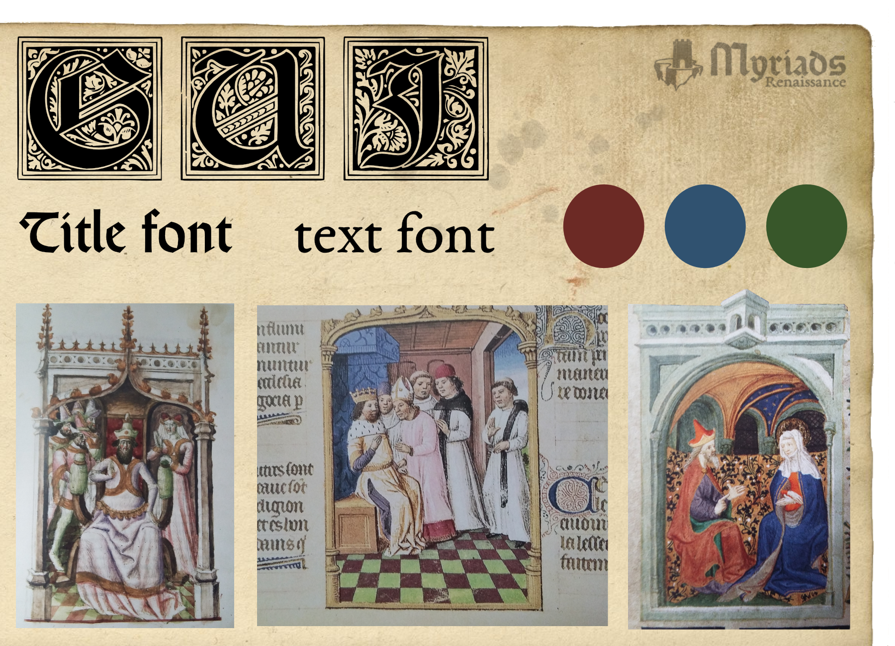
We wanted the GUI to remind the player of the medieval book style and especially the illuminations. The choice of an “old paper style” background for the various menus was pretty obvious.
However, when it comes to font, such books and modern GUI have more or less nothing in common. They meant to be pretty, not readable, while a GUI is meant to be understandable at first glance. Hence we had to give up on the “Gothic” font as it would have been difficult for the player to read it. We simply decided to keep a single “illumination style drop cap” which will be used for first character of the player’s faction name. As it does not hold any important information, we think such a choice will not affect the clarity.
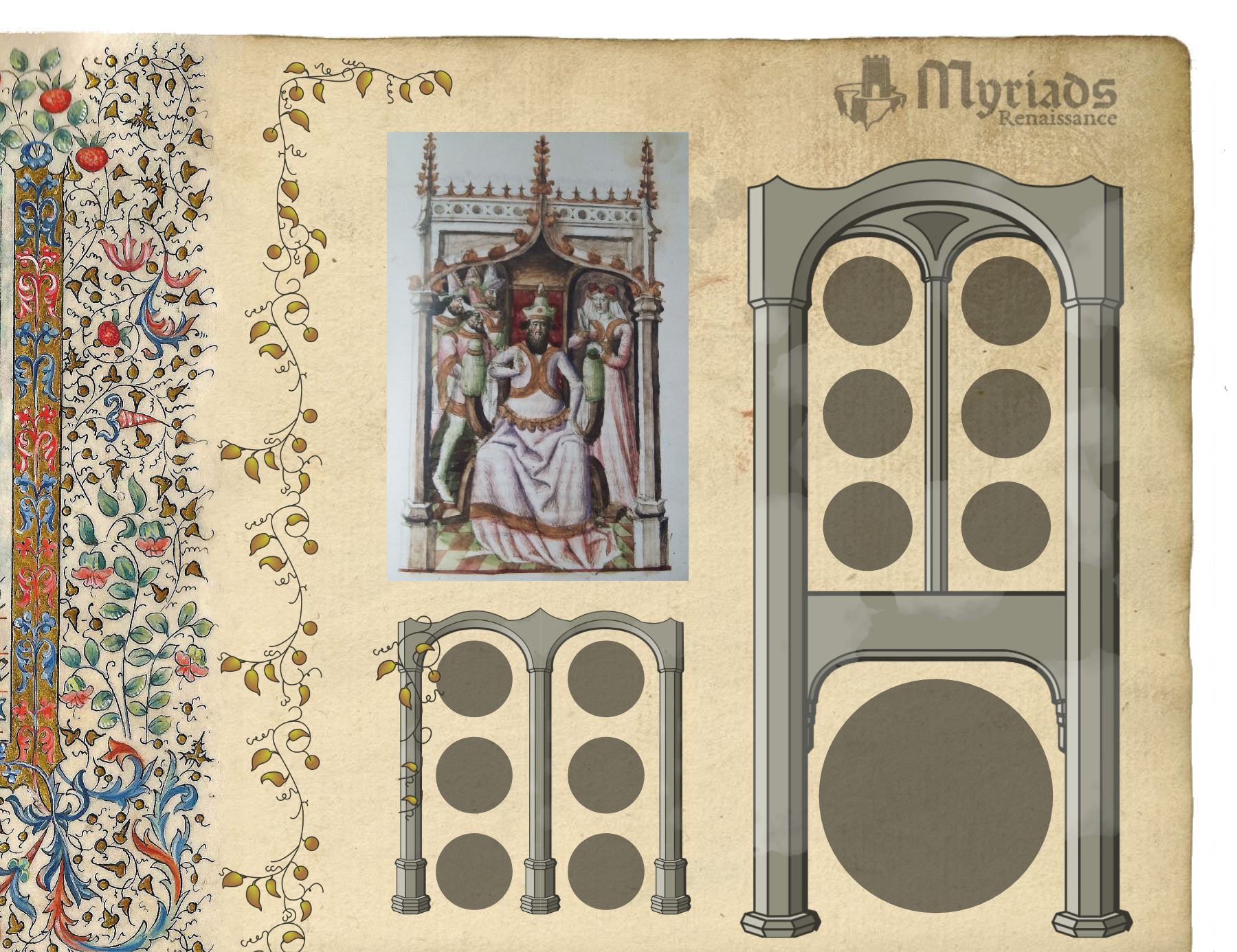
Moreover vines and columns will frame almost all the GUI parts. As you can see, we decided to keep it simple for more clarity. In particular we have significantly reduced the vines density with respect to what you can usually see in that kind of books.
Icons
At first we wanted to use real middle age drawings and turn them into icons. Technically it was feasible (we did it for the “charge” of the player’s shield). However, as these icons are meant to be rather small, it would have been very difficult for the player to recognise them. We gave up and decided to design all of them (as you can see, close to 60).
Most of them are used as icons but also as buttons. In our GUI, the difference between an icon and a button is the “volume”. The “volume” helps the player to feel that he can “click on”. Since we could not add light effects or shadows (it would not have fit the “medieval book style”) we ended up adding a circle around the icon which “act like” there is a volume.
Buttons and Items
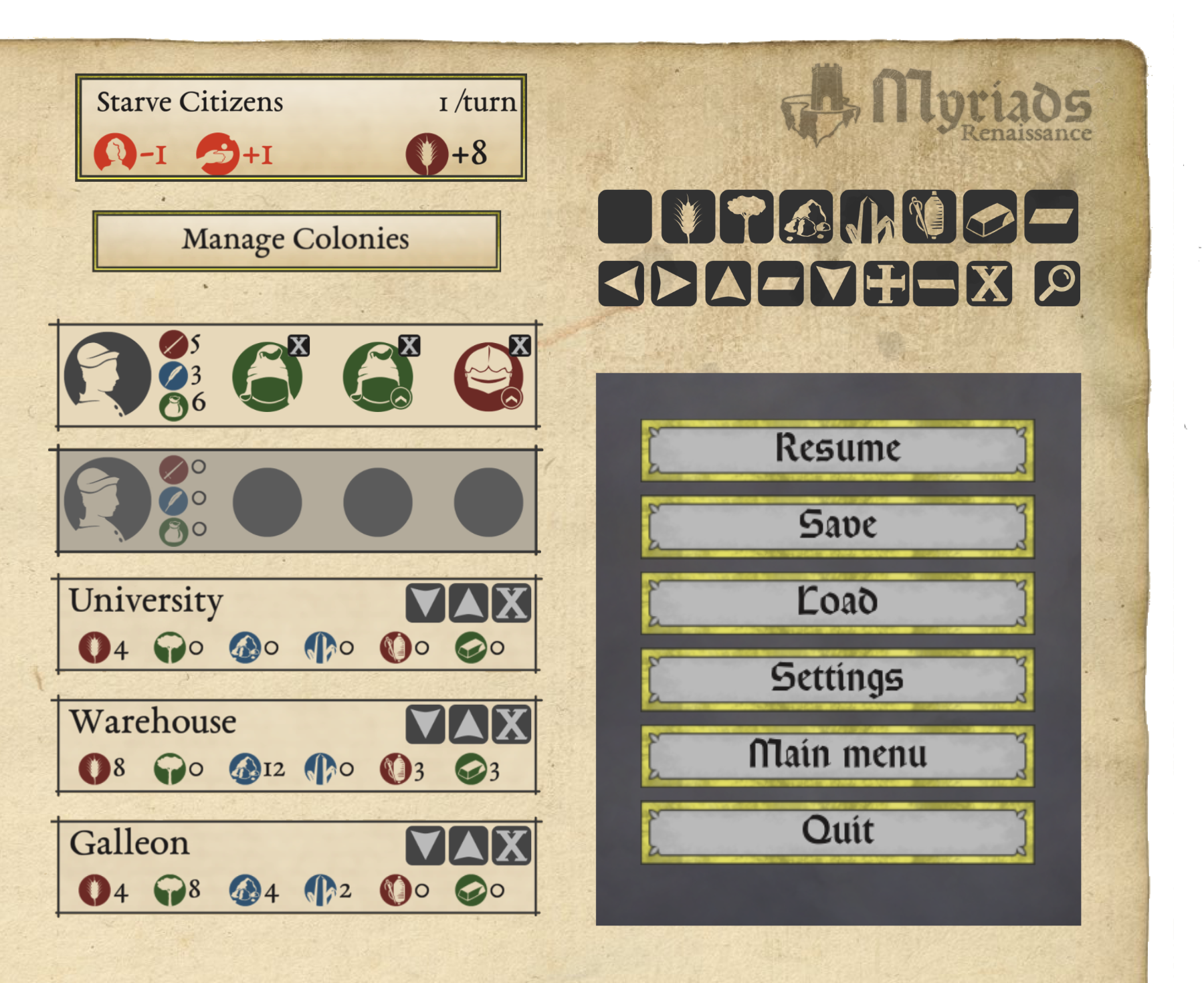
Here is a patchwork of various GUI elements. It includes:
_generic buttons which hold context dependant actions such as “Manage Colonies” or “Starve Citizens”. The button design is very generic so that it can fit various purposes.
_generic items which hold context dependant informations such as “Production queue item”. For the same reason, the design is very generic.
_menu buttons. We decided not to use the generic button so that the menu stand out.
_technical button. We decided to go for a square shape so that it is clear for the player that the purpose of these buttons are purely technical: closing windows, filter a list of colonies, and so on.
In game examples
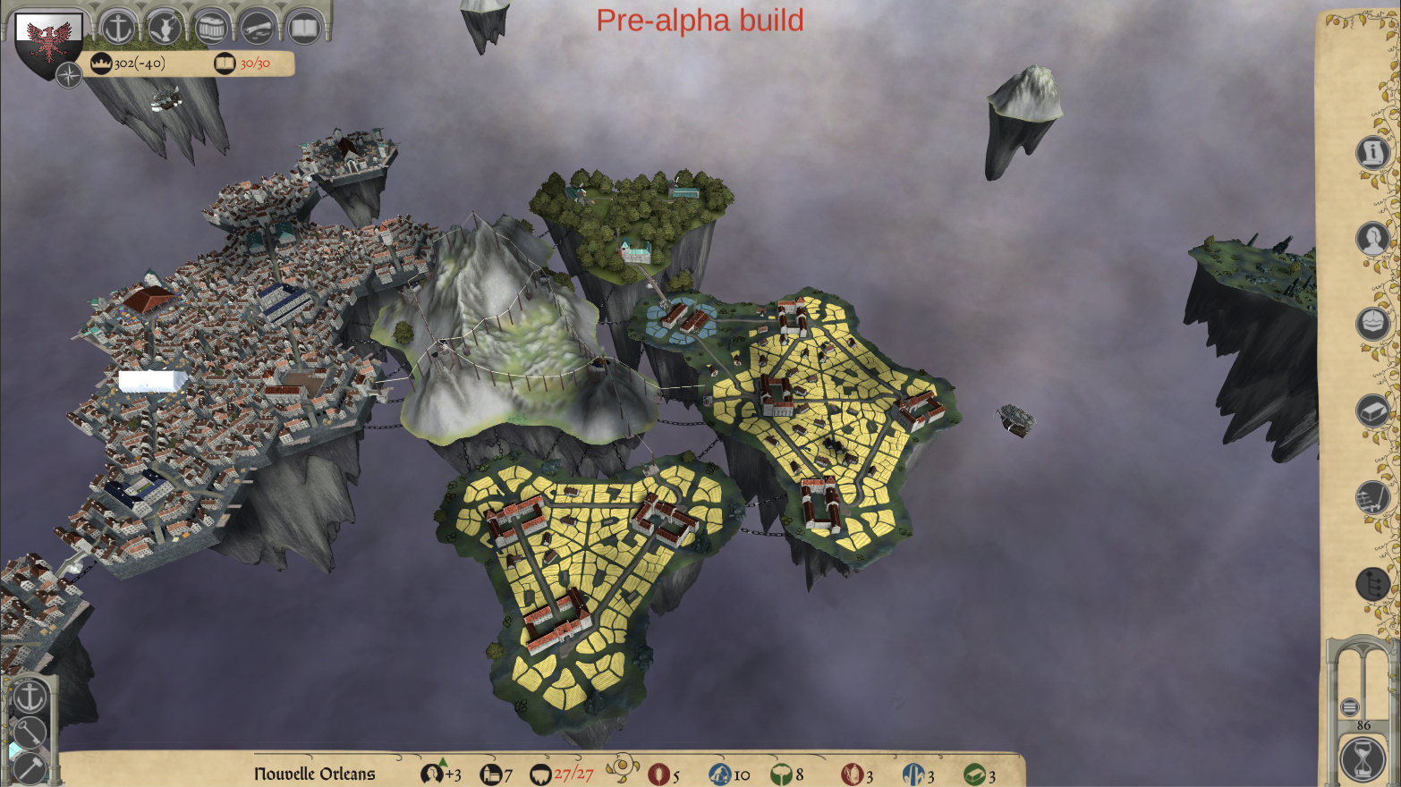
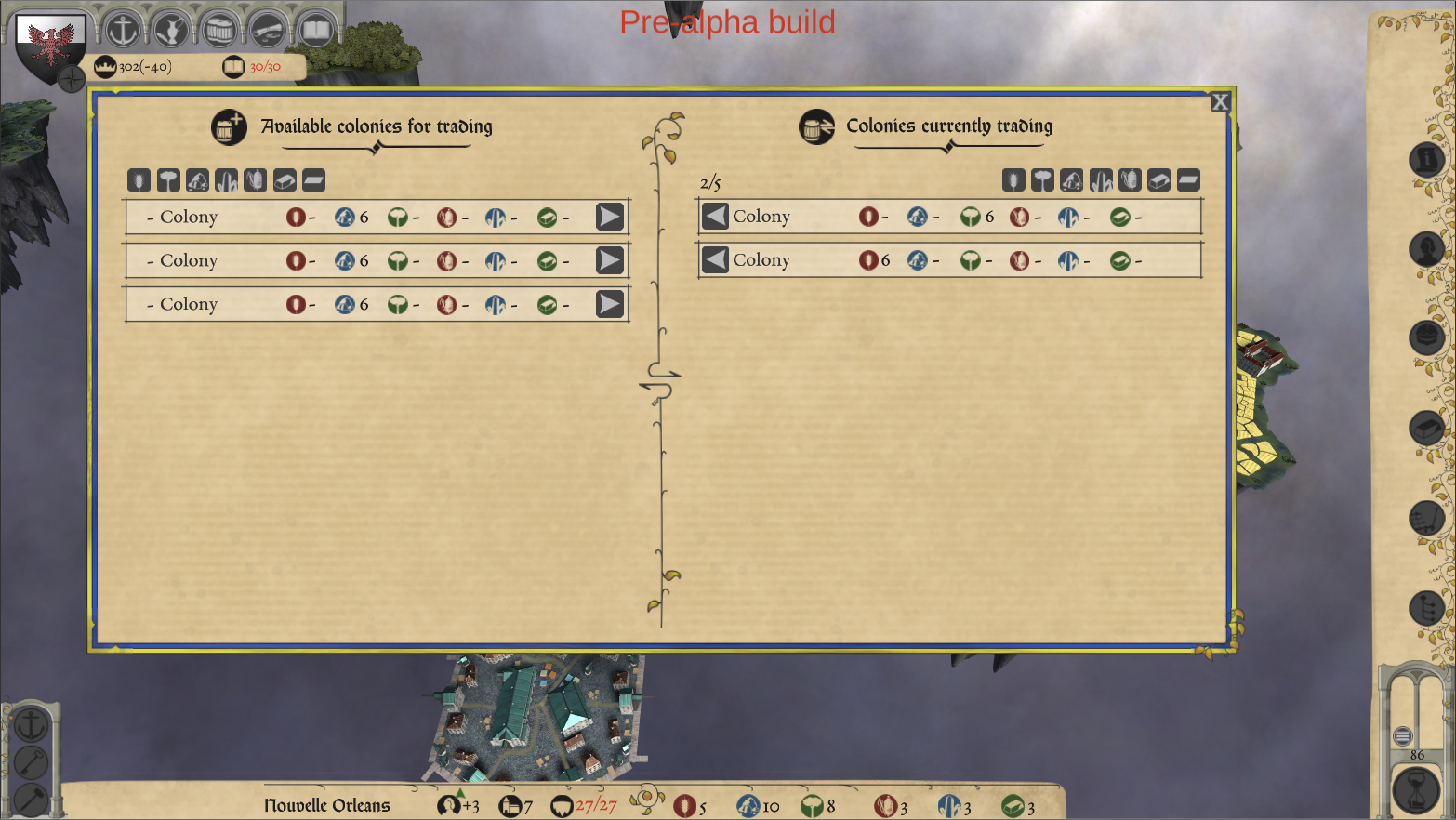
Finally, here are in game examples of The Myriads: Renaissance GUI. One of the picture shows an in game view with minimum GUI elements printed. The other one shows the colony management window which will allow the player to select the colonies he wants to trade with.
We hope you have enjoyed reading this article. We would like to hear your thoughts and feedback.
The Sleeping Eight Studio team.
