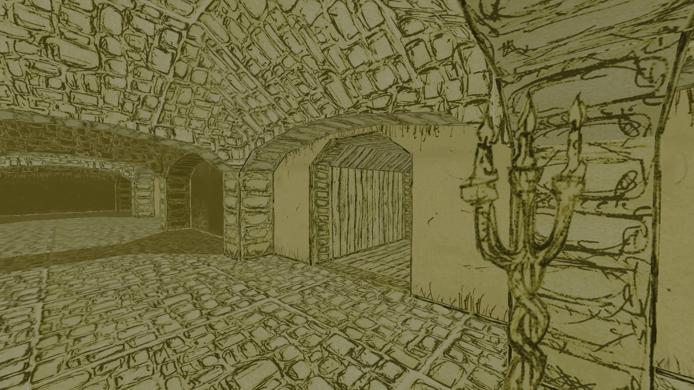
The idea behind He Came From Beyond is to make it look like it's a mad drawing in a diary of an insane person. It stemmed from the observation that a post-it note looks like an empty 64x64 Doom texture, so why not just draw something on it, scan it and import it to Doom?
The result was good enough to gain quite an interest from the Doom fanbase, but the more I did, the more I realized that this style causes problems. For example, it looked good in small spaces, but in big, open environments it stopped looking like a drawing. Texture detail meshed into a mess of pixels in the distance.
Also, my personal peeve was the fact that the geometry didn't have any contours, and the first thing you draw with a pecil is the contour.

Ultimately, the image looked flat, but not in the way I intended. At first, I tried to remedy it by adding this fake "ambient occlusion" by adding lines at the top and bottom of textures, as you can see above in some places.
This, however, posed two problems. One, the textures weren't reusable because they only worked with walls of a certain height. And two, there still wasn't any contours!
I saw the Sketch Doom mod, which makes Doom look like drawn with a pen, and I contacted the creator. He used Reshade for this effect, and while it worked for him, in my case it was just a mess.
I guess this cel shading could still be achieved by some way of automation, like Ambient Occlusion is in GZDoom's settings, but I'm no programmer. And also, this wouldn't look organic enough.
So I went the way I initially wanted to avoid - because it's extremely time consuming.
To create borders, I added small sectors near walls and corners - everywhere where I'd draw a contour if this was on paper.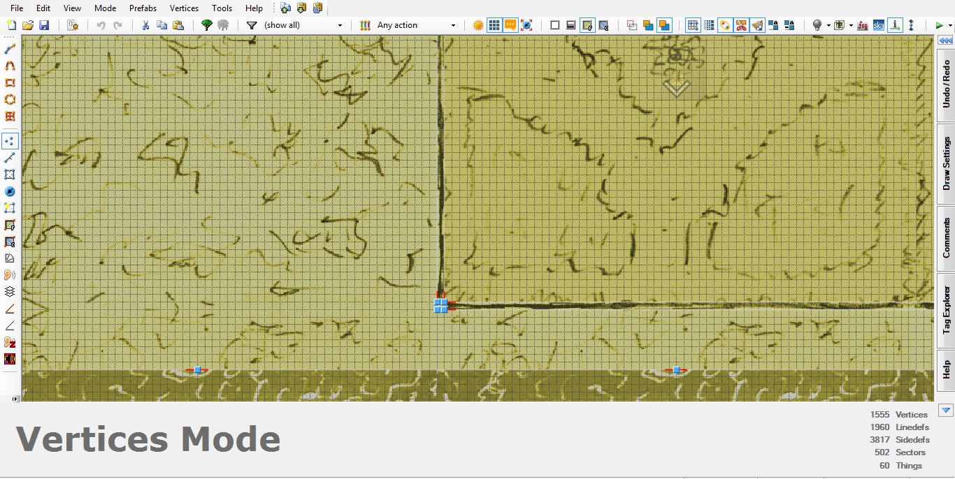
Then I added a long line texture - just a straight line drawn with a pencil on a post-it - in horizontal and vertical orientation.
Then it was just a matter of making hundreds and hundreds of these small sectors and applying the texture. At first, I wanted to leave them on the level of the adjacent sector, but this made the lines disappear with distance. So I had to elevate these sectors just a bit so that they can have a side texture as well.
You can see the height difference here: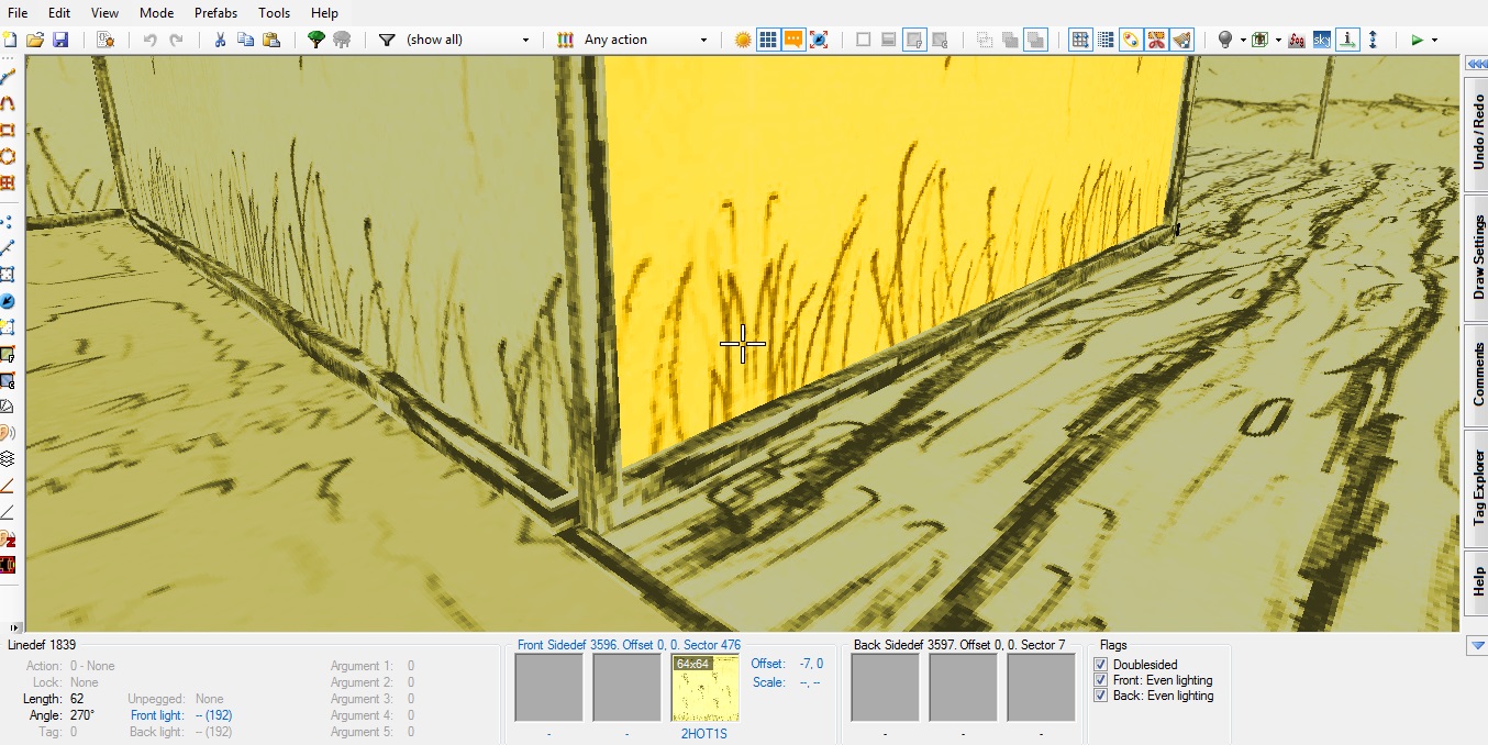
Corners are tall square sectors to make them visible from different angles and nicely pronounce the edges.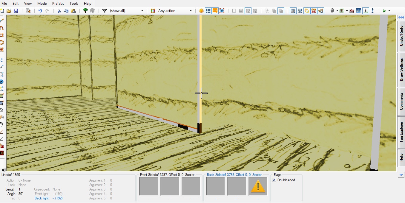
However, the big spaces were still a problem! When I used a more detailed wall texture, these contours were simply invisible. And also, the image started losing this hand-drawn quality. So I established the rule: simple walls, detailed floors. It makes sense, since whendrawing, you don't use a lot of detail for objects far away.
This is a work-in-progress area when this rule was applied. 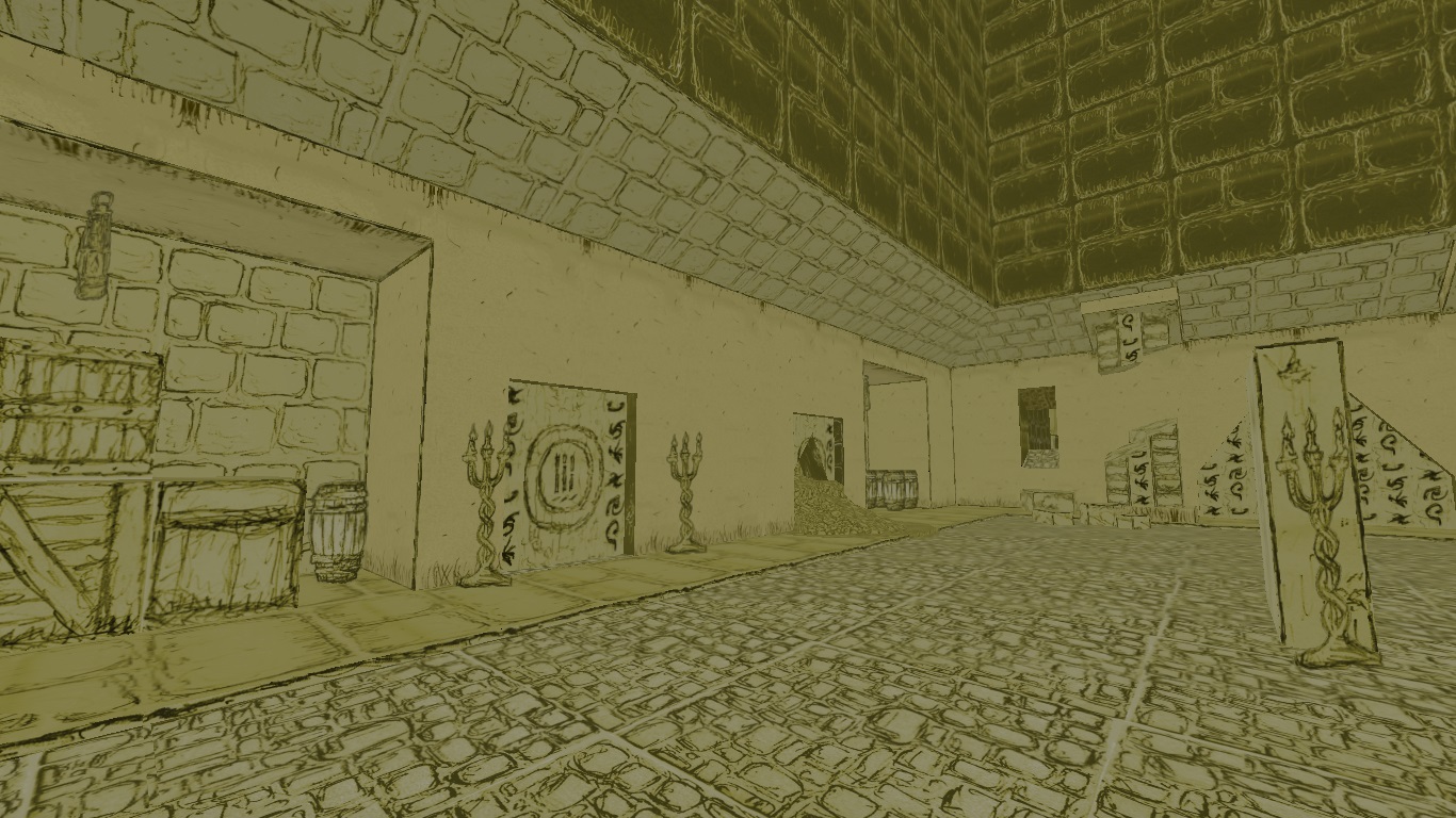
There still has to be some detail, of course, so the textures don't seem blank from up close, but subtlety is the key.
The contours take an incredible amount of time to make, but the difference is massive. The followers on the game's FB page agree - they're the reason I decided to dedicate time to contours in the first place. I showed them a comparison and the reaction was unanimous. This was the way to go. Besides, making these details is oddly satisfying and relaxing, but I won't blame you if you disagree.
BEFORE
AFTER
Nice report, it's very interesting to how about the making off of this project. It would be great if we had Noclip-like videos about mods as unique as this one.
Thanks! I like making-ofs personally, so I'd certainly watch something like this.
Reminds me of an old quake 1 mod ,really awesome work gl&hf; !!
Thanks, and wow do you remember the name of that mod?
Found NRPQuake and it does come close to what i experienced xD it could be it figured it was called draw q1 its been awhile xD
NRPQuake looks incredible! It's a pity it's just a visual mod for Quake and not something new that uses this look in a cool manner.
Looks amazing! Can't wait for it's release
Thanks!