Greetings!
Let me show you how the old maps looked back in the day compared to the new recently made ones. But before, you better play the Part One demo available right now, and so you can understand it a little bit better.
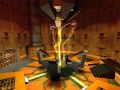
New Subway platform (insecure00b) - 2021
")
Old Subway platform (insecure00b) - 2018
")
The room was made a little bit darker for more consistency with the original game. The entrance doors has been changed up to fit better.
The rail has been moved up, so players cannot be killed walking on them or trying to exit the map. And Barney's lighting has been fixed.
New Entrance room (insecure01) - 2021
")
Old Entrance room (insecure01) - 2018
")
This part has also been simplified to fit better with a security checkpoint facility, rather than a experiment lab testing airpod. As a fun fact: this was replicated from a long time mod developed by me way back to 2016.
New Elevator room (insecure02) - 2021
")
Old elevator room (insecure02) - 2018
")
A big improvement from very claustrophobic room to a little big one. I wanted to re-use the ropes from the old map but the sounds did not fit at all. so, it was scrapped. Also, there's not a normal entrance to the office complex.
New Cafeteria (insecure02a) - 2021
")
Old Cafeteria (insecure02a) - 2018
")
Feels again a big improvement over the last one, and feels more consistent on a office building rather than a concrete one. It did not make sense for me.
New Building (insecure03b) - 2021
")
Old Building (insecure03b) - 2018
")
Now it feels more like an actual building, rather than some sort of surrounding walls leading to void. And it also fit better with the helicopter ending fight. Also, the terrain it's accessible.
And that's all the biggest diferences between the old maps and the new recreated ones.
Want to thank you all for the support of this project, i'm very happy with this project and that you liked it.
If you want to support me for development, contact me in DM and i will try to answer soon as i can.
Great job at upgrading those design
Would be fun to play both the old and new maps side-by-side, hope you go through with that release!
But other then that, these screenshots look pretty slick! Following for your new build for sure!
The old maps are cryptic as hell and very unfunny to be honest.
Glad to see you back alive and kicking. I did play your 1st demo 2 years ago and I was stunned of how good it was. When your moddb page vanished I feared for the worst.
Very amazing to witness your return. I'm going to download your latest demo right now.
Hope you enjoy the new one. :)
Great updates for some of them ! good work !
I honestly respect going back and simplifying a lot of aspects within your map design; it's an extremely challenging skill a vast majority of level designers fail to do.
It's awesome to see you realize that just because you CAN make fancy pipes and extremely high-poly brush based architecture, it doesn't mean that you SHOULD. Areas can be empty, just like in real life. A wall of pipes can looooook SUPER COOL, but it doesn't make any sense to have them at the tram entrance of this sector/area in particular.
Obviously there is a balance to this you'd need to maintain; but based off of what you're showing off, I'm actually looking forward to this!
I have a biased love towards tram sections, so you already had me at that haha
Agreed, this is often something I tend to have problems with when I'm mapping. But sometimes you have to force yourself even if you don't like it.
A clean and relatively simple area can not only look better than an overdesigned area it can also make the gameplay smoother for the player, e.g. easier to navigate, less chance on getting stuck on useless crap, easier on the eyes etc.
Also why haven't I heard of this mod before. Watching.
Thanks! And yes, i kind of dislike the high poly architecture when it's out of place or just to look cool, i've learned that some time ago after i've made those maps.
Looks very good! :3
Thanks!
Le epique!
Nice developer diary, mod looks very cool :)