Hey
Contest No3. The New Splash Screen.
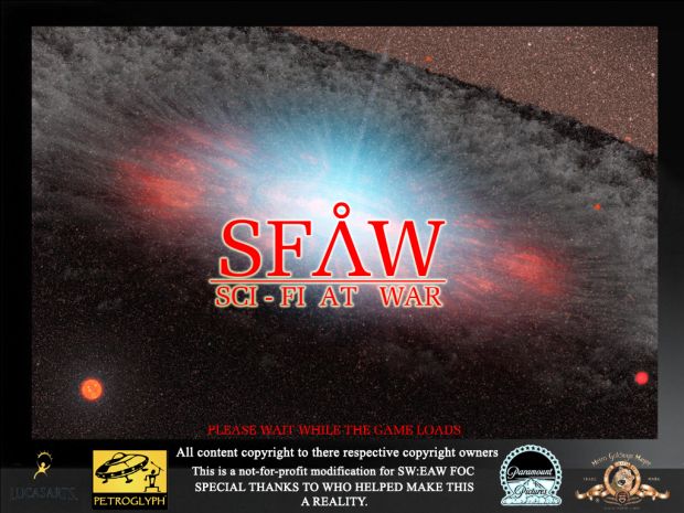
Yes another SFAW contest. For those who dont know, a Splash Screen is the first screen that opens when the mod starts. Right now its this
Dont worry this ones fairly easy all you need is an image editing program like GIMP and your good to go.
Rules
1 - Most importantly the image must be a minimum of 800x600 (preferably 1280x800). It has to be the same size as a screen resolution. You can find these sizes by going to the video settings in the game. You will see number1 x number2. Thats the width x hight of the window. The image needs to beo ne of those or itll be distroted and look horible.
2- You need to include the SFAW Logo somewhere im the image (preferably near the middle, so people know what they are playing)
3 - You need to include the logos for Lucasarts, Petroglph, Paramount, Columbia Tristar, MGM and Universal.
4 - You must include a disclaimer, similar in content to the one in the above image. basically saying
"All content copyright to there respective copyright owners
This is a not-for-profit modification of Star Wars: Empire At War - Fore of Corruption
Special thanks to all those who helped me make this a reality"
5 - Must also include a "Please wait, mod loading" notice somewhere. It doesn't have to be to big, but noticable enough.
6 - You CANNOT use screen shots from the orignal shows or movies. I cant emphisise this enough. Screen shots of the mod is ok, just not stuff from the shows.
To submit your image just post a link in the comments, and ill add it below.
Entries close on Tuesday the 8th of June. Ill make a list of the most popular and then do a general vote.
Winning entry will be made into the new Splash for the mod, and that person will be given internal access.
Finally, all logos can be downloaded from here - Gamefront.com
Good luck to all, and if i remember sometihng i forgot to say here ill let u know.
ENTRY LINKS
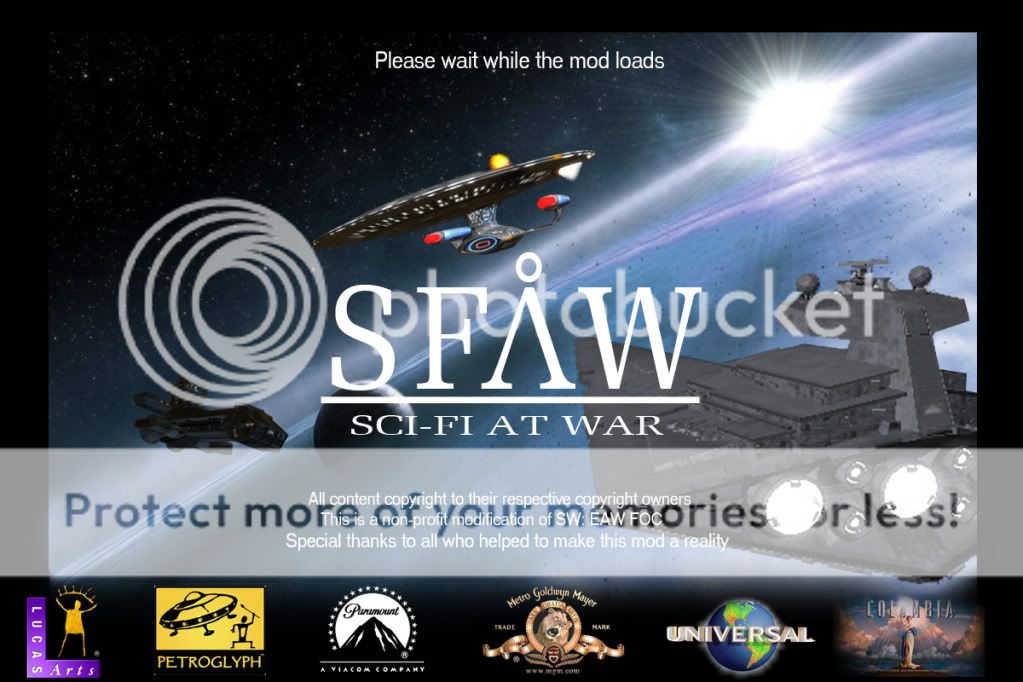
ODST_General - I758.photobucket.com
jernex65 - Flickr.com

I758.photobucket.com
Actually I may edit this slightly later when I wake up if I don't go straight for Red Dead, noticed a couple things that I can improve upon or need to be fixed. Currently though its 5 A.M. so to sleep I go!
lol, good work so far. Try and keep the logo the way it is... Or made the A fatter like the other 3 letters, it jsut looks out of place. Secondly the details along the lines of "copyright respective of owners" has blended into the engine glow, i suggest adding an outer gloe of black or deep red, just to seperate them. Other than that it actually looks really good.
Personally i'd throw in a 304 somewhere lol and possible galactica and a ship from SST but its not nessisary, it looks great as it is
have a good nights sleep
Spino
Yeah the engine issue was one of the things I mentioned, I mixed the Star Wars logo with the gate A. Though if you want them the same I will change that when I go back to edit it.
I had thought about throwing in a destroyed F-303, I still might when I go back and make fixes and such. However I do want to avoid to much clutter.
awesome.
I758.photobucket.com
You may have permissions to use my mod's splash screen images located www.moddb.com/mods/star-trek-at-war click images, search a bit and you'll find one white one, and one black one, you may use bits from each ONLY FOR THIS MOD
this week i have taken this contest into consideration, expect an entry from me soon
instead of "not-for-profit" can i say "non-profit"?
same difference lol
Ive got one coming...hopefully
I may upload one...once I finish all my gorram assignments!
can u extend the deadline? im really busy right now
nope sorry
u still got a week... next tuesday is the end of it remember
Here's my entry: Media.moddb.com
Tell me if you would like me to change anything.
oooow, this is a good one, nothing i can think of needs fixing....
Thanks. I have another version with cleaner logos here: Media.moddb.com
And I've fixed the spelling error in the old one too. You can choose which one you want to use.
updated for u
Sorry Spino, another update: Media.moddb.com
lol updated
Here's my entry Moddb.com not exactly what I how I wanted it but oh well
Not to bad, though after a VERY quick glance I would suggest getting rid of the stuff around the text in the Columbia picture if you can.