"War... War never changes. The reasons why we fight these wars remain much the same; some are fought to conquer, for religious and ideological beliefs, other wars are fought over gold, oil, spices – natural resources and money. Power is the key element. This war is no different - except there's nothing natural about Tiberium. The year is 1995 and we have just begun to open up our eyes to view a brave new future, some will come to say it's a horrific future. It is the Dawn of the Tiberian future." --- Tiberian Dawn is a total-conversion for the game Command & Conquer: Tiberium Wars. Our goal is to bring C&C1;to a new engine, with enhanced features and graphics while also bringing back much of the classic style of gameplay while not taking steps back from what C&C3;implemented in the series as gameplay features. This is not of course our only goal - the idea of the total-conversion was inspired by an art piece by Godwin that showed the cruelty and bitter humanity of...

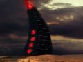
Meticulously modeled and textured solely by Ric, and with a frighteningly awesome cameo by Lazy6Pyro, the Obelisk is sure to strike fear into the hearts of all GDI troops.
The Obelisk looks to blocky compared to other buildings... it just looks a bit too rough compared to everything else...
Otherwise, great work!
It's perfect!
The Obelisk looks very Beautyful i must say, it fits really with the NOD style!
Looks a little too fat to me but otherwise awesome
It sure looks fat. I think it would look much better if the prisma at the top were bigger so it fit's the contour whit the rest of the building. Other than that, amazing ;)
I don't really like the obelisk too. Don't understand me wrong - I really like the oldschool-style of this mod - every building looks like its original but I think this goes to far for the obelisk. It looks not just bad - it looks horrible in comparison to the other buildings.
Yea it looks blocky/fat - the proportions are too toyish. Make it a bit smoother or at least thiner+higher. The texture should look like metal and not like stone in my eyes.
Do you have any suggestions that we can use to make it better? We still need to make the outer-crystal semi-translucent so the inner crystal can be seen. The pipes at the bottom will have sections that pulsate and animate when charging.
The central windows will have a Lumiglass animation like so: Youtube.com . They will also do different animations for charging and a random series of animations for idle.
It may be a simplistic structurally, but we are going to try to make the details bring this structure to life.
Whoops, I must have missed your suggestions. My apologies for that.
I will take your concerns to the rest of the team and see what they say.
As far as proportions to the world go, it is fairly accurate if you see the door on the back. It was a rather tall structure in the original game.
We wanted to mimic the stone/metal combination look to bring out the Egyptian influences in both the obelisk itself and the whole design and fiction of Nod. I can play around with adding some more specularity and a slight reflection to see if it makes it better.
Your obelisk seams to be made in stone bricks while the real one is made in some sort of metal hull.
Youtube.com
Maybe it just needs a new texture?
I agree, that was my first thought. The obelisk had a more sleek texture. I think it looks good with a rough stone pattern.
We want to keep a very real and distinct TD flair; not Renegade, which takes place in a different time in CnC's fiction. If any geometric changes are to be made, it will be either proportion changes or slight differentiations with the current model/texture.
The stone look was the original idea, given from our concept. We will play with a stone/metal hybrid and see how that looks in comparison.
EDIT: My bad; this was meant to be in reply to ScorpionaArtileria.
ok. I don't see why you can't just use a texture (very) similar to the one featured in the video I posted. why stone bricks?
http://pnmedia.gamespy.com/planetcnc.gamespy.com/fms/images/potd/2279/1228139746_medium.jpg
https://media.moddb.com/images/mods/1/9/8709/Obelisk_Of_Light.jpg
Enough to make everyone happy.
But still,your choice on how you will model it...
PS: Too many design directions taken from TD become waste in 3D,ain't it?
Not really... C&C1 had pretty high-quality renders of all their units too; more high-quality than the Renegade ones, in fact. The Obelisk is just a simple building. There are very few Renegade buildings design I like, tbh.
imo it look like a low poly model, maybe it the edges were more gradual it would look better?
Also the texture of the windows looks like you just coloured the rock red. It should be more smooth like you expect glass to be.
@ApornasPlanet
As I mentioned above, we are embellishing the origins of the obelisk itself - tracing it back to it's Egyptian roots. This was the idea of Collins, our concept artist, and the rest of the team thought it would a very neat rendition of the Obelisk while still maintaining a very classic look. This was a way we could pack in more detail to make a rather uninteresting structure into something more vibrant and interesting. We were also toying around with the idea of metal bricks, which is what we may go back to as a nice compromise.
@Unspiltglory
A) It is a low-poly model with a normals map applied to it; that's pretty-much given for a SAGE mod. It does have a beveled edge due to the way the normals were applied.
The windows aren't the rock colored red; As I have mentioned (and linked above to a youtube video) above, it is a luminglas design (with electricity dancing throughout the window). That is why there is a variation of red and white.
Yeah it looks too fat and hunched over. Needs to be taller and more imposing. It looks like a drunk homeless man version of an obelisk. lol
I think you should drop the idea with the egyptian roots when this means that the obelisk needs be made of stone.
As far as I see here, this mod recreates the ol TD stuff in very realistic and believable way. An obelisk made of stones in the metal/concrete world of buildings really doesn't fit.
Make a metal texture and bake some structures into the normal which underline the general form of the obelisk. As I already mentioned: try to make it a bit thiner/higher. In combination with a new texture it should fine then.
Try making the bricks smaller. It just doesn't look good then there is a brick with this size. Also this style just doesn't fit to everything else, its nice that it goes back to the Egyptian roots but it doesn't seem to be the best choice in this case.
Also.. why is the Power Plant texture grainy? Could need a bit more detail.
Personally, I think you all need to shove it and let mod creaters make the mod the way they want. If you want to change what they are doing, get skills and join the team. Nuff said.
Even the best mod team can learn from feedback mate...
Anyways, it looks a bit too short, and too dark. I remember it was one of the tallest structures, and that it was more grey instead of black. Then again, my memories may be a bit hazy, as it has been a time since I played TD =P
Speaking of the Obelisk, I noticed a long time ago that there is a Tib Dawn Obelisk in C&C 3, in one of the Red Zone missions. There are also Tib Sun Power Plants.
They're accessible in the map editor.
i really dont wont to offend any1 but i think it looks crap
:( sorry
All comments are appreciated but if you don't like it we prefer if you could explain why :)
cus it just looks like somthin from a really old game,and it doesnt hav much detail appart form the textures wich make it look like its made from bricks :(
Like "Renegade" :D. The Ego-Shooter from C&C.
NOD-Symbol at the power plant and the obelisk of light look really fantastic and real! The textures are great and models are great, too!
-deleted-
-deleted-
The Obelisk is dead on to the looks of the original, however it is a bit too far, if you make it skinnier, then you got the original look. ;-)
wow i could make this from lego