The mod you are trying to view has ceased development and consequently been archived. If you are a member of this mod, can demonstrate that it is being actively developed and will be able to keep this profile up to date with the latest news, images, videos and downloads, please contact us with all details and we will consider its re-activation.
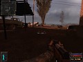
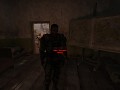
S.T.A.L.K.E.R. - PreSky is a Total Conversion mod for Clear Sky, set before the events in Clear Sky begin. Its goal is to provide a fresh new game experience from the point of a regular Stalker within the Zone. This basically means that the mod has complete and total freeplay from the start. PreSky combines some of the best elements and ideas from all 3 games in the S.T.A.L.K.E.R. series to produce a brand new gameplay experience within the Zone, with the sole intention of creating a more realistic Stalker experience that aims to make the player believe they are a Stalker. There is no main storyline progression to unlock new areas, or new items for the player. The Zone goes on living regardless of the actions of the player, with a virtually unrestricted alife that makes the Zone seem even more alive and real than it did before. The only storyline is the one you create for yourself.
")
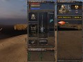
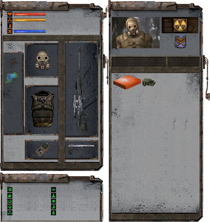
Spent 3 painstaking and long hours working on this - Making a new inventory interface. It was quite a challenge to get everything positioned correctly and set up, given my poor texturing skills.
Suggestions, ideas, and criticism welcome (Well, the first two more than the third...)
Its also meant to be transparent, but for some reason the ModDB uploader removed the alpha channel, so it doesn't look it here... But it is transparent.
It will be in the same position as the normal interface window.
its amazing! everything is positioned perfectly. will the inventory part have a grid?
It's not exactly open to criticism due to it being a much better inv than it could have been, But I will try:) Seriously though it's great, as a suggestion I wonder if it might look less segmented between the outfit and main weapon if the middle border was thinner. Maybe if that bar was as thin as the ones surrounding each item. We will be able to see it better in a screenshot once you get it in game. But it looks good.
I am really curious about separate helmet and suit idea. Like in CoP. Is it just going to reflect in statistics, or will we see actual difference in 3rd person textures too?
Looks really great. I'm wondering though if the self pic in the top right corner is going to change depending on one's outfit combination, because that would be neat.
@slayer01670
Thanks! I think the grid is a feature of the inventory window, and it should appear ingame.
@davidme
Thanks, I'll give that a try. Should make that section look less compressed.
@Drag0
There will be a few differences in 3rd person visuals, if a matching mesh combination exists.
@Oblio1942
That is possible to do. But once again, it depends on if I can get a matching icon for the combination.
I will begin to implement this ingame within a few days.
The top left window is current status of the actors properties, and the bottom left one is current protections. There is room on the right hand window for the actors name and the amount of money they currently have.
This really reminds me of SoC, but CS/CoP style.
it is transparent dude xD Media.moddb.com
and looks really nice, but, if you want some neat UI textures...send me a pm, here is what i can do in just one hour: Moddb.com
:)