Republic at War is a total conversion modification for Star Wars Empire at War Forces of Corruption. The mod replaces the Empire with the Galactic Republic and the Rebel Alliance with the Confederacy. Republic at War focuses heavily on the theatrical films but also contains content from the Clone Wars cartoon series as well as the expanded universe. Players can re-enact various Clone War campaigns such as the Outer Rim Sieges. Players will have the choice to fight as either the CIS or the Republic and wage war for control of the galaxy. Realism is key and players will have unprecedented control over how and where they fight. Push forward with an entire clone legion such as the 501st or 212th or overwhelm your opponent with a seemingly endless number of B1 battledroids. The choice is yours. There are also a number of expansions planned that will add new (as well as polish existing) content.

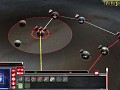
New GUI.. still a WIP.. the new buttons we may change to Black or dark gray but the style of them and icons will stay the same. Would like some feedback on this.
Awesome. Do the CIS have one with Blue in it?
the graphics look so good Z and i like the new bottons Z, it won't even look like it is a mod for emipre at war forces of corruption, because it is so detailed
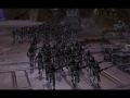
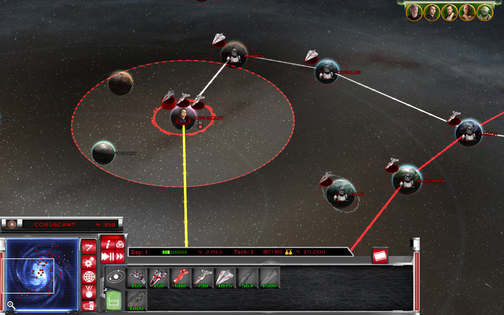
is that the full gc map?
because there are around 60 planets
No complaints from here.
Goodlike
Awesome darker tiles would be cool and could make the board behind the tiles look more battle worn with like with blaster marks and chunks missing a little darker red buttons
No we went with the same bar for both factions.. so one guy wants darker red buttons?
yeah, i like darker red too
I like it's general design. Just a couple things I noticed. Some of the buttons and icons need to be shifted and possibly have their sized adjusted so that they fit in more snuggly with with BG you made. At the moment the credit button and the ones below it seem too big and the build icons look like they need to be shifted up and to the right. But it's still a WIP so I bet you already noticed that. :p
Anyways the cinematic mod button seems a little oddly placed to me. It just seems to far away from the rest of the buttons. Good job though.
Thanks, Enc I did notice some of this also.. its back to tweaking the positions.. working on that now. Hope to have a updated pic ASAP.
Z you're doing a great job man. I really appreciate your dedication and loyalty to the fans. Keep up the great work.
The right side also cuts off kind of awkwardly. Is there anything that you can put there?
The right side ends as I run the game at max resolution.. those of you running at lower res's the bar will take up the whole screen..
I smell release coming.....
Not sure I like the interface...The buttons are too bright and simplistic, and the icons look so clean it's almost as if I opened a program in Windows XP rather than some high-tech console in the Star Wars universe. The Intelligence Droid is also gone, strangely...And the middle bottom part with the units & buildings & research icons could use more polishing IMO.
So I'd say it's a good start, but don't leave it like that. I like the metallic part, so the part on the left with the minimap looks pretty good. Gives it an Old Republic feeling.
The Red buttons need to look more high-tech and less simplistic (like actual buttons on a console), while the red needs to be toned down and perhaps the icons should not be pure white. (Perhaps emit a bright light when clicked on, but it shouldn't be so white, it just looks too plain)
NOTE: When I mention the icons & buttons with red and white, I really mean those, not talking about the unit build icons, those are perfectly fine.
I join your opinion, and I would like a brown GUI for the CIS
Agreed. But I think a blue GUI for the CIS would be better.
I agree with the blue for the cis and keep the red for the republic. I also agree with alex_06. But other than that its a very good start.
I won't lie about cosmetic changes but it certainly looks good. You deserve credit for not doing the same thing everyone else has.
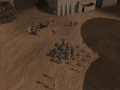
WoW! the pop is 952, this is going to be fun
wow
you guys have done a great job... again :P
Omg this is sooo much better than brown and yellow!
This looks pretty cool! I like how you created new GUI buttons too. Keep up the great work!!
Nice Hud and icons!
Very nice, I certainly like the overall style. However, like you mentioned in the description, I think that a color change might be needed for the buttons, maybe even a different shade of red. Right now, I look at the red buttons and it seems too much "darkside" with the red resembling a darkside lightsaber too much. It also sort of looks like a Cylon type GUI with the red, but maybe that's just me.
Still, I like the overall design, the only thing I would change would be the color of the buttons, to what I'm not sure maybe the black or the dark gray like you said.
cool!
is the droid actually gone or is it just cut out of shot? if it is gone, I personally think it looks better with it :)
No the droid was too kiddish.. and we removed it.
I'm not to much of a fan of where the "cinema" button is. I could live with it but it seems to be a bit out of the way compared to everything else.
Perhaps if you place it on the diagonal end of the info bar with you credits, tech etc. on it? I think it wouldn't be in the way as much that way.
Agreed.
I can't wait for GC in this mod...
A little late to the party but hey,
The Red buttons are too bright, a little darke would be better.
It's been said before but move the cinamatic button back to it's friends.
I think the green tab should be gray also, with a black symbol for inactive and a white symbol for the active tab.
Other then that I like it
Very good idea!
You should make the GUI like a big hologram like the star wars universe, in my opinion it would look canon.
Cool
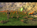
you can build squadrons of bombers and little star ships
but are there still any squadrons of them in in bigger ships?
Noticed that its day one and your tech lvl 2 and you can already get pride of the core? Awesome.
Like Z said a few posts above, the Mandator(Pride of the Core) will not be available day 1, nor will it be unlocked at tech 2. It will more then likely be able to be constructed at tech 5, and at a large price. It appears here at day 1, tech 2 because of testing purposes.
Oh ok but I really wanted pride of the core on day 1 :(
You should change the red to another color like white,black,green or blue.
nice
Well, I am working on the updated GUI now.. a much darker red button set, and snugging up a few of the buttons plus relocating the cinematic button. Also re-did the attack button to be lightsabers it will be the only full color button so I think it will look pretty cool. Also using warbs idea on the build tabs.. hope to have some WIP shots up later.
Sorry if this is redundant, but, why put CIS up with red buttons or interface? Why not blue?
You cant change buttons per faction.. only the design of the actual interface.. and the interface I made is neutral.
Ok, gotcha.