Redux is a large-scale modification that attempts to modernize Doom 3 with a massive overhaul of the graphical, sound and UI aspects of the game along with bug fixes, restored content and new features.

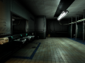
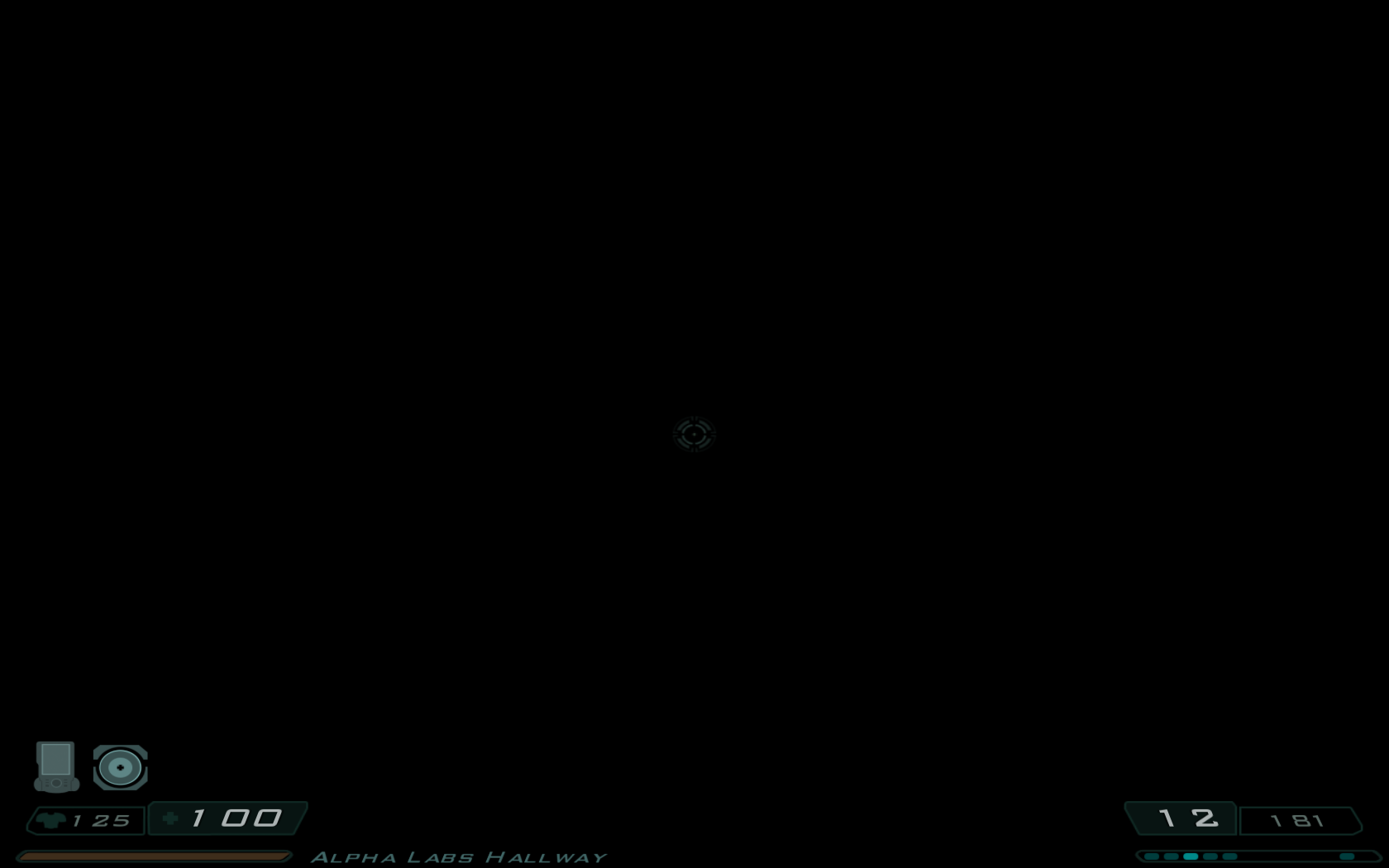
High-resolution UI (WIP)
(view original)
")
Post a comment
Sorry I've kept you waiting guys ! A few drawbacks that occurred during the last few month (including the loss of a month worth of work on the mod due to the fact that I forgot to make a backup of the most recent version prior to upgrading my computer) kept me from delivering the mod as soon as I first intended, but I've been hard at work recently so I think it's safe to assume that the release date is now pretty close.
Cool news! With DOOM being pushed to May, this can still get me to replay DOOM 3/RoE. Also, nice work with the GUI. Widescreen treatment was truly needed.
Can't wait! Nice work, Clear_strelok!
I'm sorry to notice, but the crosshair is still stretched.
That's right. I hope Clear_strelok author will be fix it.
Overall the new UI looks very neat, although the crosshair does look a little bit stretched. Hey, at least it's crisp now :D
By the way, anybody remember the crosshait from Doom 3 E3 Trailer (https://www.youtube.com/watch?v=j8NaZZa54cs)? It was quite different.
Indeed, by default Doom 3 stretches the crosshair when playing with 16:9 or 16:10 resolutions and I found no efficient fix to this date, however the new crosshair in itself is twice the size of the original.
I can't help but notice how bad the kerning is. There's way too much space after the number 1, that "100" looks like "1 00". Most of the other text too have kerning problems. It's probably not your fault but if it can be fixed it would look much better.