(Update 25 September 2011) We are currently changing engines so the page will be going under maintenance to change all information.

Website 2#Update
(view original)

Post a comment
Description
I know a lot of people don't care about the website and only the game but once i'm done with the website I'm gonna get started on working full throttle on textures, sound, and game mechanics so bare with me. Here's the 2# update to the website.
(buried)
3/10
The blue background was better IMO, because I think it reflected that the website's homepage was a virtual interface.
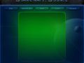
It looks okay, try to change the font to "starcraft" and put back the blue background.
i like it:)
why are there four icons?
time to flex my nerd-ism lol.
lets see, Zerg, Protoss, Confederacy, Brothers of Korhal.
if you wanna get really technical they could also be one for the UED in the place of the Confederacy.
very nice :D though i think i agree with Playerh3ll about the wallpaper
me too! personaly I think it´s too colourful,
the starcraft univers is dark...
more gray and black and warscarred machines!
This looks more like DUNE...
I think all you need to do is change the brownish coloring on the top back to dark blue and it will be fine. The icons are good, but seriously, why 4?
the buttons are better, but the body/information area needs to be changed...
becouse there are more than 1 human faction in starcraft, if you ever played the original.
Honestly have no idea what the icons are within the lore. Anyway, I personally believe that your first draft was closer to home than this version, but it is only my opinion