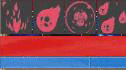
Our new HUD includes brand new spell icons for every spell, cooldown timers for all abilities, and a complete visual overhaul. In this update I want to cover a few of the HUD elements and why they are important. First off, here is a look at a few of the new icons and the cooldown timers already in our internal build. A couple more tweaks need to be made but these are very close to patch ready!
While fairly standard in MMOs, we knew this little feature would help players get a much better handle on spell timers and allow them to make better tactical decisions. Along the same lines we didn’t want players completely reliant on looking away from the center of the screen to judge cooldowns. In the heat of battle we understand how important it is to stay focused on the action and so we’ve also included new cooldown indicators just below the crosshair. You can see them in action here:
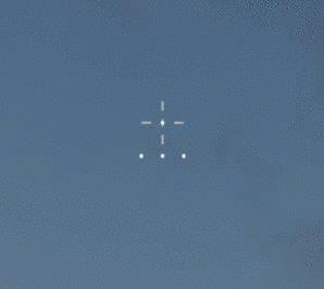
Whenever you cast a spell the corresponding cooldown indicator will darken. It will light up again when the spell is ready to be cast. Additionally, the new charge bar takes up much less screen real-estate and fits neatly inside your crosshair.
The best part of all of these new HUD changes is we’ve moved to a system where we can add HUD customization in the future, including the potential for draggable UI elements, different types of crosshairs, and the ability to toggle different displays on and off depending on preference. Those features won’t be a part of this first version, but they are changes that are much easier for us to make with the new UI tech if the community shows interest.
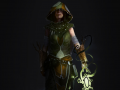
The other big thing coming up in the next patch is a completely new main menu and class selection menu. The main menu is already complete and the class selection menu is well underway. Check out the concept pictures from earlier updates if you want to see what it’s going to look like- because it looks exactly the same in game!