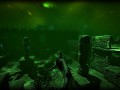
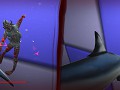
Depth is a PvP multiplayer game which blends heart pounding tension and visceral action in a dark aquatic world. Playing as either a diver, or a shark, eliminate your enemies using a combination of stealth, cunning, and teamwork.
More tough choices
(view original)

Post a comment
Description
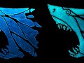
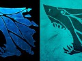
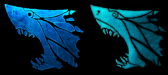
Based on the feedback I received from the first set of emblem designs, I have pitted the winner from the first round against a new contender which incorporates the best aspects of the righthand and lefthand emblems. The winner of this round will most likely be our final emblem design!
uuuuuuhhhh.... UUUUUHHHH, can't decide!! they are both beautiful, you evil, evil creature XD. I feel I have no more option that choose the left one, but i still like the otherone too T_T
Good work as always guys!
Love the lef tone.
yapp, left one ftw. +1 :)
Left one, is what I vote :)
Indeed, left.
Left one +1!
Left one looks better.
Right one is so badass! Ahh that's awesome!
Right one. Maybe without the eye, but the right one is definitely more pleasing to look at. Left one looks like I've seen it's kind one too many times (like if it had hideous b-movie brothers).
Not that the left one doesn't do it's justice though.
Agreed
idd, right.
Agree with "theM3nace". I cast my ballot for the emblem on the right. I would comment though, to keep the eye, but that it be as black and soulless as an actual sharks or perhaps be directly modeled after one.
The focus of mans fear of the shark isn't so much it's nature as it is the complete absence of anything but sheer instinct behind it's deep, black, empty eyes. IMHO, the emblem should strive to express that in addition to it's great artistic style.
Right one, if remove the eye
Left.
Right with out the eye, atm left but only by a pinch, both look great.
Think the left one is perfect
Right.
Definitely the Right icon. I love the green fade and the rough texture
Right, deffo.
left
I have to go with the left one; the eye black looks better and more menacing. Also, the shading looks like the ocean, what with it getting darker as you go down.
The left one is better IMO
Right one looks much more professional in my opinion but overall they are both great.
Left one. The black eye makes the shark look more deadly.
Although the right one with the black eye would probably be the best.
Left one. It seems darker and sharper.
Left > Right
Right one without eye.
left one, i like the deep blue.
Right one is better :D
I like the left one better. If you make the eye on the right one like it is on the left, then I'd probably like the right one better.
Like them both but the black eye looks better.
Left again, still looks meaner and the darker colour is more powerful.
ohhh decisions decisions, the right looks as though the ice is shattering from the back of the head, maybe with a hollow eye like the left it may look better, the effect it has on the left is good.
The right also highlights more scratches & marks, however the left is definitely the better contrast to the black backing.
Right one, it has more of a tropic color.
Left, but lighten the teeth a little, to focus on them some more. That seems to make the right one more menacing/ give it impact.
I like the brighter, more tropical (and possibly, contrasting to the mood of the game) look ing one on the right.
Right one all the way!
Left one!
The right one!
Left
left
has darker colors and the eye at the right one looks just wrong
Left one!
I like the right one, but the left simply fits the game better.
In these situations, I take both designs and mix the best of both of them :D
I73.photobucket.com
Definitely the left one. The colour scheme is darker and better conveys the idea of the deep oceans, as well as having that terrifying black hole eyeball that is so iconic in Great Whites.
Left one.
right
I'd go for a combo of the left and right. The left one looks more 3d than the right (3d is a good thing), but I like the "icy" color of the right one more. So if you add some highlight to the edges of the right one, I'd prefer the right.
If you're too lazy to do that: Go for the left.
The right for it's colors, the left for it's design.