Hey guys,
This is the start of a new series I will be adding to the blog. It will focus on our design process for Party of Sin. This will be a set of articles focusing on how we designed the levels, weapons, puzzles and story… give or take. We will also hear from Vince, our Lead Designer, in some of the posts.
Before we dive into the first design piece, I wanted to give a shout out to Xyrom for winning the Environmental Guessing Game Contest 2010. To see the actual press release for announcing the winner along with his prize, visit PartyofSin.com and wait no longer!
Moving on to the design piece, we decided to start running these pieces because we thought we had a pretty unique design process that would be worth sharing. In the end, we do not know if this process will hold true and we are looking to you guys for some feedback as to what might you change or encourage more with our process.
Level Design Basics
Level design at first was tricky for us because we had three elements we needed to include in each level: combat, platforming and puzzles. To ensure that each brought a unique element to the level without generating too much clutter or filler was the challenge. The reason it was so tricky is because when you look at a game like Metal Slug, its primary function is combat and has very minimal platforming. On the hand, a game like Little Big Planet has zero combat but tons of puzzling. When the game puts more weight on one of these elements, the design process is more focused and easier to handle. In our case, we put equal weight on all three elements because Party of Sin is defined as a platforming-shooter with puzzling elements.
To address this challenge, we decided to emphasize a progression throughout the game. Instead of having all 3 elements in each level, we decided to evenly sprinkle them across each world. For example, as players break out of Hell, they encounter a police force of angels. Therefore, the first level is extremely combat oriented while using platforming and puzzling as complimentary elements. On the other hand, when players enter Earth for the first time, they will be fighting less and challenged with challenging puzzles. What we hope to achieve is a less sequential game and one that is more open and unpredictable. For us, there is nothing less interesting than knowing what is going to happen before it actually does!
Memorable Moments
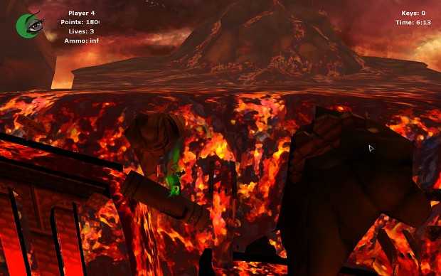
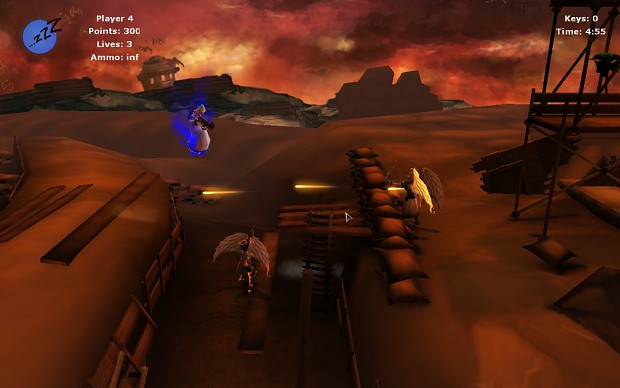
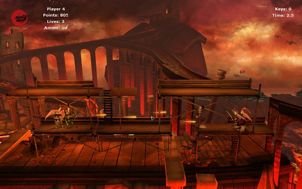
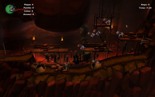
Once the overall level design process was established, we developed a set of guidelines that would be invisible for the player (until now) but would make the game more “fun”. This was the inclusion of what we called “Memorable Moments”. This asks the question “What parts of the level do you want the player to remember after they beat it?” I think this is our most unique approach to designing levels and splits up the process in a very simple manner. It also allows us to label each section of each level and track repetition or filler across the entire game. To refer to an in game example, the second level of Hell (Hell2) has four memorable moments: battle trenches, scaffolding, lava coaster ride/waterfall and underground cavern. Once these parts were completed, tested and approved, they were plugged together to create the entirety of Hell2. We then started testing again… and then again.
Here are screenshots from our four memorable moments in Hell:
Embracing the Art in Design
One of the aspects of Party of Sin we are proud to show off is the unique art style of each world. This means that each style adds something new for the player to look at and soak in. Vince wanted the player to have the opportunity to enjoy and observe the new style without being pressured by enemies or puzzles. How do we do this without making the first minute of gameplay of the new world boring? We put mini games/goals at the beginning of the level to keep them entertained and moving forward at the same time. What would be the point of spending resources in developing unique art styles if no one will be enjoying them.
Hope you all thought this was insightful. Stay tuned for more design pieces. In the meantime leave some of your thoughts in our forums.


I can't see the images on fullscreen, it says that the page wasn't found :(
The idea of changing the 3 elements level thing is really nice, but you also put some spoiler there, I didn't know that we were going to Heaven and Earth... Still, your game seems to be very unique, I never saw a game like this, with good concepts, really constant updates, etc.
I'm impressed with this, be sure that when you release it, don't just stop developing games because of Critics, most of them are paid to say bad/good things about games and make less companies on the world.
I'm already waiting for more updates, keep them coming!!
And w00t! It was Canada in the future? Ah man I wish I lived in a 1st world country.
ERROR! 404 on the images
All images are now viewable... this is what happens when you're doing work at 3AM
Not fixed for me. I still get an error.
"We're sorry, but there seems to be a problem viewing the media requested. If you'd like the boring old technical reason for the error this is it:
"The media requested could not be found.""
This is looking extremely nice! keep up the great work!
The art style looks very good, even at this WIP stage, and you clearly have a good understanding of level design, knowing not to confuse things. (The joined up set-pieces idea is hardly new, but as you've recognised it is used in most good games, which means this is promising)
If I can forsee one issue, it's that the characters (sins and enemies) do not stand out enough.
even in these screen-shots where the action is fairly low intensity (only 1 player and a few enemies on screen), and even full screen, it is hard to quickly distinguish at a glance where each player is, who they are, and what enemies are present.
This isn't so much character design, but more lighting and size. If you look at the picture with lust, it's actually rather hard to tell her apart from the background, even more so to tell what she's doing. this is probably because she is red and pink, with reddish glow lighting, and is small.
Two of the pictures have distinctive coloured glows, I'm guessing because a power is charged, which certainly helps tell where the sins are, but it is still hard to tell where, for example, they are aiming.
Hope you find this to be a helpful critique.
I'm posting your comment on the forums for the artists!
brilliant character design! good luck!