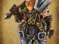
Warcraft III - The Edge of Eternity is an epic full-conversion mod. It's based on the events after Warcraft 3: The Frozen Throne, and it will feature 6 full-length campaigns.

Possible New Logo?
(view original)
Post a comment
Description
Alex has been busy making a new logo for us. What do you guys think? It's not as dark and gritty as the previous one, but I quite like the unique design. Enjoy and discuss!
It's not bad but make the Of larger so it fits more into the wood.
But the logo itself looks a bit weird since I see a W and a I in it. Not a III or a IV.
empty space before 'of' doesn't fit very well...
But other than that I really like it. More than previous.
Ummm, no. Can't read IV out of this.
Well if you read a while back we changed it from Warcraft IV to Warcraft III for legal reasons (we didn't want Blizzard to shut us down). The way this looks right now is like a mix of a III and a W (for Warcraft).
Looks way too... Immature. Warcraft needs a darker feel.
It's warcraft, what did you expect? :P It's about as dark as a D&D novel.
I thought you were trying to make it less cartoony?