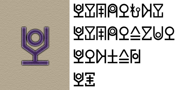
Before I alreday introduced alfabet what I will use for styling. Some of that letters looks good in middle of word, but not so good if use them in front, as capital. So I added some new or change looking of them.
1. Imperial I.
Letter "I" in previous version looks "empty" if place it in front of word. But in Dune universe words like Imperium, Imperia, Imperator, Imperial, or name Irulan started exactly from this sound. So need to add more monumental looking letter to place t in front of that words.

This letter also can be used in middle of words as "Long I" (like "ee" in English, "ie" in German, "ī" in classic Latin, ...)
2. Kapital K.
Standart "K" also looks "empty" in front of words. But from this sound started Caladan, Kaitain, Corrino. So there is capital form of this letter. But, compare to Imperial I, this is not another letter, this is same letter, just different font styling.

3. Grand G.
This sound also using in some proper names (Giedi, Gesserit, ...), so need to make capital style. Same as Kapital K - not another letter, just different font.

4. Nominal N.
Another styling to make it not looks so empty.

Grammatical Explaining.
1. Double letters.
In Dune Universe using double letters in some proper names (HarkoNNen, aRRakis, GeSSerit, RaBBan, ShaDDam, CoRRino, ...). To write it shorter, you can place "double moon" in top of that letter. So, if you see letter with "double moon", you will know, this letter need pronounce like double.

2. Yoting / Joting.
If you want to write vowel with [j] sound in front, no need to write 2 letters too, just add "segmented line" in top. If you want sound like "Ya" in English, or "Ja" in German, just write "A" with "segmented line".

Corrected font example:


Great work, I do think those are solid improvements.
What are you using to draw then characters, photoshop, Illustrator?
Just Photoshop.
I already have font if you still interested. But now it replace only Cyrillic letters.
Sure, I would love to take a look!
Alright, I will upload later :))