Poly_G
Cartoon Enthusiast joined
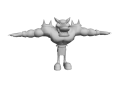
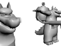
I make character models and environments. As of now, they are utterly lifeless...


Cortex_Textured
(view original)

Post a comment
Description
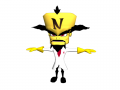
Three colors stand out to me most from both the original Cortex design and the new one.
Original Cortex: Yellow, white, and black.
New Cortex: Yellow, white, and red.
How do I combine the original design with the newer (CNK/Twinsanity) one without ending up with too many colors and too much detail?
Well, I'd like to think that this is somewhere in between; basically just his Crash 2 design with red accents. Keepin' it as simple as possible for now, so no buttons, material shaders, or metallic trim on his gloves/boots just yet.
Fun fact: The 'N' I on his forehead is actually in Crash bandicoot font right now. Looks pretty meh to be honest... Might change it later.