I wrote up a quick piece about the visual style on my TIG thread, so I thought it would be a good idea to mirror it here!
1. The top graphics seem to be in a different style from the bottom. The top looks like video game pixel art, the bottom looks like a slick app.
2. Shouldn't Shuffle/Clear/Submit have some border around it so you know it's a button to press? I feel silly asking because you can tell from the words that they're buttons, but it just doesn't seem conventional.
For the two visual styles, I think it works okay, even though it's a bit unconventional.
This was something that I struggled with a lot when I started. I don't have much art experience, so I had to pick a style that I knew I could pull off. I also knew I wanted a huge amount of enemies, so it had to be something I could create fast. Enter pixel art!
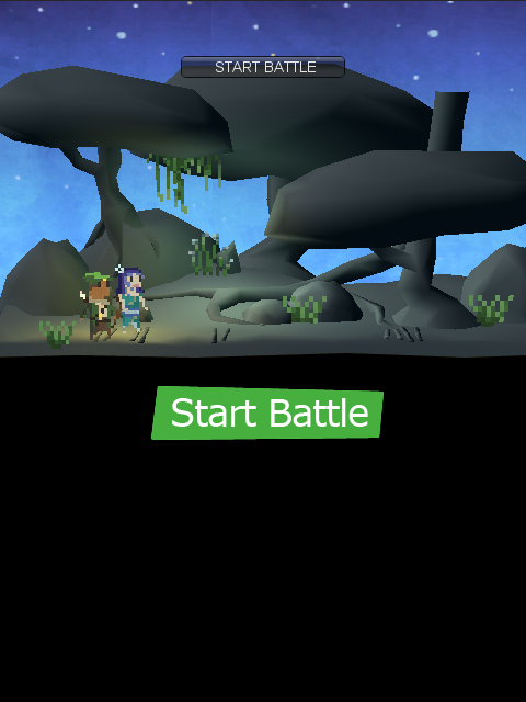
For the backgrounds, I actually started trying 3d, since I have more modelling experience...

Right away I knew it wouldn't look good :(
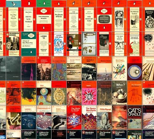
So I did pixel art for everything. But on the bottom, because it's a word game, you need everything to be nice an clean and clear. That's when I started to adapt the book cover inspiration. The whole game should look like one of those old Penguin Book Covers, and the top pixel art is just the illustration to the story

As for the buttons, you're right, it's a bit odd they don't look like buttons. When I started, I had these strange cutout buttons. They didn't look great, but it was obvious you could press them.

Obviously this style of button REALLY clashes with the pixel art and the clean text. So when I decided to go for the book cover aesthetic, I started to strip away as much as I could, eventually leading to just text.
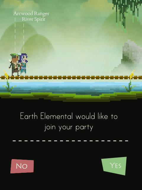
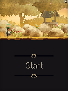
You're right that it being obviously a button became a problem, but, because I use this style everywhere, you learn pretty quick. For example, when you start a level, you see this screen :

This reminds the player that buttons are simple text, and also hints that the bottom of the screen is where all the interaction will take place.
In most cases, the buttons are also coloured quite dramatically compared to the rest of the text, so that helps too!

