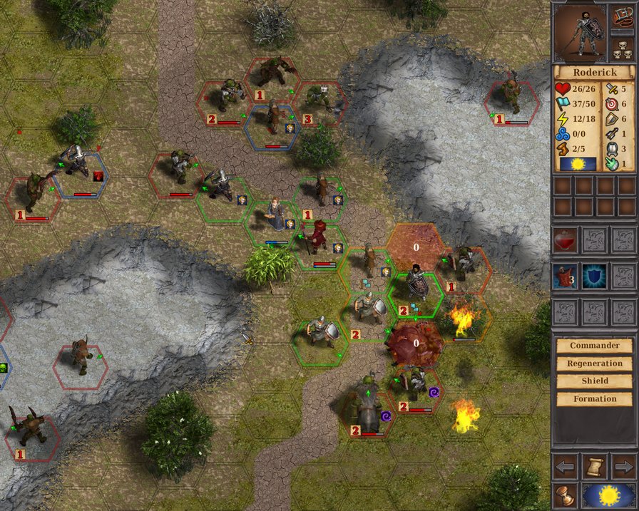
Warbanners is a turn-based tactical strategy combat game mixed with RPG elements set in a brutal fantasy universe.

facilitates interface...
(view original)

Post a comment
Warbanners is a turn-based tactical strategy combat game mixed with RPG elements set in a brutal fantasy universe.
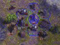
this is massive improvement in UI clarity. I see unit now. I even start to like the game looks now.
1.
shield-men has a metal shield. They looks like cheap unit, maybe you could give them wooden one?
2.
enemies (orks) looks like blurred stain, its hard to distinguished where they have arms, where torso. Maybe on game it looks better.
3.
little green arrow (unit facing direction), looks odd.
maybe you could remove green arrow. And highlight green/red hex frame at the one side the unit is facing?
Mediafire.com
line colors in my mock up are too bright, but you should get the idea.
I try somewhere to remove the hex frame and leave only front line - I think it could be a good change.
4.
there is a BIG contrast in right panels icons esthetic.
there are some dark toned skulls, or skills at the bottom - looks decent.
Change please: heart into blood drop.
there is also ugly green magic resist symbol (i belive) under plate armor icon - what that suppose to be?
screenshot compressed, reduced quality...
About units - edit sprites units we will be up to the release. Yes, I think some of the Orcs need to adjust.
"ugly symbol" - Magic Resistance.
about icons - yet they will not be changed. But think about it.
about "remove the hex frame and leave only front line" - brilliant idea! I really like it! Many thanks! I do.
S019.radikal.ru
сладкий Иисус ортодоксальный
I didnt think it will look such good. It looks "natural" and there is not too much garbage icon on the screen.
Units are nicely exposed.
Still I didnt like the big AP numbers, could you do some experiment with removing the paper-scroll background at least?
Without background I do not very much. Confused with damage:
S019.radikal.ru
I'm very grateful for the advice! I added you to the "attribution".
right, its better with paper