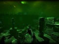
Depth is a PvP multiplayer game which blends heart pounding tension and visceral action in a dark aquatic world. Playing as either a diver, or a shark, eliminate your enemies using a combination of stealth, cunning, and teamwork.

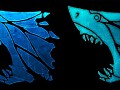
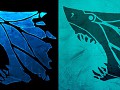

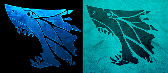
Emblem
(view original)

Post a comment
Description
Hey guys, we're working on an emblem to represent the game. Which variation do you like better?
the left, looks more deep-sea and would work on more backgrounds, the right one reminds me of ice too much for some reason...
Agreed
Me too
Yeah
this looks so so good
thanks for the feedback guys!
I prefer the one of the right. A lot better than the left.
Maybe it's not as deep-sea-ish but I think it's better.
Me too. Love the colors.
Mevotes for left. Looks scarier... :)
Yeah i like the one on the left, the one on the right looks kinda like something you would see on a piece of shark hunting equipment, while the left really looks like a deep sea emblem kinda thing. They're both great though.
I say the left. It's simpler, and has nicer effects overall. i'm not digging the textured background from the right side.
I vote for left. Both are good but the left is just spot-on. Like it's made for this game :P
Left, it just looks a lot sharper and packs more of an impact.
I agree with the left as an emblem. (the right looks like a flag material because of the scratches or whatever they are (I would loose them and have a solid colour instead).
either way left for me.
I have to buck the trend and say the one of the right; it looks like you're peering into the ocean and finding the shark. I won't buck the trend in saying that they both look excellent.
Both of them are great (they are the same thing anyway, just with different colors and effects) but I think the one on the left is more interesting.
They are both great, and I would like to see them both used... perhaps one for smaller icons and the other for larger? If I absolutely had to choose one though, it's the left, though it only wins by smidge.
Left has a more stunning effect, but it's not as pleasing to look at as the right one.
Right
I like the right one, it has more defined shapes and the shark looks like it's out to mindlessly eat someone, the left one has more of a yawning expression.
As a logo, 100% left. If you need a more subtle variation/mark, you can always indent it into a colour, which is what the one on the right is. Not really a decision...
I like the right one!
Right one please, and also, add some scratches to it, or bites :)
left
Right looks more like shallow, non-threatening tropical water.
Left looks menacing and scarier.
most shark attacks happen in shallow water :)
left
left
Left is better. Put the dark blue shark emblem from the left on the light blue background, gues that would work better.
The tribal look of the one on the right makes it boss.
left !