| Posts | ||
|---|---|---|
| Joan Sword by AmnesiaGames | Locked | |
| Thread Options | ||
| Jun 23 2014 Anchor | ||
|
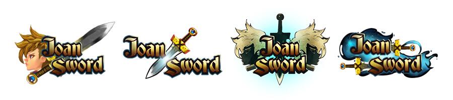
Hey everyone! we wanted to introduce ourselves to the community. Our name is AmnesiaGames and we are an indie game developer company from Chile. We are developing a platformer Action-RPG game for OUYA, NVIDIA SHIELD, PC, PS Vita and Android consoles that's called Joan Sword. We want your feedback about the game and to help us decide wich logo looks better for the game! Please answer this poll (the shortest poll in the history of polls) and choose your favorite logo for Joan Sword! -> Goo.gl <-
Hi guys! here are some gameplay pics from the first level of the demo of Joan Sword! please note that these pics are still in development and nothing is final. Enjoy
Edited by: AmnesiaGames |
||
| Jul 3 2014 Anchor | ||
|
Hi guys! I uploaded some gameplay pics and we would like your opinions and feedback S105.photobucket.com THANKS! |
||
| Jul 3 2014 Anchor | ||
|
Nice On your screenshots, the hero and ennemies are quite nice (I love the skeletons). I have the feeling you could do some improvement to the background though. Sometimes, it feels empty, like on the screen like this one (but I realize, you might not be finished with it?):
Also, I notice that the contrasts are sometimes a bit confusing. For instance on the screenshot below, the thighs of the hero blend with the background because everything is dark. On the inverse, on the big boss screen, it feels like the women stands out a bit strong, considering it's just decor. Maybe the important things should contrast more, and the decor things a bit less?
That being said, it's a really good job. The big boss is quite impressive |
||
| Jul 4 2014 Anchor | ||
I really appreciate that you took the time to analyze the pics and share your opinion with us. You're right, some backgrounds are not finished yet (like the one for the survival arena). About the boss, is from the cutscene of the beginning, that's why Joan is a little bit dark, but yeah... maybe the background IS taking too much protagonism hahahaha we will work on the contrast details. Thank you again for your feedback! :D Hi everyone! we closed the last poll and selected the 4 logos people voted the most. Can you help us definitely decide from the top 4? THANKS! :D -> Goo.gl <-
|
||


 Obtaining your first ability.
 Climbing the walls!
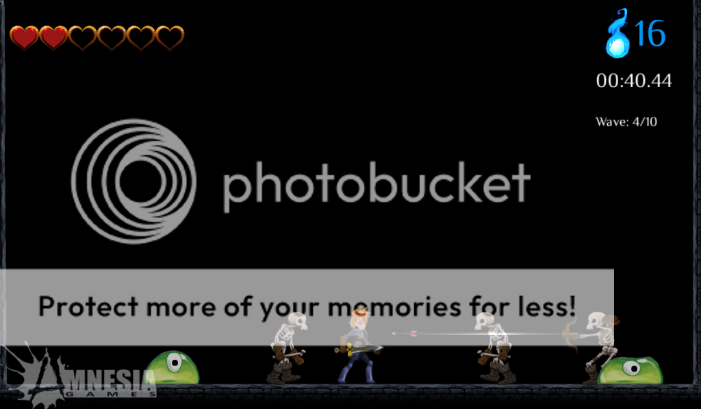
 The survival arena.
 The first boss!
Only registered members can share their thoughts. So come on! Join the community today (totally free - or sign in with your social account on the right) and join in the conversation.