| Posts | ||
|---|---|---|
| C&C Crimson Dawn: Logo Opinions | Locked | |
| Thread Options | ||
| Dec 17 2004 Anchor | ||
|
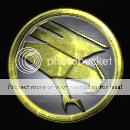
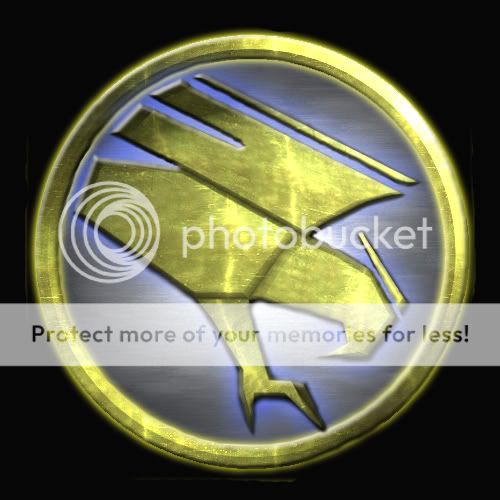
Over at Command & Conquer: Crimson Dawn, we have two new versions of the Universal Defense Initiative logo, and want to know which one you guys and girls prefer, as it is for you we are doing this. Version 1: Version 2: Votes can be cast here, unless there is a poll option on these forums which as cunningly sheilded itself from my "speedy" eyesight. Edited by: matrixnut42 --
|
||
|
|
Dec 17 2004 Anchor | |
|
i like thre blue glow bette but i think the first one would look best -- ModDB Fucking Oldtimer and (ex) Crow |
||
| Dec 17 2004 Anchor | ||
|
First one looks better, IMO. The blue glow may be nice, but it's also kind of silly. -- "He who fights with monsters might take care lest he thereby become a monster." |
||
|
|
Dec 18 2004 Anchor | |
|
can i ask why your seeing which GDI logo looks better |
||
|
|
Dec 18 2004 Anchor | |
|
To see which we prefer, he stated that in his post. I perfer the first, for the same reasons as the others. -- 98% of the internet population has a Myspace. If you're part of the 98% that is an emo bastard, copy and paste this into your sig. |
||
|
|
Dec 18 2004 Anchor | |
|
but he named a completely different group, is it a different group and he just ripped off the logo or is he using another name for GDI? I only played the first C&C when it first came out and enever got into the other newer ones |
||
| Dec 18 2004 Anchor | ||
|
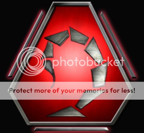
We are aiming to continue the Command & Conquer story line. Crimson Dawn is set after Tiberian Sun, and the GDI (Global Defense Initiative) have now become the UDI (Universal Defense Initiative. Here is the new Nod logo just for reference: Edited by: matrixnut42 --
|
||
|
|
Dec 18 2004 Anchor | |
|
whats different about it? |
||
| Dec 18 2004 Anchor | ||
|
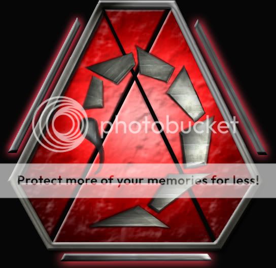
Tiberian Dawn: Crimson Dawn: --
|
||
|
|
Dec 18 2004 Anchor | |
|
tiberian dawns owns yours its alot higher quality, it has no jaggies, it hasnt got the really bad erasing obviousness of the second one. edit: oh and texture quality is better Edited by: embers. |
||
|
|
Dec 18 2004 Anchor | |
|
I liked the Crimson Dawn NOD logo better, it seems much more futuristic, both the scorpion-tail and the borders. Great work -- If you run you'll only die tired! |
||
| Dec 19 2004 Anchor | ||
|
Nod Logo- Revision 1
--
|
||
|
|
Dec 19 2004 Anchor | |
|
thats wayyyyyyyyyyy worse that anarchistic A thing looks terrible |
||
|
|
Dec 19 2004 Anchor | |
|
I like the original crimson dawn better... the rough surface sorta looks rough and flat at the same time. It would look awesome if u could make the edges of the different plates fit the rough 3d shape like when there is a rise, also make the border lookm like it is higher. Dont just cut it flat. -- OMG it's teh Raaaaammmbooo!!! |
||


Only registered members can share their thoughts. So come on! Join the community today (totally free - or sign in with your social account on the right) and join in the conversation.