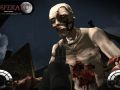
Can you imagine how hard it is to find a new starting sentence every week ? Anyway this week the highly controversial thompson M1A1 skinned by pete (dont start to complain about the reason for an M1A1 again, I can assure you there IS a reason).

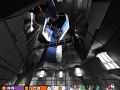
Next a couple of new work in progress shots from JMW's map condemned.


Also this week, a new track from the Nosferatu Soundtrack, enjoy:
In other news tnoh joined the mapper department, and he perfectly fits the style of the game (just take a look at his previous maps)
I also started to update my .plan again, which you should check out , since it reveals some nice insider stuff ;) ( Parapraxis did as well).
Looking good as always. The torch lighting is a nice effect.
Its too soon to critics? I have bad deja-vus from duke nukem forever. PLease, no more burning barrels. Ok?, and no more crates, and no more air corridors. Ok?.
EXCEPT If your artist want to create a burning barrels.
pros:
from condemned4.jpg I like the plant
condemned2.jpg, I like the ground street texture
condemned3.jpg, that one feel humm... better
condemned1.jpg, that one Its Ok if you want to make
cons:
condemned1_thumb.jpg, I hate that one.
Btw the torch/fire effect, will be replaced by some better looking particle FX, so they are basicly just placeholders atm.
What are air corridors ?
Also if you havent seen the first pics of this map check it here Nosferatuthegame.com
oh and btw. what are you talking about burning barrels ? There are no burning barrels on the map :)
The soundtrack is very solid; my compliments! Though in the beginning it can be a bit to vibrant but especially too loud. (I think the vibrantness (word?) would be fine if it wasn't so loud.) Regardless; still a mighty fine piece 'o music! :)
I can't comment to much on the maps though, the posted pics are very dark. But the plant is clearly visible and is indeed very nice.. ;)
it looks like the brightness of the map shots depend very much on the monitor you are using.
In other words: the guy who made those maps has a very high gamma value unlike the rest of the people who are viewing it.. ;P
<b>In other words: the guy who made those maps has a very high gamma value unlike the rest of the people who are viewing it.. ;P</b>
Most people (99%) that play deathmach games on internet adjust the gamma to maximize the visibility of other players. :/
The map looks weak in comparison to the high quality weapon model.
At first, i thought it was something from Quake, or the origianl Half Life.
Not a flame per se, just something that really struck me as out of place.
Well keep in mind that the map is still work in progress and doesnt have much detail yet.
Then 99% of the game designers working on DM are doing something wrong. That or it's just a fictive number you quickly made to get your point across. Which isn't very valid in my eyes; In that way the level designer can make all his flaws look as if they're actually the player his fault.
Simply turn up the lightning a little or compile with a(n) (increased) gamma command. It ain't that hard.
ehm just wanted to post that Tei doesnt have anything todo with the map or the game (it looks like you understood it that way). Also you have to keep in mind that the map plays at night and needs some darker areas to keep the ambient/horror style. Be assured tho that it wont end up like doom3 hehe. Also the players are able to bring some additional light into the maps by using different tools like flashlights and lanterns.
Aside from that we will work on the lighting some more (its still work in progress ;)) so I can assure you that you wont be left in the dark.
nice work :))
the gamma on my monitor is awfully high and it still looks dark :(
Well its supposed to be night after all, so some degree of darkness cant be avoided.
It looks really nice, cept for the fact that the map looks a little red, torches dont make things look so red like that.