ENG:
RED MEDIA RELEASE, DEVELOPMENT STATUS & FEEDBACK
Hello again ModDB!
In this news, we want to tell you about the current status of the mod:
1) So far all essential maps, textures and models have been completed, the remaining time of the development will be devoted to sharpening the gameplay, fixing the bugs and, just as important, to sound design.
2) Community affects the quality of the developing, we heed to your views.
After working with the same maps for quite a long time, you get used to them and it's easy to miss certain shortcomings.
Thanks to your comments, the following things have been done:
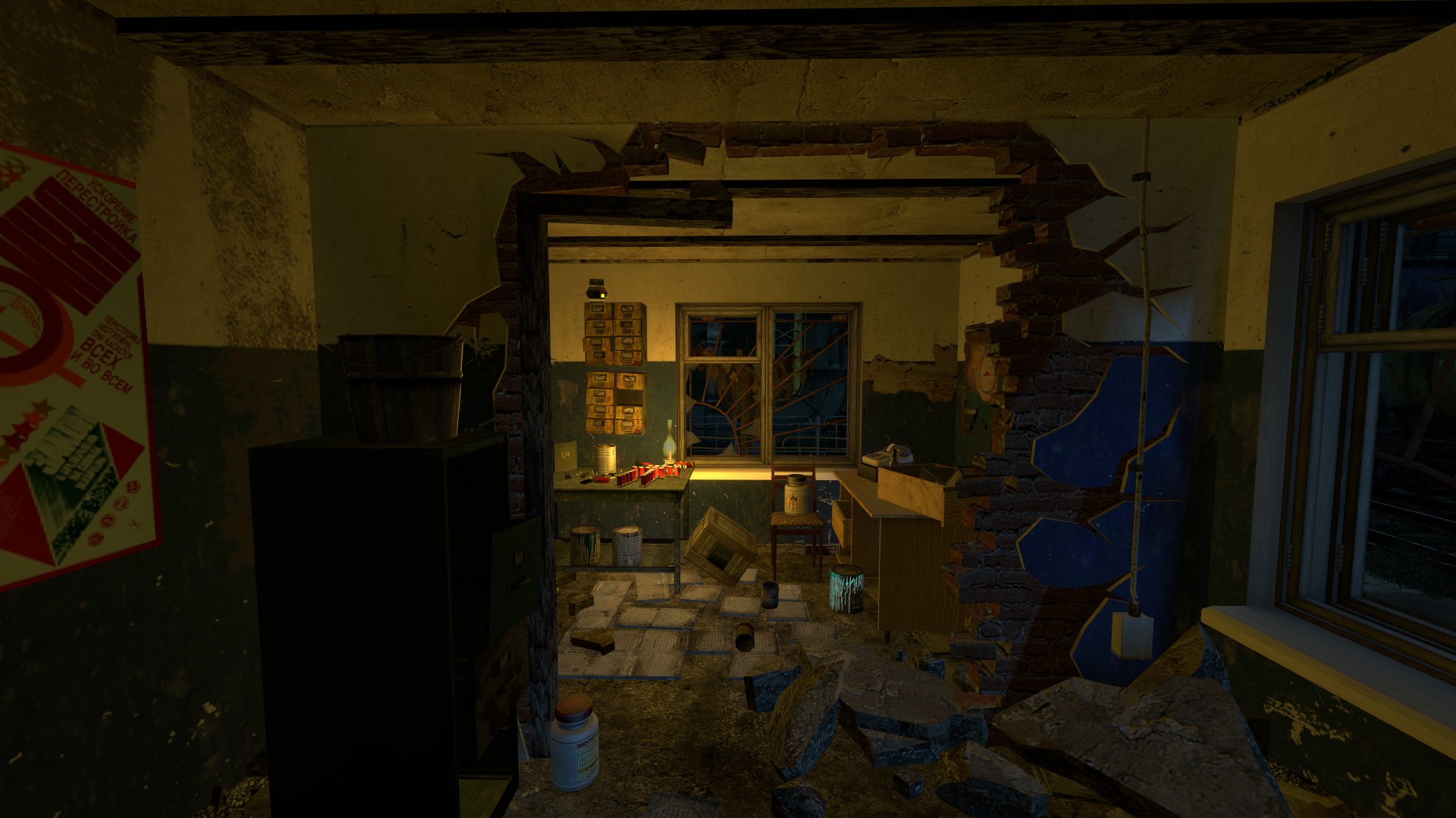
- The lighting has been fixed along with the cracked wall:
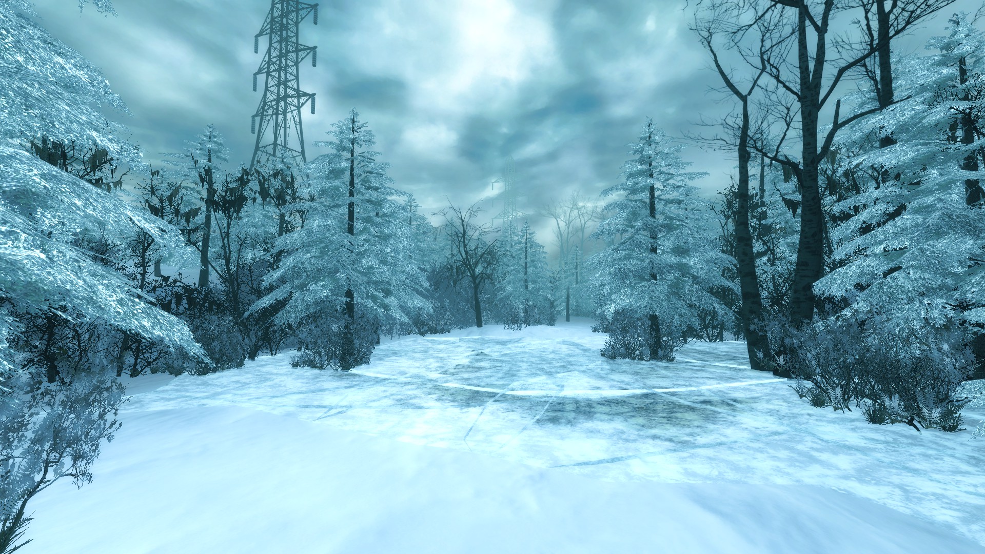
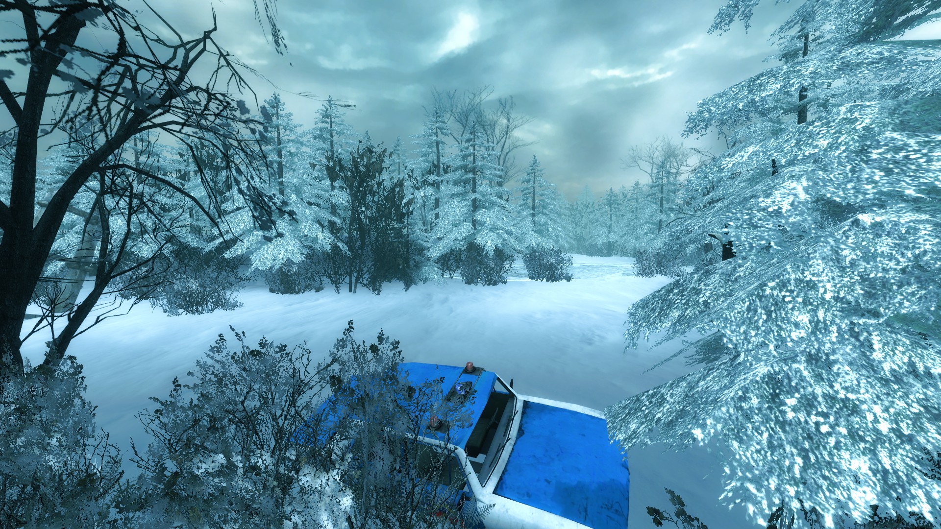
- The intensity of color corretion has been decreased in order to make the picture more pleasant:
- Different versions of menu maps have been tried:
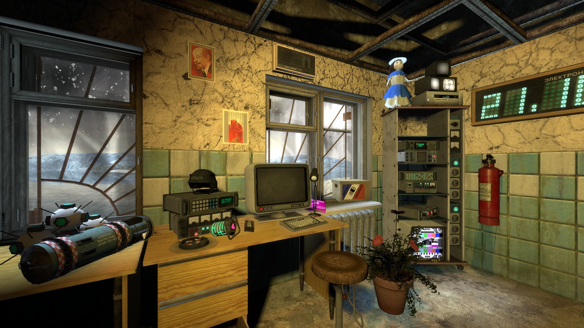
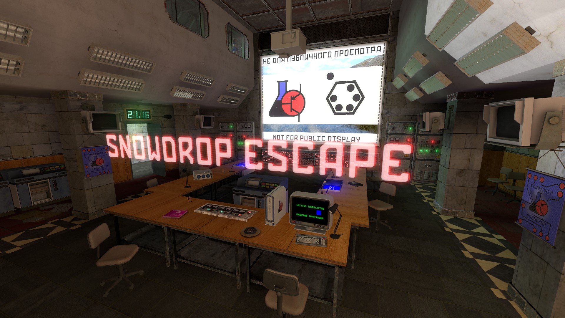
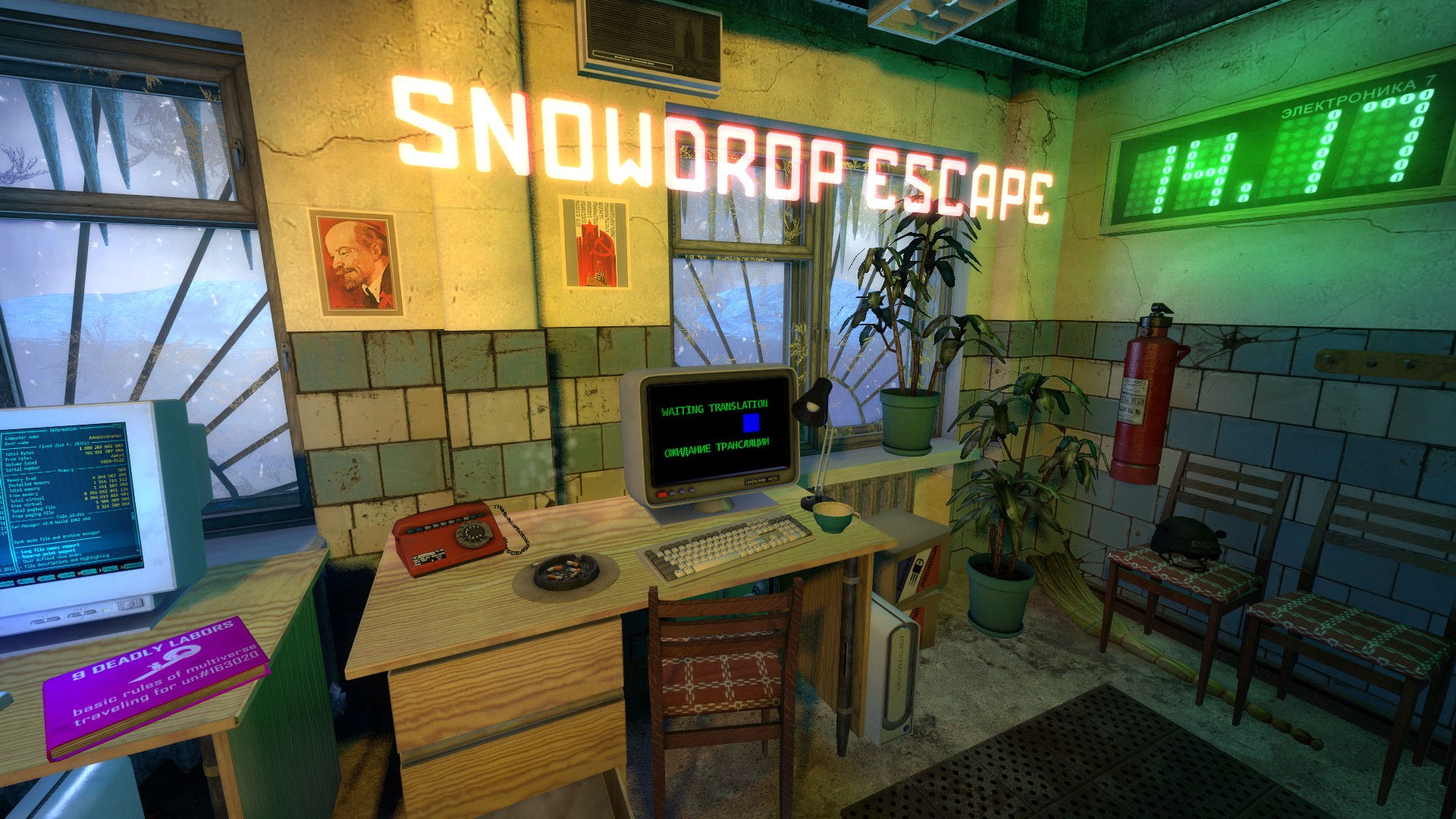
(we also suggest that you choose the most suitable one out of the three options and share your opinion about what else you would change)
3) Thanks to private playtests, the average duration of the gameplay has been identifed:
3-6 hours when playing for the first time with normal speed;
5-10 hours when playing for the first time with fully exploring all the locations;
1-4 hours when it's not your first playthrough & with knowledge of all the locations, hiding places, the number and position of the enemies and solutions to the puzzles.
We also suggest checking out new screenshots: [Gallery]
RUS:
КРАСНЫЙ МЕДИАРЕЛИЗ, СТАТУС РАЗРАБОТКИ И ОБРАТНАЯ СВЯЗЬ
И вновь привет, ModDB!
В этой новости мы хотим рассказать вам о нынешнем состоянии мода:
1) На данный момент все необходимые карты, текстуры и модели готовы, оставшееся время разработки будет уделено оттачиванию геймплея, фиксу багов а также, что не менее важно, - звуковому дизайну.
2) Сообщество влияет на качество разработки, мы прислушиваемся к вашему мнению.
Когда долго работаешь с одними и теми же картами - невольно привыкаешь к ним, легко не заменить недочёты.
Благодаря вашим комментариям было сделано:
- Исправлено освещение и переделана разломанная стена:
- Уменьшена интенсивность цветокоррекции, теперь картинка более приятная:
- Опробованы различные варианты карты для меню:
(также предлагаем вам выбрать наиболее понравившийся из трёх вариантов и поделиться мнением о том, что бы вы изменили)
3) Благодаря закрытым плейтестам, была выявлена средняя продолжительность прохождения:
3-6 часов, когда проходите первый раз с нормальной скоростью;
5-10 часов, когда проходите первый раз, полностью исследуя локации;
1-4 часа, когда проходите не первый раз, зная локации, тайники, количество врагов и прохождение паззлов.
Также предлагаем посмотреть новые скриншоты: [Галерея]
Awesome news!
I think i like the first of the three menus the best!
Despite the two weapon limit, I'm stoked to play this soon. Great to hear the levels just need polishing, the amount of work you have put into those custom props reminds me of the pages of unreleased HL2 mods back in the 2006-2008 era that dedicated entire updates just to show off their model roster.
Oh, 2006-2008, golden era of mods, this years make me fan of hl2-mods
I agree with TimeCrab the first of the three menus is the one i like.
I prefer the first menu too good job !
Второй вариант меню классный.
Wow! Please release soon! All of us can't wait to play it!
it's great to hear you guys are taking in consideration our comments. i'm very glad you chose to rework the color correction in the outside areas. also, although all backgrounds look good i'd go with the last one, it looks more elegant since the first one is a bit too crowded with models, but then again, that's just my opinion :)
Тhank you! Every opinion is important, especially if it well-reasoned :D
The first menu is best with some unusual devices that spark curiosity, and that hologram-looking title just doesn't fit that well so it's better without it, but at same time third picture has more interesting lighting, so if I was you I'd try combining the first and third into one, taking aspects from both. Second one, has some curious elements but environment looks more unnaturally geometric despite the props, and has a less natural view angle. So it's kinda weak.
The map design is so dope!