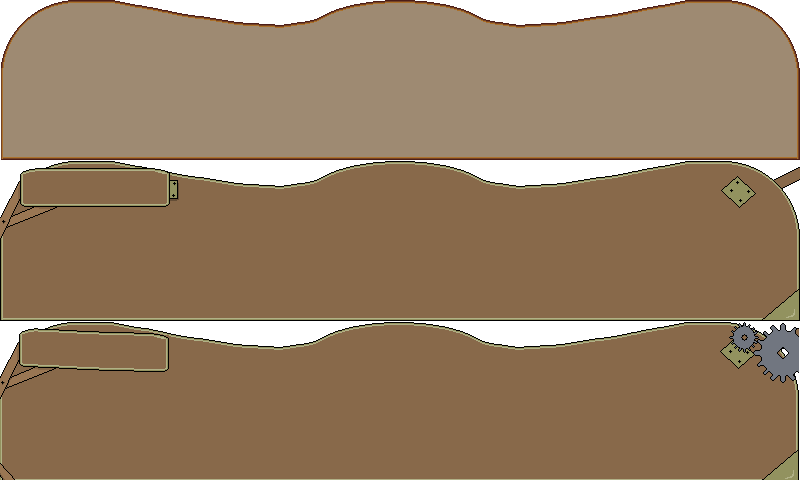
This week I worked on the various HUD elements. Why? I don't know, I am the coder. But we decided to go with a kind of steam punk off-kilter design. The first think we designed was the text box for the cut scenes. I started with the basic shape I wanted, then added a name plate, recolored, and added a couple of details. Then I remembered it can't be steam punk without a couple gears.
Quick mock-up:
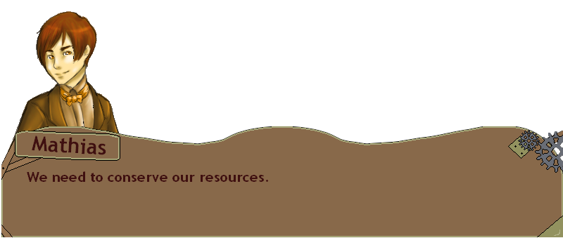
The HUD was a bit easier to deal with because it was smaller. The Health and Resources will be in the top 2 spaces, and your gold in the bottom hanging sign.
Well I think that is it for now, I would love some feedback on the art as I am not really a designer.

Digging the steam-punk idea and layout of those HUDs, but I'd see if your portrait artist could take a stab at them. You'll want them to fit better with the character artwork they go with, and right now they may be a bit too 'rough'.
Hud looks good, simple, maybe a little wood effect?
something a bit like this? I need to texture the brass or whatever it is still, but you get the idea.
Img269.imageshack.us