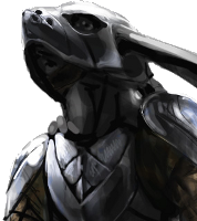
This update, I worked a bit more on the UI for Overgrowth (which you can preorder here). I made a mock-up of the level-select screen, and worked out some rabbit glyphs that may appear in a few places in the game. Although I've never been obsessed with lore in fantasy worlds, I think it would be cool to use these symbols enough for people to start to pick up on their meaning from their context. We talked over a few interesting ideas for the UI, but it's hard to predict what will actually make it into the game.
Be sure to watch it in HD!
One reason it's hard to know what UI the game will have is because it's easy to test for usability and easy to revise. It would be great to try out a lot of ideas and see what works the best.
I've been paying a lot more attention to UI in games recently. What do you think are great (or terrible) game interfaces?
If you liked this video, be sure to subscribe below.
Track us on ModDB (visit our page)


The symbol idea is pretty sweet. When it's all finished do you think we could have a database of what each symbol means?
That map is totaly awesome
Absolutely wonderful.
Love the hand-drawn feel to it all.
You guys are really creative with a lot of your game mechanics, so I'm a bit disappointing to see a basic 'level select' map.
I think an open world (doesn't have to be seamless), with quick-travel options (the map looks nice, use it for that!!), is so much more appealing. I think it's still possible to have very clear progression and objectives, without cutting everything into 'levels'.
UI-wise I always really enjoy 'integrated' UI, eg Dead Space. That 'tech' UI doesn't really work for overgrowth, but health can easily be shown by animation/ character speed/ blood textures etc, and you could have the characters look at a map themselves/ check a pouch for items. The tricky way to do it for sure, but I like immersive UI.
aerozol i like your thinking, maybe like far cry 2, its really free and with a big map, but if you leave it this way it would be great to
This.
sweet
love the art style you achieved here, the map looks really cool, i think the "moving" wave animations could be a bit more distinct, because in comparison the clouds they are not really noticeable imho - and if you can't see it it's not really worthy the effort i think. the symbols work really well too, especially because you are able to reuse them as patterns for cloths or other surfaces and combine them to get different meanings - thats really cool!
i could also imagine a "braveheart style" makeup on the animals faces or bodys with these symbols here... good work. :)
That map looks lovely. One thing I have to say though. I don't really like the spinning around. It makes me feel just a tad natious watching it in such an open space. Maybe have it still? (Though, Zelda 64's map view has always been a favorite.)