A mod for real combat experience in MoW: Assault Squad (more info DMS forums) Real ranges and penetration tables for all guns and vehicles
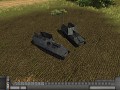
King Tiger Ambush Camo Variants
(view original)

Post a comment
Description
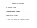
Petition by AwsumPawsum
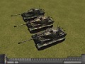
1st in the back
I agree with the above.
The middle one is possibly too bright and vibrant.
The third one is also reasonable, although it seems to have a greater purple hue (they all have a slight purple in the third shade).
I know it seems ironic and hypocritical looking at the King Tigers in my avatar and profile header, but they are intentionally garish and not recommended for combat :-P
p.s. I like that your using an historical palette.
Thanks Baryonyx xD , im trying to get the historical colour palette but is difficult, i cant find the perfect photo xD
I actually had a set of colours from a paint suppliers colour chart who got it as close to the original as seems possible. They had the colours on their website for painting historic models. If only I could find the images I downloaded I'd give them to you. I'll PM you if I find them again.
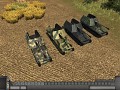
Hi Bary, here the camo with the original colours in comparision with my other camo.
Img3.imageshack.us
They look suprisingly similar after using the samples. Although I still think there is something going on with the purple hue (that might just be the image), the new example is quite dark and its lost some of the contrast and highlights.
Was that using a straight sampling with no changes?
Because if it is I think it shows your own ones are are quite close and that it would be the result I'd expect without adjustments.
Like I said your choices are really quite accurate already, in my opinion they just needs a few tweaks here and there. Some of the best I've seen regarding history.
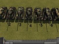
yes, i do 20 or 30 of the camo
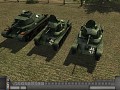
Here more variants.
Img842.imageshack.us
I think your removing too much colour, and the method your using seems to be the reason for the purple tint and the increasing lack of red and green.
Using the third one from the top of this page as an example, I would take the RAL 8017 (Red brown) layer and try to adjust the colour hue very gently to bring the shade closer to the middle one, yet not making it as bright.
I think its the method your using to remove vibrancy is too heavy and you need to find a balance between brightness and colour.
For a game I would usually lighten relative to the real world and reduce the colour vibrancy but only by small amounts.
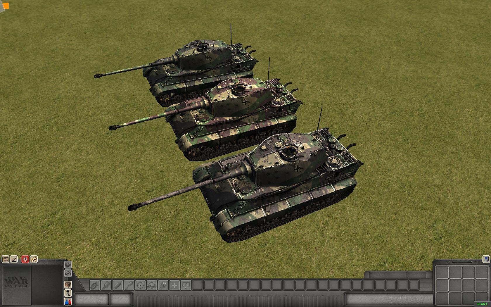
Really cool ambush camo! I would say the second variant is better, cause the colours on the other two variants are too dark to match up with the original hue (referring to the moddb picture).
When looking closer on the middle one I have to correct myself and agree with Baryonyx that its too bright. I would choose the 1st one in the back, but much like Baryonyx, I find the colours too dark. If you could change the dark brownish colour to more a more red brown hint, it would be perfect! Nuff said.
In the vanilla assault squad are no Tiger II are they?
Yes there is.