In The Rising, there is no place to hide, there is no escape, and you will not be rescued. The only hope available for mankind will come from your determination and resilience. The time of avoidance and submission are over. The only option is to resist.
WIP (75%) remake of subway spawn
Post a comment
Its still processing, but before I watch I want to put this out there: You should really consider doing the modern day metro station kind of thing with the balcony's' to the left and right of the tracks. That way the doorway to the surface would make a lot more sense. I cant find a picture (really hard to explain my point) maybe someone here can add on to my comment.
Just watched it, AWESOME!
Hmm, I don't quite understand you. I'm loosely basing it off a San Francisco MUNI station, so it's fairly realistic.
I don't doubt that, it looks really nice. It's just I don't live in a 'major' U.S city and when I visited Chicago a couple of years ago I went into a subway for the first time and basically came to a platform where I paid for my ticket and then walked down a hallway that had a railing overseeing the tracks if you will and then took a corner and walked down a set of stairs similar to the one in your video. I probably pre-maturely made the assumption that that's how a lot of subways all are. Anyways, I cant find it...but still I think something like this https://www.youtube.com/watch?v=kBhAdx7KKNU instead of just going from subway to street level would work better.
Spooboy loves creating more work for me!
I hope that's a good thing :O
Haha but thanks for being cool about it. Glad to know you are there to give feedback with the community.
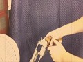
I like this map much better (less default look) but I am not a big fan on that Mac 10, more specifically the stock. The stock is first off too low-poly. For something that is always obvious and in view, you should add more detail. Second of all, it doesn't really look like the player is leaning the stock against his body; I would remove it altogether.
Yeah, the stock needs to be higher poly. As for leaning against the stock, you're right, he's not leaning against it in the hip view. He leans up against it during ironsights (that's why you see the weapon get pressed closer against the screen).
I'm pretty sure the bent look on the stock was intentional. And he's aiming from the hip. It's obviously there for aiming down the sights.
The stock gives the UZI much more character when comparing to most others.
EDIT: Mat got to me first.
Amazing work.
I love the lighting
Omg..I have never seen this much detail been put into animations for a mod before.. that Mac 10 reload... I was woww...
Excellent work!
This is AWESOME stuff! Hehe Also I didn't expect the jailbreak add. LoL!!
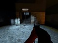
For some reason, the Glock's slide seems to pull back after you draw another weapon.
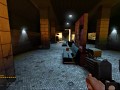
As for the map, I'm pretty sure you haven't quite prioritize misc. prefabs like garbage yet. Other than that, it looks quite solid.
Yeah it's still a heavy wip.
This is AWESOME! I love this mod, and I cant wait until it's release.
But, just a minor thing I saw in the video, the aux-power bar. it still has the same style as in hl2...
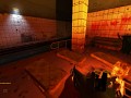
Looks good. It seems to feel a little less secure than the last one, almost like monsters could come flying out of the dark along the tracks to rape your face off. :P
One itty bitty nitpick thing, the little ramp of junk looks a little too organized.
I'm not liking the glow sticks fire and ad signs...
Hurray for mattresses ;) and I'm digging the radio and ad signs, as well as the tunnel approach in the beginning
Absolutely 100% incredible. If ANYONE had any doubts about this being an instant download, then this would change their mind.
Great work guys, I'm looking forward to an official release, because, this is realism at it's finest.
-Deremix
Animations are flawless. XD
I hate you so much for being able to play...
The ads look a little ugly don't you think?
Make it a little darker, too many lights, just that barrel with flames would fit more an "apocalyptic" look (yes sorry for the english if I wrote it wrong), but anyway, it's already really nice, I would like to see it darker and without doubts, it's really great, can't consider it a WIP.
Feels like the gun should lag a bit more... seems like its glued to the player's head as it is. I'm picking holes, sure, but it's something that's always felt "off" in Source games. Oh and the drains in the floor texture are kind of out of place.
What drains?