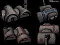
New texture and normal map method image - Rise of the Mandalorians mod for Star Wars: Empire at War: Forces of Corruption
The Empire has fallen and a New Republic is born out of the conflict. But in the ashes of civil war, yet another life stirs...

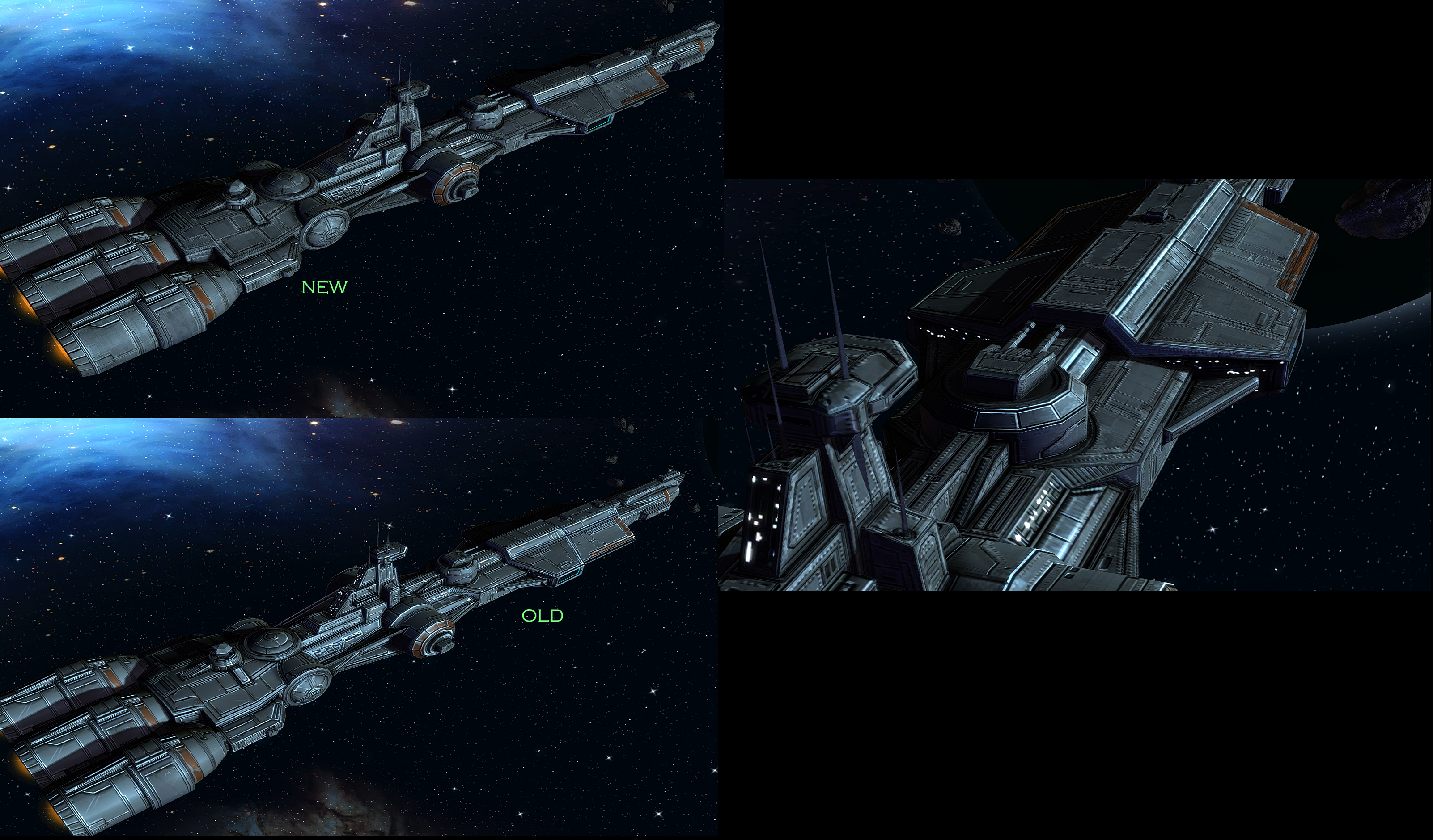
New texture and normal map method
(view original)

Post a comment
Description
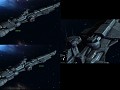
A new approach to texturing with more realistic weathering and more details such as rivets. Also, better normal map process. Compare and leave comments please!
I like it. Its always inspiring to see the top modders out doing themselves compared to there old work. It really gives me the inspiration to keep going with my own mod
please dont hate me; but i dont really see a difference between new and old :(
I see more scratches and some places more dark in the new texture
The normal mapping is way cleaner and more accurate. The weathering is more realistic. Rather than giant scratches and scoring lines, its worn corners and panel edges etc.
Only issue I see is those rivets are gigantic considering the size of the ship, and there are too many in my opinion, there are some spots where they look nice but the upper/top hull looks a bit saturated. I like your old clean style, and I think if you try to go somewhere in the middle between them, it'll be spot on. My feedback:
Reduce the ammount of rivets, specially in the armor plating on the top hull. So you still have some rivets, but the areas are cleaner, I also like that you added color variation to the armor plate, giving it a more star wars classic look, but I think you over detailed with the rivets. I think rivets would fit smaller ships better, or at least in a reduced ammount. The scratches and other details are very nice btw.
Overall, I'm impressed you are still trying to improve the looks of the mod, I already thought your work was breathtaking, what a way to start a new year!
Next time you drive over a bridge, look at the riveting on that sucker...its huge! Rivets can scale depending on need. However, they are a bit strong in the normal mapping and i intend to reduce that. Overall, the surfaces are still quite clean but especially on the larger ships, i wanted to add more detail and change the way i weathered the edges. Trying to stay true to the athstetic of the mod while improving the look. The "comic book" style is actually somewhat controversial...
I'm personally a fan of the ''comic'' look, but as you wish, at the moment those rivets pop up too much imho, but if you can reduce its normals somehow, and bring up the rest of the ship details by doing so, it could be awesome.
I like the comic book look as well. The feedback I'm getting is that you love it or you hate it... There isn't much middle ground lol. I'm trying to bring the comic look a little closer to realism without losing what makes the art style special. I will certainly reduce the rivet normal mapping...it's way too prominent.
Yeah i agree with Nightovizard, the rivets are a bit overboard. I like everything else about it.
It looks good on a single ship, but I think I actually prefer the "comic" look since it's cleaner and visually less busy and confusing when there are 20 ships on the screen.
Maybe try the new weathering but lose the rivets? I can't recall there being visible rivets like that on Star Wars ships anyway.
Yeah that too, for some reason armor plating full of gigantic rivets all over the hull is something I have not seen in sw ships. This change is undoubtedly an upgrade, but the rivets make it look less star warish.
Magnetically sealed durasteel plating ;)
No need for riveting when the panels fuse together magnetically...hence the reason you don't see it in SW often. This was purely an artistic choice because I felt it made it look more like a battleship. IDK, just personal preference. However, if the feedback on them is majority negative, I can certainly reconsider.
I enjoy the cleaner looking old look personally. The new look actually has "too much" detail, and from a distance it actually looks like its got weird low res shadows on it unless you zoom in all the way, which you probably won't do too much when in battle.
I also agree with the others on those rivets, but they might work if you make them maybe less noticeable. I'm a bit concerned that your mod might get a more realistic than a comic book style.
I believe that we have enough EaW mods with "MuH rEalIstIC GrAFex". Mods that have their own distinctive style are far more uncommon these days, because everyone is trying to be (foto)realistic and/or more detailed.
Nonetheless I think that some changes that you made on the texture look good, but I´m conflicted wether those changes are so much better, like this new visible plating, that you also introduced in a fix on the steam release, where the MC ships and the Imperial star destroyers got this new plating pattern, which is at least fitting for the star destroyers, because they looked in the initial realease like some new ones that came out of a factory.
But other than that keep up the fantastic work.
The old one looks way more cleaner and artistically polished.
I love that comic book style.
I actually prefer the Old texture or Comic Book style. It's pretty unique to RotM. The second I see a screenshot that have ships with these textures, I know exactly what mod I'm looking at.
It's not that new one doesn't look good, because it looks fantastic. But that the old style is so recognizable. To me, the style is as much a part of the mod as the Mandalorians themselves.
I love this ship so much!