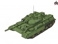
Red Alter was a total conversion based on C&C3;: Tiberium Wars, based on own alternate history of WWII ending and later Cold War, which gone hot.
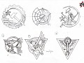
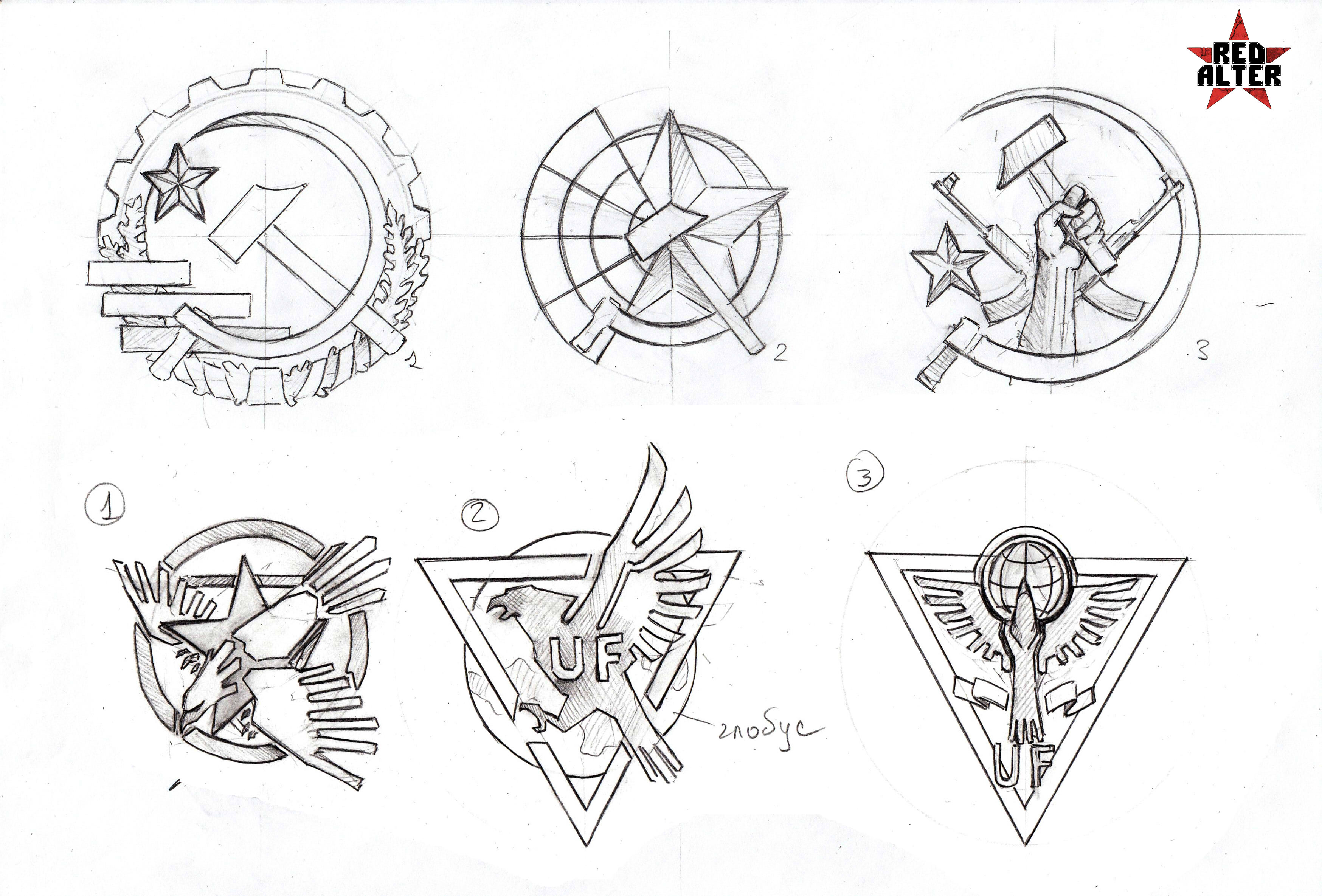
Other variants of the factions logos
(view original)

Post a comment
*Factions :) Looking good, I especially like the bottom-left Alliance logo.
Thanks, fixed.
1. Of the Soviets and 3. of the Alliance
Agreed !
1 for soviets, 2 for allies.
Agree!
2 for Soviet and 3 for Alliance
1 for Soviet and 1 for the Alliance
2nd for soviet, adn 1-2 for allies, logos must be simplier, cose if its to detailed,it will not realy good loocking on units.
I'd vote either 1 or 2 for the Alliance, and 1 for the Soviets.
Both seconds.
2 for soviet and 2 for allience
I absolutely love soviet nr.1 but I wouldnt want to see the others go to waste
Definitely 1 for Mother Russia and 2 for the Capitalists.
For the soviets i stick with my previous choose, UF either 1 or 2.
The fist one looks kinda weird, the star should probably be removed, it feels like the eagle was decapitated by the star.Love the eagle design tho!
We wanted to make the logo look like this - Image.shutterstock.com
If you do need the star there try something like this Moddb.com
By placing the star on the top you fill in the gap in that section. You can replace the star with something else as well.
An excellent variant, but we need symmetry. We try to make new version of logo, based on your suggestion.
птичку жалко ... зачем звездой пришибли ;-)
USSR: 1
Allies: 1, 2, or something looking like logo of NATO => En.wikipedia.org
1 For Soviets, 2 for Allies
1 For USSR 3 for Allies
Soviets 2
alliances 1