The mod you are trying to view has ceased development and consequently been archived. If you are a member of this mod, can demonstrate that it is being actively developed and will be able to keep this profile up to date with the latest news, images, videos and downloads, please contact us with all details and we will consider its re-activation.
Hello I am L()KI. This mod is based in an alternate earth with 3 main factions fighting for their survival The American Empire, Eurasian Federation and Remnant. It is NOT FOR PROFIT. A NON-comercial mod.
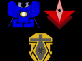
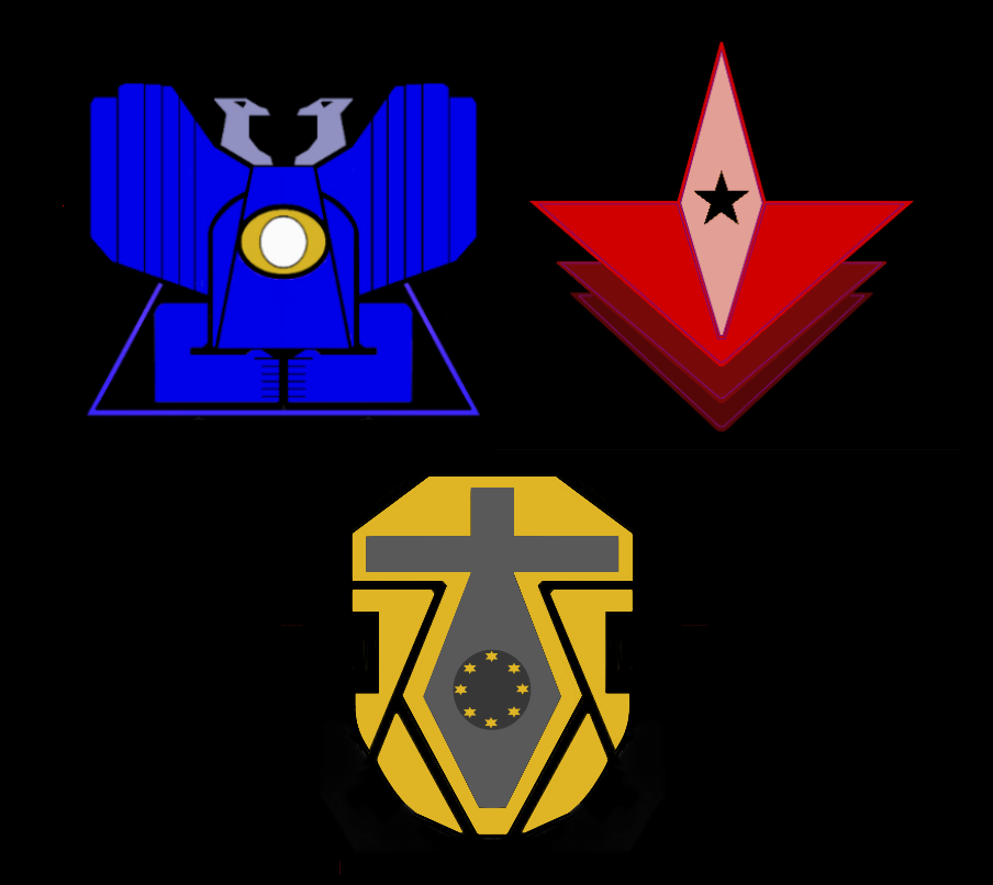
Logo concepts. Need opinions.
(view original)

Post a comment
Description
Here they are, tell me what you think.
Blue is American Empire, yellow is Eurasian Federation and red is Neo Soviets
View original they got squished a bit again.
The American empire logo looks very Native american
Yea it does, never saw it that way before though.
I dont like the first one but the second 2 are great.
Will you be adding shading etc. to make it look better?
Probably for some instances, still need to see how it looks in the menus etc.
I don't like the blue one. I was thinking it might look better if the heads were scaled up. The red is my personal favourite just so simple.
Thanks for the comments.
Hmmmm, which one seems the most evil to you guys?
The Eurasian Federation seems most totalitarian but not necessarily most evil. Probably the neo soviets.
Very original. I like them (Thumbs up) :)
As a concept, they are fine :)
the American Empire logo is kinda freaky considering that the hand have 7 fingers each.. :3
EDIT: other than that they look quite fine
Lol I never even noticed. I think I'll keep it now that you mentioned its creepy. :)