The mod you are trying to view has ceased development and consequently been archived. If you are a member of this mod, can demonstrate that it is being actively developed and will be able to keep this profile up to date with the latest news, images, videos and downloads, please contact us with all details and we will consider its re-activation.
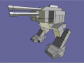
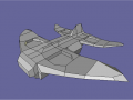
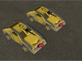
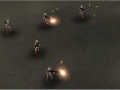
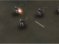
Hello I am L()KI. This mod is based in an alternate earth with 3 main factions fighting for their survival The American Empire, Eurasian Federation and Remnant. It is NOT FOR PROFIT. A NON-comercial mod.
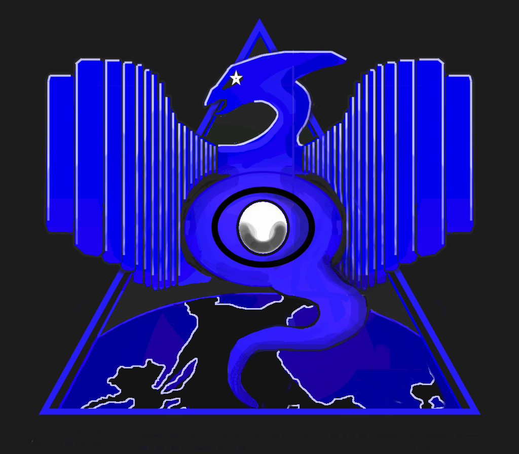
American Empire Rough Logo concept.
(view original)
Post a comment
Description
This is a rough concept logo for the American Empire. It will look a lot cleaner and better when done obviously. Anyway what do you think of the design though?
nice
good but i don't like the the star in the eagles eye
I think that, in comparison with your stlye, this is the best as it is.
hmm yeah delete the star and the tail and it will look much better. IMHO
The tails is good... but that star probably is out of place...
Yeah you dudes are right about the star it needs to go.