The reapers have returned from dark space. With Earth under attack and the mass relays in a state of chaos from refugees and the councils fleet engaging reaper forces the galaxy is a mess. The outcome is unknown, the warfare is devastating. The galaxy will never be the same.


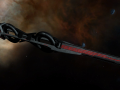
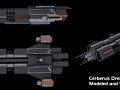
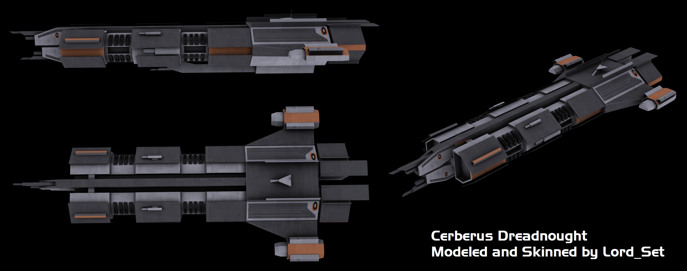
Cerberus Dreadnought v5
(view original)

Post a comment
Description
Going with a new skin type based off Skylines clean cut Cerberus Cruiser. Not close to done yet but this is what i have done so far.
AwSOME!!
The black parts really give it an armored feeling.
Which makes it 42 times more badass!
In the happiest way possible when do you have time to sleep because you update every working, free and sleep time I have???
Also nice skin
It's just amazing how fast you guys work !
Dang now i cant choose a faction. I was almost sold to the council but now... :(
Keep up!
looks very sinister >:) cant wait to see them in action!
still wondering what the small rectangular segments next to the engines are supposed to be...Missile pods? bays? Torpedo holks?
You know what would be really cool for this... but I don't think it would really fit with the aesthetic of Cerberus? Give it a slight perforation of the armor. Just a thought.
Dude.... so many updates in such a short period... This is so awesome. I hope it will look as good while i use it to maintain human dominance!
no offence or anything but i dont like the colour scheme coz it looks too plain to me i imagine cerberus as having almost completly white with yellow and black stripes along the hull
It will make a nice contrast with the smaller ships.
yh thats true buty i still feel that this skin is too bland (little harsh i know but its the only word i could think off)as the cerberus skins to me should be very hospital like so they should be white so that they are clinical and fit with the rest of the cerberus style as the grey does not suit cerberus at all as they are a faction that relies on having a very modern and clean appearance
Similar to what was said above, I think it makes it look a little more boss. I think Cerberus needs one ship like that, and the dreadnaught makes sense.
The only thing that puts me off is that from certain angles the orange could be a little more saturated. That is moot if those are team colors.